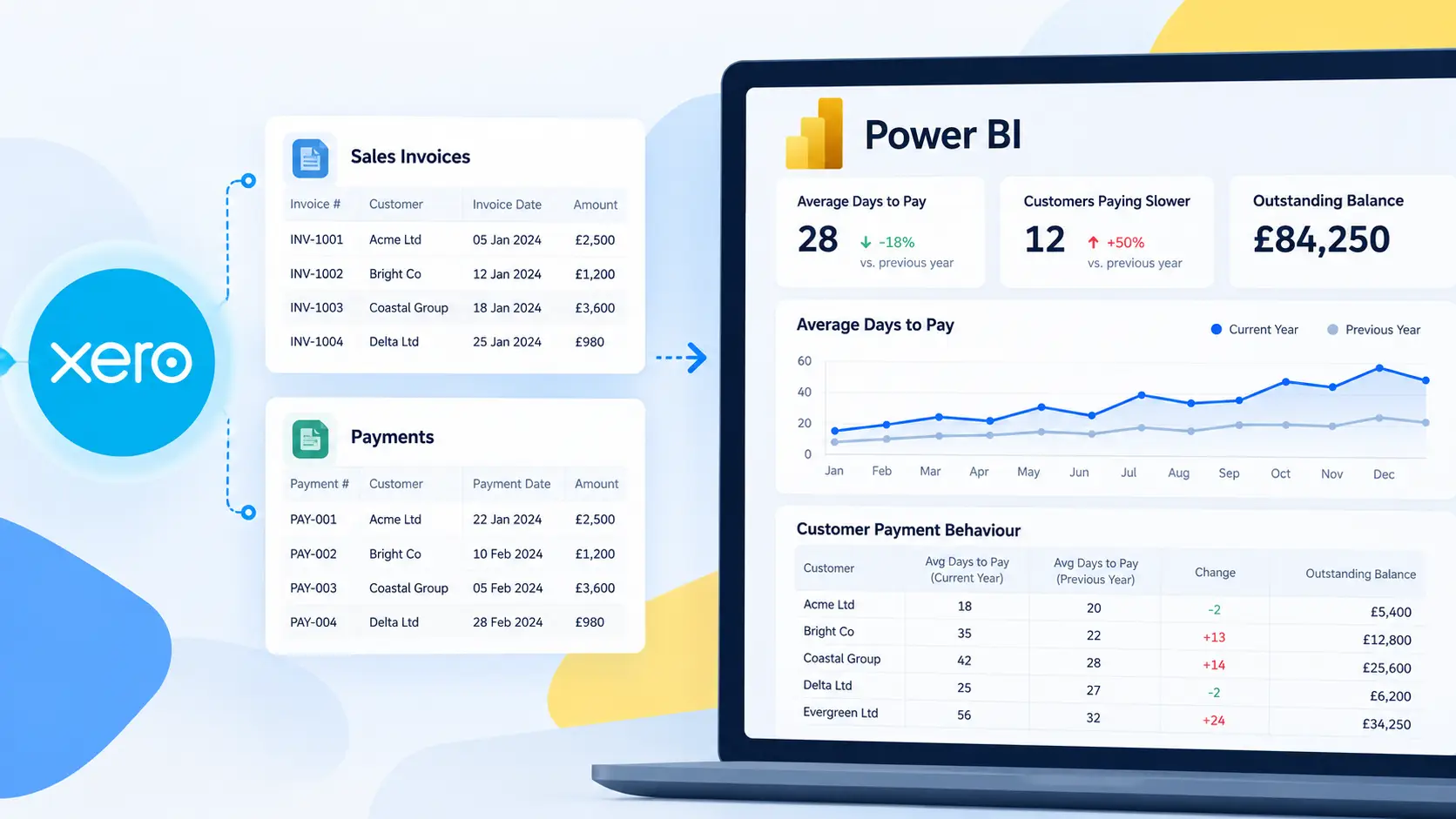

A HubSpot sales pipeline dashboard in Power BI gives sales managers and business leaders a clearer view of open opportunities, expected revenue, pipeline movement and deals requiring attention.
In this guide, we will build the dashboard using the Connectorly HubSpot and Power BI solution. Connectorly supplies the structured HubSpot data model, while Power BI provides the calculations, filters and interactive visuals.
The result will help users answer questions such as:
How much open pipeline do we currently have?
Which stages contain the most value?
Which deals are expected to close soon?
How is pipeline distributed between owners?
Which opportunities have become stale?
Are there enough qualified deals to support the sales target?
This is a practical supporting guide. For a broader explanation of connection methods, HubSpot objects, reporting models and KPIs, read our complete guide to HubSpot reporting in Power BI.
What Will the HubSpot Sales Pipeline Dashboard Include?
We will build a focused sales overview containing:
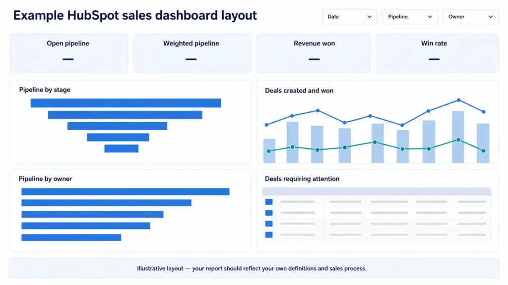
KPI cards for open pipeline, weighted pipeline, open deals and average deal value
Pipeline value by deal stage
Pipeline value by sales owner
Expected pipeline by close month
A table of deals requiring attention
Filters for date, pipeline and owner
The dashboard will use real fields from the Connectorly HubSpot data model. However, the exact property names and pipeline structure may differ between HubSpot accounts, especially where custom properties or several sales pipelines are used.
Before building the visuals, we will define the reporting logic and confirm which HubSpot records should count as open pipeline. This prevents an attractive dashboard from producing misleading results.
What HubSpot Data Do You Need?
A sales pipeline dashboard does not require every HubSpot table. Start with the objects needed for the questions the report must answer.
The core Connectorly tables are:
HubSpot Deals for opportunity value, dates, owners and deal properties
HubSpot Deal Pipelines for pipeline and stage labels
HubSpot Owners for sales-representative information
HubSpot Dates for monthly trends and time-based filtering
HubSpot Companies and Contacts when users need customer-level detail
Activity tables such as calls, meetings and tasks can be added later if the dashboard needs to identify opportunities without recent engagement.
Important deal fields
The exact field names depend on the HubSpot account and Connectorly model version. In most cases, the report will need:
Deal ID
Deal name
Pipeline and stage
Deal amount or reporting-currency amount
Deal owner
Created date
Expected close date
Closed date
Archived status
Closed-won or closed-lost status
Last activity or update date, where available
Use the reporting-currency amount when the model contains deals in several currencies and the dashboard needs one comparable total.
Connect the data before building the report
If the Connectorly connection is not already configured, follow the HubSpot and Power BI setup guide.
You can then connect Power BI Desktop to the prepared database using the instructions for bringing HubSpot data into Power BI.
Connectorly’s HubSpot All-in-One template provides an existing model and report foundation. You can customise that template or use the same prepared tables in a new Power BI file.
Step 1: Define What Counts as Open Pipeline
Before creating a measure, agree on which deals should count as open pipeline.
A typical definition includes deals that:
Are not archived
Belong to an included sales pipeline
Are currently in an open stage
Have a valid deal amount
Meet any organisation-specific exclusions
Do not identify open deals only by checking whether the stage name contains a particular word. Stage labels can be renamed and different pipelines may use different terminology.
Where possible, use the stage information in the Connectorly pipeline table to determine whether a stage is open, won or lost.
Decide how to treat missing amounts
A deal without an amount can still be a genuine open opportunity. However, it cannot contribute to pipeline value.
A useful approach is to:
Include the deal in the open-deal count
Exclude its blank amount from the pipeline-value measure
Display the number of open deals with missing amounts as a data-quality indicator
This keeps the opportunity visible without assigning it an invented value.
Confirm the reporting currency
If every deal uses the same currency, the standard deal amount may be sufficient.
For multi-currency reporting, use the Connectorly reporting-currency amount and display the selected reporting currency clearly. Do not add amounts from different currencies into one KPI unless they have been converted consistently.
Document exclusions
Record any rules that remove deals from the dashboard, such as:
Test or demonstration pipelines
Internal opportunities
Renewals reported elsewhere
Deals owned by inactive users
Particular business units or regions
Clear exclusions make it easier to explain why the Power BI total differs from a broader HubSpot view.
Step 2: Create the Core Pipeline Measures
The following measures use the reporting-currency fields in the Connectorly model. If every deal uses one currency, you can replace Amount (RC) with Amount.
These formulas assume that:
ArchivedandIs Closedare Boolean fieldsThe relationship between
hubspot dealsandhubspot deal_pipelinesis activePipeline-stage probability is stored as a decimal, such as 0.25 for 25%
To extend this dashboard beyond pipeline monitoring, see our guide to HubSpot sales KPIs in Power BI. It includes additional DAX measures for won revenue, win rate, average deal value, sales-cycle length and pipeline coverage.
Open deals
Create this measure to count distinct, non-archived deals in open stages:
Open Deals =
CALCULATE(
    DISTINCTCOUNT('hubspot deals'[Deal ID]),
    'hubspot deals'[Archived] = FALSE(),
    'hubspot deals'[Is Closed] = FALSE()
)
Open pipeline value
This measure adds the reporting-currency value of open deals:
Open Pipeline (RC) =
CALCULATE(
    SUM('hubspot deals'[Amount (RC)]),
    'hubspot deals'[Archived] = FALSE(),
    'hubspot deals'[Is Closed] = FALSE()
)
Blank deal amounts do not add value, but the deals remain included in the open-deal count.
Average open deal value
Divide the open pipeline value by the number of open deals:
Average Open Deal Value (RC) =
DIVIDE(
    [Open Pipeline (RC)],
    [Open Deals]
)
Weighted open pipeline
Weighted pipeline applies the probability assigned to each deal’s current pipeline stage:
Weighted Open Pipeline (RC) =
SUMX(
    FILTER(
        'hubspot deals',
        'hubspot deals'[Archived] = FALSE()
            && 'hubspot deals'[Is Closed] = FALSE()
            && NOT ISBLANK('hubspot deals'[Amount (RC)])
    ),
    VAR StageProbability =
        RELATED('hubspot deal_pipelines'[Probability])
    RETURN
        'hubspot deals'[Amount (RC)]
            * COALESCE(StageProbability, 0)
)
Before using this measure, format the Probability column as a percentage and inspect several stages.
If the underlying values are stored as whole percentages, such as 25 rather than 0.25, divide StageProbability by 100 in the calculation.
Weighted pipeline is a directional estimate, not guaranteed revenue. Its usefulness depends on whether stage probabilities reflect the organisation’s actual sales process.
Format the measures
Apply the following Power BI formats:
Open Deals: Whole number
Open Pipeline (RC): Reporting currency
Average Open Deal Value (RC): Reporting currency
Weighted Open Pipeline (RC): Reporting currency
These four measures will become the KPI cards at the top of the dashboard.
Step 3: Add the Pipeline KPI Cards
Create four Card visuals across the top of the report page.
Assign one measure to each card:
Open Pipeline (RC)
Weighted Open Pipeline (RC)
Open Deals
Average Open Deal Value (RC)
Use short, business-friendly titles:
Open pipeline
Weighted pipeline
Open deals
Average deal value
Keep the card formatting consistent. Use the same font, background, border and spacing so that users can scan the measures quickly.
Avoid using strong red or green colours for these headline values. A large pipeline is not automatically positive if the deals are old, poorly qualified or concentrated in one stage.
Show when the data was last updated
The Connectorly deals table includes the Data current as of field. Create this measure:
Data Current As Of =
MAX('hubspot deals'[Data current as of])
You can also create a formatted label:
Data Current Label =
"Data current as of "
    & FORMAT(
        [Data Current As Of],
        "dd MMMM yyyy HH:mm"
    )
Display this value near the dashboard title using a Card visual.
A visible timestamp helps users distinguish a genuine pipeline change from a report that has not yet received the latest HubSpot data.
Test the cards
Before adding more visuals, check the cards with several filters:
Select one sales pipeline
Select one owner
Change the reporting period
Select an individual stage
Confirm that every KPI responds as expected. It is easier to correct the reporting logic now than after the page contains several charts.
Step 4: Show Pipeline Value by Deal Stage
Add a horizontal Bar chart to show where open pipeline value is concentrated.
Configure the visual as follows:
Y-axis:
hubspot deal_pipelines[Pipeline Stage Label]X-axis:
[Open Pipeline (RC)]Tooltips:
[Open Deals],[Weighted Open Pipeline (RC)]and[Average Open Deal Value (RC)]
Use the title:
Open Pipeline by Deal Stage
The measure already excludes closed deals, so closed-won and closed-lost stages should not contribute to the chart.
Sort stages in pipeline order
Alphabetical sorting makes a sales pipeline difficult to understand.
Select the Pipeline Stage Label column and use:
Column tools → Sort by column → Pipeline Stage Sort Order
The stages should then follow the order defined in HubSpot.
If the model contains several pipelines, add Pipeline Label as a page filter or slicer. Different pipelines may use different stages and sorting structures, so displaying all of them together can create a misleading sequence.
Format the visual
For a clean stage chart:
Use one consistent accent colour
Turn on data labels
Format values using the reporting currency
Avoid assigning an unrelated colour to every stage
Keep long stage labels readable
Remove unnecessary gridlines and borders
The chart should make it easy to identify stages containing a disproportionate amount of open value.
However, a large stage is not automatically a problem. Review it alongside the number of deals, stage probability and time spent in the stage.
Step 5: Compare Open Pipeline by Owner
Add a second horizontal Bar chart to compare pipeline responsibility across the sales team.
Configure it as follows:
Y-axis:
hubspot deals[Owner Name]X-axis:
[Open Pipeline (RC)]Tooltips:
[Open Deals],[Weighted Open Pipeline (RC)]and[Average Open Deal Value (RC)]
Use the title:
Open Pipeline by Owner
Sort the chart by open pipeline value in descending order.
This visual helps managers identify:
Owners carrying the largest pipeline
Representatives with relatively few opportunities
Concentration of value among a small number of owners
Differences between total and weighted pipeline
Owners with unusually large average deal values
Pipeline value should not be treated as a performance ranking on its own. One owner may handle a smaller number of strategic opportunities, while another manages a larger volume of lower-value deals.
Handle deals without an owner
Create a data-quality measure for open deals without an assigned owner:
Unassigned Open Deals =
CALCULATE(
    [Open Deals],
    FILTER(
        'hubspot deals',
        ISBLANK('hubspot deals'[Owner ID])
    )
)
Add this measure to a tooltip, small card or data-quality panel.
Unassigned deals are easy to overlook in an owner chart because their label may appear blank. Keeping them visible helps prevent genuine opportunities from being excluded from sales follow-up.
Step 6: Show Expected Pipeline by Close Month
A pipeline dashboard should show not only how much value is open, but also when that value is expected to close.
Create this calculated column in hubspot deals:
Forecast Close Month =
VAR CloseDate =
    'hubspot deals'[Forecast Close Date]
RETURN
    IF(
        NOT ISBLANK(CloseDate),
        DATE(
            YEAR(CloseDate),
            MONTH(CloseDate),
            1
        )
    )
Format the column as MMM yyyy. Because the underlying value is a date, Power BI can sort it chronologically.
Create the visual
Add a Line and clustered column chart:
X-axis:
hubspot deals[Forecast Close Month]Column Y-axis:
[Open Pipeline (RC)]Line Y-axis:
[Weighted Open Pipeline (RC)]
Use the title:
Expected Pipeline by Close Month
The columns show the full open pipeline, while the line provides the probability-weighted view.
Keep the axis at month-and-year level. Using month names without the year can combine different reporting years and produce a misleading result.
Identify missing and overdue close dates
Create this measure for open deals without a forecast close date:
Open Deals Missing Close Date =
CALCULATE(
    [Open Deals],
    FILTER(
        'hubspot deals',
        ISBLANK('hubspot deals'[Forecast Close Date])
    )
)
Create another measure for deals whose forecast close date has already passed:
Open Deals Past Forecast Close Date =
CALCULATE(
    [Open Deals],
    FILTER(
        'hubspot deals',
        NOT ISBLANK('hubspot deals'[Forecast Close Date])
            && 'hubspot deals'[Forecast Close Date] < TODAY()
    )
)
Display these measures as small cards or in a data-quality panel.
Missing and overdue dates reduce the usefulness of a pipeline forecast. Making them visible encourages users to maintain the underlying HubSpot records.
Step 7: Create a Deals Requiring Attention Table
Summary charts show the scale of the pipeline. A detail table helps users act on individual opportunities.
Create this calculated column in hubspot deals:
Primary Attention Reason =
VAR DealIsOpen =
    'hubspot deals'[Archived] = FALSE()
        && 'hubspot deals'[Is Closed] = FALSE()
VAR DaysSinceUpdate =
    DATEDIFF(
        'hubspot deals'[Updated Date],
        TODAY(),
        DAY
    )
RETURN
    IF(
        NOT DealIsOpen,
        BLANK(),
        SWITCH(
            TRUE(),
            ISBLANK('hubspot deals'[Owner ID]), "Missing owner",
            ISBLANK('hubspot deals'[Amount (RC)]), "Missing amount",
            ISBLANK('hubspot deals'[Forecast Close Date]), "Missing close date",
            'hubspot deals'[Forecast Close Date] < TODAY(), "Close date passed",
            ISBLANK('hubspot deals'[Updated Date]), "Missing update date",
            DaysSinceUpdate > 30, "No recent update",
            BLANK()
        )
    )
The example uses 30 days to identify a deal without a recent update. Adjust this threshold to reflect the organisation’s normal sales cycle.
Build the table
Add a Table visual containing:
Deal NameCompany NameOwner NamePipeline Stage LabelAmount (RC)Forecast Close DateUpdated DateNext StepPrimary Attention ReasonInternal URL
Apply a visual-level filter so that Primary Attention Reason is not blank.
Use the title:
Deals Requiring Attention
Add a link back to HubSpot
Select the Internal URL field and set its Data category to Web URL.
In the table formatting options, display it as a link icon if available. Users can then open the relevant HubSpot record directly from Power BI.
Format the exceptions
Use restrained conditional formatting for Primary Attention Reason.
For example:
Red for a passed close date
Orange for a missing owner, amount or close date
Yellow for no recent update
The table should prioritise action rather than decoration. Sort it by amount, expected close date or urgency depending on the sales team’s workflow.
Step 8: Add Filters and Arrange the Dashboard
Add three primary slicers:
hubspot deals[Forecast Close Month]hubspot deals[Pipeline Label]hubspot deals[Owner Name]
You may also add Pipeline Stage Label when users need to focus on a particular part of the sales process.
Avoid placing too many slicers on the page. Additional fields can be moved into the Power BI filter pane or added to a separate detail page.
Recommended page layout
Arrange the report in this order:
Title and data timestamp at the top
Four KPI cards beneath the title
Open Pipeline by Deal Stage on the left
Expected Pipeline by Close Month on the right
Open Pipeline by Owner beneath the stage chart
Deals Requiring Attention beneath the trend chart
Date, pipeline and owner slicers near the top-right corner
This layout provides a clear reading path from the overall pipeline position to trends, ownership and individual records.
Keep the design consistent
Use a limited colour palette and reserve warning colours for genuine exceptions.
Apply consistent:
Card sizes
Visual titles
Font sizes
Currency formats
Backgrounds and borders
Spacing between visuals
Where possible, use the same stage, pipeline and owner terminology that users already see in HubSpot.
A familiar reporting language makes the dashboard easier to adopt and reduces confusion during validation.
Step 9: Validate the Dashboard Against HubSpot
Do not publish the dashboard until the principal measures have been checked against HubSpot.
Start with a small, controlled comparison:
Select one pipeline.
Select one owner.
Use a short forecast-close period.
Compare the open deals in HubSpot with the Power BI detail table.
Trace several individual Deal IDs through both systems.
Confirm the amount, stage, owner and forecast close date.
Compare the resulting totals.
If the figures differ, check:
Whether Power BI has received the latest Connectorly data
Whether archived deals are excluded
Whether both reports use the same pipeline
Whether the same stages count as open
Whether HubSpot and Power BI use the same amount field
Whether reporting-currency values are being compared with original-currency values
Whether blank amounts or close dates are handled differently
Whether filters from another visual or page remain active
Whether a relationship is duplicating or excluding deals
Test the stage probabilities
Review several pipeline stages and confirm that the Probability values match the intended HubSpot configuration.
Then manually calculate the weighted value of a small group of deals:
Deal amount × stage probability
Compare the result with the Power BI weighted-pipeline measure.
Record the agreed definitions
Document:
What counts as an open deal
Which pipelines are included
Which amount field is used
How stage probability is applied
Which date controls the trend
How missing values are treated
Which currency the report displays
Validation is not only about making two totals agree. It should establish that every important figure has a clear, repeatable and explainable definition.
Step 10: Publish and Maintain the Dashboard
Once the figures have been validated, publish the report to the appropriate Power BI workspace.
Before sharing it, confirm:
The Connectorly data source credentials are configured
The dataset refresh completes successfully
Report users have the correct workspace or app access
Currency formats and time zones are correct
The data timestamp appears on the page
HubSpot record links open as expected
Sensitive deal information is restricted appropriately
Use row-level security when different teams, regions or business units should see different records.
Review changes to the HubSpot process
The dashboard depends on the structure and meaning of the HubSpot sales process.
Review the report whenever users:
Add or remove a pipeline
Rename or reorder stages
Change stage probabilities
Introduce a new reporting currency
Replace an important custom property
Change how deal owners or teams are assigned
Revise the definition of forecast or pipeline
A scheduled refresh keeps the data current, but it does not automatically confirm that the business meaning remains correct.
Monitor data quality
Keep the exception measures visible and review them regularly:
Unassigned open deals
Deals without an amount
Deals without a forecast close date
Deals with a close date in the past
Deals without a recent update
These indicators help the Power BI dashboard improve the underlying HubSpot process rather than simply display it.
Frequently Asked Questions
Can Power BI report on a HubSpot sales pipeline?
Yes. Power BI can report on HubSpot deals, pipelines, stages, owners, companies, contacts and activities when that data is available through a suitable connection. Connectorly supplies these objects in a structured reporting database for Power BI.
What should count as open pipeline?
Open pipeline normally includes non-archived deals in stages that HubSpot identifies as open. The organisation should also document which pipelines, currencies and deal types are included.
How is weighted pipeline calculated?
Weighted pipeline multiplies each open deal’s amount by the probability assigned to its current pipeline stage. For example, a £10,000 deal in a stage with a 40% probability contributes £4,000 to weighted pipeline.
Why does the Power BI pipeline total differ from HubSpot?
Common causes include refresh timing, archived records, different pipeline filters, blank amounts, currency conversion, stage definitions and using different amount or date fields. Compare a small group of Deal IDs using identical filters before investigating only the overall total.
Can users open a HubSpot deal from Power BI?
Yes. The Connectorly deals table includes an Internal URL field. Set its Power BI Data category to Web URL and add it to the detail table so users can open the corresponding HubSpot record.
Do I need to use the Connectorly template?
No. You can build a new Power BI report using the prepared Connectorly tables. However, the HubSpot All-in-One template provides an existing model, relationships and report foundation that can reduce setup time.
Can the dashboard include sales activities?
Yes. Calls, meetings and tasks can be added to identify deals without recent engagement and compare activity with pipeline progression. Add these tables only when the dashboard has a clear activity-reporting requirement.
Final Thoughts
A useful HubSpot sales pipeline dashboard does more than display one large pipeline total.
It should explain where the value sits, when deals are expected to close, who owns the opportunities and which records require attention. It should also make missing amounts, overdue close dates and stale deals visible.
Begin with clear definitions, create a small set of explicit measures and validate them against individual HubSpot records. Once the foundation is dependable, you can extend the report with activities, conversion analysis, sales targets and executive forecasting.
Pipeline reporting shows the opportunities currently moving through your sales process, while forecasting estimates how much of that pipeline may convert into revenue. For the next step, see our practical guide to building a HubSpot sales forecast dashboard in Power BI, including probability-weighted forecasts, expected close dates and sales targets.
Connectorly provides the structured HubSpot data model, while Power BI supplies the calculations and interactive reporting experience.
For additional guidance:
- Read The Complete Guide to HubSpot Reporting in Power BI
- Learn how to build a HubSpot deal conversion and win rate dashboard in Power BI
- Follow the instructions to connect HubSpot to Power BI
- Compare HubSpot native reporting with Power BI
- Explore the Connectorly HubSpot and Power BI integration