Introduction
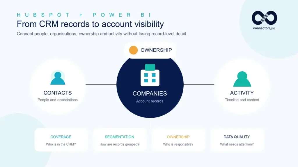
A HubSpot contacts and companies dashboard in Power BI brings your CRM records into one interactive view, helping you understand who is in your database, which organisations they belong to and who is responsible for each relationship.
HubSpot already provides useful contact and company views inside the CRM. However, Power BI becomes valuable when you need flexible analysis across owners, industries, locations, company types, record-creation dates and multiple HubSpot organisations. It also makes it easier to identify incomplete records, missing associations and areas where CRM data quality needs attention.
In this guide, we will build the dashboard using Connectorly’s structured HubSpot data model. We will work primarily with the hubspot contacts, hubspot companies, hubspot owners and hubspot dates tables, then introduce timeline data where it adds useful activity context.
The finished report will help you answer practical questions such as:
- How many contacts and companies are held in HubSpot?
- How has the database grown over time?
- Which owners are responsible for each contact or company?
- Where are companies located and which industries do they represent?
- Which contacts are not associated with a company?
- Which records are missing important reporting information?
This article focuses on CRM coverage, account visibility and data quality. For a broader overview of sales, activity, pipeline and customer reporting, read our complete guide to HubSpot reporting in Power BI.
What Should a HubSpot Contacts and Companies Dashboard Show?
A useful contacts and companies dashboard should do more than display a list of CRM records. It should help users understand the size, structure, ownership and quality of the database while making it easy to move from a summary into an individual HubSpot record.
The dashboard should include:
- Total active contacts
- Total active companies
- New contacts and companies created during the selected period
- Contacts and companies by owner
- Companies by industry, country, city and company type
- Contacts without an associated company
- Records without an assigned owner
- Companies missing an industry, country, domain or website
- Database growth over time
- A searchable contact and company detail table
These measures serve different purposes. Record totals and growth trends describe CRM coverage, while missing-owner and incomplete-record measures highlight data-quality issues that may affect sales reporting, segmentation and account management.
The report should also preserve the distinction between a contact and a company. A contact represents an individual person, while a company represents an organisation. Although contacts may be associated with companies in HubSpot, not every contact necessarily has a company association. The dashboard should therefore show both record types clearly instead of treating them as a single customer list.
What You Need Before You Start
To follow this guide, you need Power BI Desktop and access to HubSpot data through the Connectorly data model. The main tables used in the dashboard are:
- hubspot contacts — individual contact records, contact identifiers, company associations and record details
- hubspot companies — company names, types, industries, locations, domains, ownership and company identifiers
- hubspot owners — the HubSpot users responsible for contacts and companies
- hubspot dates — the calendar table used to analyse record creation over days, months, quarters and years
Useful fields include Contact ID, Contact Name, Company ID, Company Name, Owner ID, Created Date, Archived and Connection Name. From the companies table, fields such as Company Type, Industry, Country, City, Domain, Website, Number of Employees and Annual Revenue can provide additional segmentation.
You may also use hubspot contact_timeline and hubspot company_timeline later if you want to add engagement context. These timeline tables can contain several records for one contact or company, so they should not be used to calculate the basic number of contacts or companies.
Before Building the Report
Confirm that the model contains clear relationships between contacts, companies, owners and dates. Also check whether your Connectorly database contains one HubSpot organisation or several. When several organisations are combined, use Connection Name as a slicer and retain it in validation tables so records from different portals remain distinguishable.
Finally, decide whether archived records should appear in the dashboard. For most current-state reporting, the core measures should exclude records where Archived is true. Archived records can still be analysed separately when historical CRM administration is relevant.
Step 1: Check the Data Model and Relationships
Before creating measures or visuals, open Model view in Power BI and confirm how the four main tables are connected.
For record-creation analysis, the expected date relationships are:
- hubspot dates[Date] to hubspot contacts[Created Date]
- hubspot dates[Date] to hubspot companies[Created Date]
Each relationship should use the dates table on the one side and the CRM table on the many side. Use single-direction filtering from dates to the CRM records.
Owner information is matched using Owner ID. Depending on the relationships already supplied in your Connectorly model, hubspot owners[Owner ID] can provide Owner Name for contact and company reporting. Do not create duplicate owner relationships if the model already contains them.
Do Contacts Need a Relationship to Companies?
The hubspot contacts table already includes useful company-association fields such as Company ID and Company Name. This means the basic dashboard can count associated and unassociated contacts without requiring a new active relationship to hubspot companies.
Your Connectorly model may also contain a relationship between hubspot companies[Company ID] and hubspot contacts[Company ID]. If that relationship is inactive, do not activate it automatically. Activating additional paths between dates, owners, companies and contacts can create ambiguous filtering or make measures behave differently from expected.
For the first version of the dashboard, use the contact table for contact-level measures and the company table for company-level measures. Test every slicer against both sets of KPIs before adding more complex cross-table filtering.
Check the Relationship Keys
Use identifiers rather than names when creating relationships. Contact ID, Company ID and Owner ID are more reliable than contact names, company names or email addresses, which may be blank, duplicated or changed over time.
If you report across multiple HubSpot organisations, also test the model with Connection Name. The same descriptive name may appear in more than one portal, so totals should always be validated within the correct connection context.
Step 2: Create the Core Contact and Company Measures
Start with measures that count unique CRM records. Use DISTINCTCOUNT on the HubSpot identifiers rather than counting rows, because identifiers provide a safer definition of a contact or company.
Active Contacts
Active Contacts =
CALCULATE(
    DISTINCTCOUNT('hubspot contacts'[Contact ID]),
    'hubspot contacts'[Archived] = FALSE()
)
Active Companies
Active Companies =
CALCULATE(
    DISTINCTCOUNT('hubspot companies'[Company ID]),
    'hubspot companies'[Archived] = FALSE()
)
These two measures provide the main database totals. When hubspot dates[Date] filters the relevant Created Date field, the same measures can also show how many contacts or companies were created during a selected period.
Contacts Without a Company
Contacts Without a Company =
CALCULATE(
    DISTINCTCOUNT('hubspot contacts'[Contact ID]),
    'hubspot contacts'[Archived] = FALSE(),
    ISBLANK('hubspot contacts'[Company ID])
)
Contact-to-Company Association Rate
Contact-to-Company Association Rate =
DIVIDE(
    [Active Contacts] - [Contacts Without a Company],
    [Active Contacts]
)
Format the association-rate measure as a percentage. A lower value does not automatically mean the CRM is poorly maintained: some organisations legitimately hold individual contacts without company associations. Interpret the result according to the way your team uses HubSpot.
Contacts Without an Owner
Contacts Without an Owner =
CALCULATE(
    DISTINCTCOUNT('hubspot contacts'[Contact ID]),
    'hubspot contacts'[Archived] = FALSE(),
    ISBLANK('hubspot contacts'[Owner ID])
)
Companies Without an Owner
Companies Without an Owner =
CALCULATE(
    DISTINCTCOUNT('hubspot companies'[Company ID]),
    'hubspot companies'[Archived] = FALSE(),
    ISBLANK('hubspot companies'[Owner ID])
)
Unassigned records can be useful operational KPIs because they identify contacts or companies that may not have a clear person responsible for follow-up. However, confirm how your HubSpot portal handles ownership before treating every blank owner as an error.
Step 3: Measure CRM Data Completeness
Contact and company dashboards are especially useful for identifying incomplete CRM records. Missing information can weaken segmentation, ownership reporting, account planning and any analysis that depends on company attributes.
The exact fields your organisation considers mandatory will depend on its HubSpot processes. A practical starting point is to check whether active companies contain an industry, country and domain.
Companies Missing an Industry
Companies Missing an Industry =
CALCULATE(
    DISTINCTCOUNT('hubspot companies'[Company ID]),
    FILTER(
        'hubspot companies',
        'hubspot companies'[Archived] = FALSE()
            && (
                ISBLANK('hubspot companies'[Industry])
                || 'hubspot companies'[Industry] = ""
            )
    )
)
Companies Missing a Country
Companies Missing a Country =
CALCULATE(
    DISTINCTCOUNT('hubspot companies'[Company ID]),
    FILTER(
        'hubspot companies',
        'hubspot companies'[Archived] = FALSE()
            && (
                ISBLANK('hubspot companies'[Country])
                || 'hubspot companies'[Country] = ""
            )
    )
)
Companies Missing a Domain
Companies Missing a Domain =
CALCULATE(
    DISTINCTCOUNT('hubspot companies'[Company ID]),
    FILTER(
        'hubspot companies',
        'hubspot companies'[Archived] = FALSE()
            && (
                ISBLANK('hubspot companies'[Domain])
                || 'hubspot companies'[Domain] = ""
            )
    )
)
Companies Missing Key Details
Companies Missing Key Details =
CALCULATE(
    DISTINCTCOUNT('hubspot companies'[Company ID]),
    FILTER(
        'hubspot companies',
        'hubspot companies'[Archived] = FALSE()
            && (
                ISBLANK('hubspot companies'[Industry])
                || 'hubspot companies'[Industry] = ""
                || ISBLANK('hubspot companies'[Country])
                || 'hubspot companies'[Country] = ""
                || ISBLANK('hubspot companies'[Domain])
                || 'hubspot companies'[Domain] = ""
            )
    )
)
Company Data Completeness Rate
Company Data Completeness Rate =
DIVIDE(
    [Active Companies] - [Companies Missing Key Details],
    [Active Companies]
)
Format the completeness-rate measure as a percentage. Remember that this is a reporting rule created for the dashboard, not a universal HubSpot definition of a complete company. Adjust the required fields to reflect your own CRM standards.
If your organisation stores important segmentation information in HubSpot custom properties, Connectorly makes those properties available through the Custom Properties field. Expand only the properties needed for reporting so the Power BI model remains focused and manageable.
Step 4: Build the KPI Cards and Database Growth Trend
Begin the report page with a concise row of KPI cards. These should provide an immediate summary of CRM coverage and the most important data-quality exceptions.
Add Card visuals for:
- Active Contacts
- Active Companies
- Contacts Without a Company
- Contact-to-Company Association Rate
- Companies Missing Key Details
- Company Data Completeness Rate
Use whole-number formatting for record counts and percentage formatting for the two rates. Keep the labels explicit: a card labelled simply “Missing” is less useful than one labelled “Contacts Without a Company”.
Show Contact and Company Growth Over Time
Next, add a Line chart to show how many contacts and companies were created during each reporting period.
Configure the visual as follows:
- X-axis: hubspot dates[Calendar Month Name]
- Values: Active Contacts and Active Companies
Sort Calendar Month Name by Calendar Month Start so the months appear chronologically. If the report covers several years, include Calendar Year Name in the visual hierarchy or use a combined month-and-year field from the dates table.
Because the date relationships use Created Date, the measures represent records created during each month—not the total number of records that existed at the end of that month. Label the chart “New Contacts and Companies by Month” to make that distinction clear.
Add Date and Organisation Slicers
Add slicers for:
- hubspot dates[Date] or an appropriate calendar period
- Connection Name when the model combines multiple HubSpot organisations
Test that the date slicer filters both the contact and company measures as expected. If one set of KPIs does not change, return to Model view and inspect the relevant Created Date relationship.
If you need more detail about calendar relationships, sorting and time-based reporting, see our guide to creating and using a Power BI date table.
Step 5: Segment Contacts and Companies
Once the headline measures are working, add visuals that explain how the CRM database is distributed. These breakdowns help sales managers understand account coverage and reveal where classifications are missing or inconsistent.
Compare Records by Owner
Create two horizontal Bar charts:
- Axis: hubspot owners[Owner Name]
Value: Active Contacts - Axis: hubspot owners[Owner Name]
Value: Active Companies
Keep the contact and company charts separate. A person may own many contacts and companies, and combining both measures in one ranking can make the result difficult to interpret.
If unassigned records do not appear in the owner chart, show Contacts Without an Owner and Companies Without an Owner as separate cards. Blank foreign keys generally cannot be grouped under a named row from the owners table.
Analyse Companies by Industry
Add a Bar chart with:
- Axis: hubspot companies[Industry]
- Value: Active Companies
Sort the chart by Active Companies in descending order and use a Top N filter if the portal contains many industries. Keep blank industry values visible in a data-quality table even if you exclude them from the presentation chart.
Analyse Geographic Coverage
Create a second Bar chart using Country or City from hubspot companies with Active Companies as the value. A map can also work, but only when the location fields are sufficiently complete and consistent.
Country names entered in different formats—such as “UK”, “United Kingdom” and “Great Britain”—will appear as separate categories unless they are standardised. Power Query can be used to create a cleaned reporting field without changing the original HubSpot value.
Compare Company Types
Add a Column chart or Donut chart using:
- Legend or axis: hubspot companies[Company Type]
- Value: Active Companies
Company Type can help distinguish prospects, partners, resellers, vendors and other organisations where those classifications are maintained in HubSpot.
Use Custom Properties When Standard Fields Are Not Enough
Many organisations segment accounts using custom properties such as territory, customer tier, service line or account status. If those values are stored inside Custom Properties, expand only the fields required for the report.
For the full process, follow our guide to expanding HubSpot JSON custom properties in Power BI.
Step 6: Add Contact and Company Detail Tables
Summary visuals help users identify patterns, but they should also be able to inspect the records behind a result. Add separate detail tables for contacts and companies rather than combining both record types into one large visual.
Contact Detail Table
Create a Table visual using fields such as:
- hubspot contacts[Contact Name]
- hubspot contacts[Company Name]
- hubspot contacts[City]
- hubspot owners[Owner Name]
- hubspot contacts[Created Date]
- hubspot contacts[Connection Name]
Apply a visual-level filter so archived contacts are excluded. Allow the owner, company and date visuals on the page to filter this table so users can immediately see which records make up a selected result.
Company Detail Table
Create another Table visual using:
- hubspot companies[Company Name]
- hubspot companies[Company Type]
- hubspot companies[Industry]
- hubspot companies[Country]
- hubspot companies[City]
- hubspot companies[Domain]
- hubspot owners[Owner Name]
- hubspot companies[Created Date]
- hubspot companies[Connection Name]
You can also include Annual Revenue and Number of Employees where those fields are maintained consistently enough to support analysis.
Open the Original Record in HubSpot
If the table includes Connectorly’s HubSpot record-link field, set its data category to Web URL and display it as an icon. This gives authorised users a direct route from the Power BI detail table to the original contact or company record in HubSpot.
Access to the destination still depends on the viewer’s HubSpot permissions. The link does not grant access to anyone who cannot already open that record in HubSpot.
Add Drill-Through for a Cleaner Report
If the main dashboard becomes crowded, move the detail tables to dedicated drill-through pages. Users can then right-click a company, contact, owner or category and open a focused page without losing the context of their selection.
For detailed instructions, follow our guide to creating a Power BI drill-through page.
Step 7: Add Contact and Company Activity Context
The core contacts and companies tables describe CRM records. If you also want to understand the activity surrounding those records, add the Connectorly timeline tables to a separate report section or drill-through page.
The relevant tables are:
- hubspot contact_timeline — timeline records associated with contacts
- hubspot company_timeline — timeline records associated with companies
Timeline records can represent different HubSpot engagement types, including calls, deals, emails, meetings, notes, quotes, tasks and tickets. Use the Type, Title, Created, Owner ID and relevant contact or company identifier to provide context.
Create Basic Timeline Measures
Contact Timeline Records =
CALCULATE(
    DISTINCTCOUNT('hubspot contact_timeline'[ID]),
    'hubspot contact_timeline'[Archived] = FALSE()
)
Company Timeline Records =
CALCULATE(
DISTINCTCOUNT('hubspot company_timeline'[ID]),
'hubspot company_timeline'[Archived] = FALSE()
)Add a Bar chart using Type as the axis and the relevant timeline-record measure as the value. This shows the mix of recorded activity around contacts or companies.
You can also create a timeline detail table containing:
- Created
- Type
- Title
- Owner Name
- Contact Name or Company Name
Keep activity counts separate from contact and company counts. One contact or company can have many timeline records, so counting timeline rows does not tell you how many unique CRM records exist.
What Activity Reporting Can and Cannot Show
Timeline data can help users understand recorded engagement volume and investigate recent interactions. However, it should not automatically be interpreted as engagement quality or sales effectiveness. Different teams record activity in different ways, and automated records may behave differently from manually logged interactions.
For a more detailed report focused on tasks and sales interactions, read our guide to building a HubSpot sales activity dashboard in Power BI.
Step 8: Arrange the Finished Dashboard
A contacts and companies dashboard contains several different reporting questions, so the page should follow a clear visual hierarchy instead of placing every chart at the same level.
Recommended Page Layout
Top row — filters and headline KPIs
- Date or reporting-period slicer
- Connection Name slicer
- Owner slicer
- Active Contacts
- Active Companies
- Contact-to-Company Association Rate
- Company Data Completeness Rate
Middle row — growth and ownership
- New Contacts and Companies by Month
- Active Contacts by Owner
- Active Companies by Owner
Lower row — segmentation and data quality
- Companies by Industry
- Companies by Country or Company Type
- Contacts Without a Company
- Companies Missing Key Details
Bottom section or drill-through pages — record details
- Contact detail table
- Company detail table
- Contact or company timeline
- Links back to the original HubSpot records
Configure Visual Interactions
Use Edit interactions to confirm that each segmentation chart filters the intended detail table and KPI cards. Avoid allowing every visual to filter every other visual automatically, as this can make the report difficult to understand.
For example, selecting an industry should filter company KPIs and the company-detail table. It should only filter contact measures if the model contains a deliberate, tested path between the company and contact tables.
Keep Data-Quality Signals Visible
Use Connectorly blue for standard information, amber for records needing review and red only for clear exceptions. Data-quality indicators should attract attention without making ordinary blank values look like critical failures.
Add a small data-freshness label using the available Data current as of field so viewers can see when Connectorly last retrieved the HubSpot data.
Step 9: Validate the Dashboard Against HubSpot
Before sharing the report, compare its results with HubSpot. Validation is particularly important when the model combines contacts, companies, owners, dates and timeline records because each table has a different level of detail.
Check the following:
- Active contact and company totals exclude archived records consistently
- Contact and company measures use distinct identifiers rather than row counts
- The selected Connection Name matches the HubSpot portal being checked
- Date filters use Created Date for database-growth analysis
- Owner totals reconcile after accounting for records with blank Owner ID values
- Contacts without a company have a blank Company ID, not merely a blank company name
- Company segmentation uses the same Industry, Country and Company Type values visible in HubSpot
- Archived owners are not unintentionally removed from historical records
- Timeline measures count unique timeline IDs and not contacts or companies
- The displayed Data current as of timestamp is appropriate for the comparison
Investigate Differences at Record Level
If totals do not match, add a temporary validation table containing the record identifier, record name, Archived status, Connection Name, Owner ID and Created Date. Compare the individual records rather than adjusting a measure until the headline total looks correct.
Common causes of differences include:
- A different HubSpot view or filter being used for comparison
- Recently changed records that have not yet reached the Connectorly dataset
- Archived records being included on one side but excluded on the other
- Different date fields or time-zone boundaries
- Blank company or owner associations
- Duplicate descriptive names across several HubSpot organisations
Document the dashboard’s definitions—especially what counts as active, associated, assigned and complete—so future users understand why its figures may differ from another HubSpot report.
Common Contacts and Companies Dashboard Mistakes
Counting Rows Instead of Unique Records
Use distinct Contact ID and Company ID counts. Timeline, association or activity tables can contain several rows for the same CRM record, so a simple row count may overstate totals.
Treating Contacts and Companies as the Same Thing
A contact is a person and a company is an organisation. Keep their measures and detail tables separate, even when contacts contain company-association information.
Joining Tables Using Names
Contact names, company names and owner names can be duplicated or changed. Use Contact ID, Company ID and Owner ID for relationships and record-level validation.
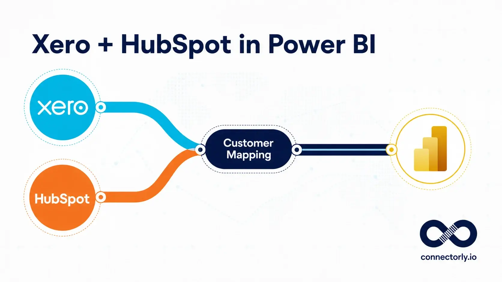
When customer records must be connected across HubSpot and an accounting system, the identifiers will not be shared between platforms. Our guide to combining Xero and HubSpot data in Power BI explains how to generate carefully reviewed customer mappings using normalised names, email addresses and a dedicated bridge table.
Activating Every Available Relationship
Additional active paths between dates, owners, contacts and companies can create ambiguous filtering. Preserve the relationships supplied with the Connectorly model unless you understand how a change will affect every measure.
Calling Created-Record Counts a Database Balance
A monthly chart filtered by Created Date shows new records created during each period. It does not automatically reconstruct the number of active records that existed at every historical month-end.
Hiding Blank Categories
Removing blank industries, countries, owners or company associations may make charts look cleaner, but it also hides useful data-quality information. Keep exception measures or a review table elsewhere on the report.
Ranking Owners Without Context
A larger number of contacts or companies does not necessarily mean better performance. Ownership totals describe allocation and coverage, not sales quality, conversion or workload complexity.
Assuming Every Timeline Record Represents Manual Activity
HubSpot portals can contain a mixture of manually recorded, system-generated and integrated engagement records. Review the Type and source context before interpreting timeline volume as human effort.
Ignoring Multiple HubSpot Organisations
When several portals are combined, use Connection Name in slicers and validation tables. Descriptive names may repeat across organisations even when the underlying records are different.
Final Thoughts
A HubSpot contacts and companies dashboard in Power BI can turn a large CRM database into a practical view of account coverage, ownership, segmentation and data quality.
The most important design choice is to keep the reporting level clear. Contact measures should count unique Contact ID values, company measures should count unique Company ID values, and timeline records should remain separate from both. This prevents activity volume or table relationships from inflating the core CRM totals.
The dashboard should also make exceptions visible. Contacts without companies, unassigned records and companies missing important attributes are not merely reporting problems—they can identify areas where CRM processes need attention.
Connectorly provides a structured HubSpot dataset that Power BI can use without requiring you to maintain a custom HubSpot API extraction. It includes contacts, companies, owners, dates, activity tables and identifiers that support reporting across one or several HubSpot organisations.
The model remains fully customisable in Power BI, so you can adapt the measures, required fields, report layout and custom-property analysis to match the way your organisation manages contacts and accounts.
Learn more about the Connectorly HubSpot and Power BI integration.
Frequently Asked Questions
Can Power BI report on HubSpot contacts and companies?
Yes. Power BI can analyse HubSpot contacts and companies using record identifiers, ownership, creation dates, associations, locations, industries and other CRM attributes. Connectorly provides these records in a structured data model designed for reporting.
Which Connectorly tables are used for this dashboard?
The core tables are hubspot contacts, hubspot companies, hubspot owners and hubspot dates. Contact and company timeline tables can provide additional activity context.
How are HubSpot contacts associated with companies?
The contacts table includes company-association information such as Company ID and Company Name. Some contacts may not have an associated company, so the dashboard should measure and display those records separately.
Does the dashboard need an active relationship between contacts and companies?
Not for the basic measures in this guide. Contact-level calculations can use fields in the contacts table, while company-level calculations use the companies table. Only add or activate further relationships when the required cross-filtering has been deliberately designed and tested.
Can the dashboard report across several HubSpot organisations?
Yes. Connectorly is designed to support reporting across multiple HubSpot organisations. Use Connection Name to filter, group and validate records from each portal.
Can Power BI show HubSpot custom contact and company properties?
Yes. Connectorly makes custom properties available through the Custom Properties field. Power BI can parse the JSON and expand the specific properties required for reporting.
Does a Created Date trend show the historical size of the CRM database?
No. It shows how many records were created during each period. Reconstructing the exact number of active records at a historical date may require additional logic, particularly when records can later be archived or changed.
Why might Power BI totals differ from HubSpot?
Common causes include archived-record filters, different date fields, portal selection, blank associations, refresh timing, time-zone boundaries and comparison against a different HubSpot view.
Can users open HubSpot records from the Power BI dashboard?
Yes, where the Connectorly table provides a HubSpot record-link field. Configure it as a Web URL in Power BI. The viewer must still have permission to access the destination record in HubSpot.