Sales forecasts help organisations estimate future revenue, assess whether targets are achievable and identify deals that may need attention. HubSpot contains much of the information required for forecasting, but Power BI provides greater flexibility for combining pipeline data, forecast values, probabilities, owners and expected close dates in one interactive dashboard.
In this guide, we’ll build a HubSpot sales forecast dashboard in Power BI using the Connectorly HubSpot data model. You’ll learn which fields to use, how to calculate weighted pipeline values and how to compare forecast revenue across periods, pipeline stages and deal owners.
This tutorial builds on our guide to creating a HubSpot sales pipeline dashboard in Power BI. For a broader overview of the available reporting options, see our complete guide to HubSpot reporting in Power BI.
What Is a HubSpot Sales Forecast Dashboard?
A HubSpot sales forecast dashboard estimates the revenue that may close during a future reporting period. It combines open deal values with information such as expected close dates, pipeline stages, forecast probabilities and deal owners.
Unlike a standard pipeline dashboard, which primarily shows where deals currently sit, a forecast dashboard focuses on likely future outcomes. It helps sales leaders answer questions such as:
How much revenue could close this month or quarter?
How much of the pipeline is weighted by probability?
Which sales representatives are expected to contribute the most revenue?
Which deals have forecast close dates approaching?
How does the current forecast compare with the sales target?
How much forecast revenue depends on a small number of large deals?
A forecast is an estimate rather than a guaranteed result. Its usefulness depends on the accuracy of deal amounts, close dates, pipeline stages and probabilities maintained in HubSpot. Power BI cannot correct poor CRM data automatically, but it can make missing, outdated or inconsistent information much easier to identify.
What HubSpot Data Do You Need for Sales Forecasting?
The Connectorly HubSpot data model provides the deal and pipeline information required to build the forecast. The main fields come from the hubspot deals and hubspot deal_pipelines tables.
Use these fields from hubspot deals:
Deal ID — uniquely identifies each opportunity.
Deal Name — provides a readable description.
Amount or Amount (RC) — stores the deal value. Use the RC version when reporting in a consistent reporting currency.
Forecast Amount or Forecast Amount (RC) — provides the forecast value available for the deal.
Forecast Probability — represents the probability associated with the forecast.
Forecast Close Date — places forecast revenue into the expected reporting period.
Projected Amount or Projected Amount (RC) — provides an additional projected value where applicable.
Predicted Amount or Predicted Amount (RC) — makes HubSpot’s predicted value available where supported.
Manual Forecast Category — identifies the forecast category assigned to the deal.
Pipeline Label and Pipeline Stage Label — show where the opportunity sits.
Owner ID and Owner Name — allow forecasts to be analysed by sales representative.
Is Closed and Is Closed Won — distinguish open, won and lost opportunities.
The hubspot deal_pipelines table adds stage information such as Stage Label, Probability, Is Closed and the pipeline sorting fields. These help display stages in their intended order and support probability-based calculations when a separate deal-level forecast probability is not being used.
Before building the dashboard, check which forecast fields your organisation actively maintains. Avoid mixing forecast, projected and predicted values in the same measure unless you have clearly defined how each one should be used.
Choose the Forecasting Method Before Building Measures
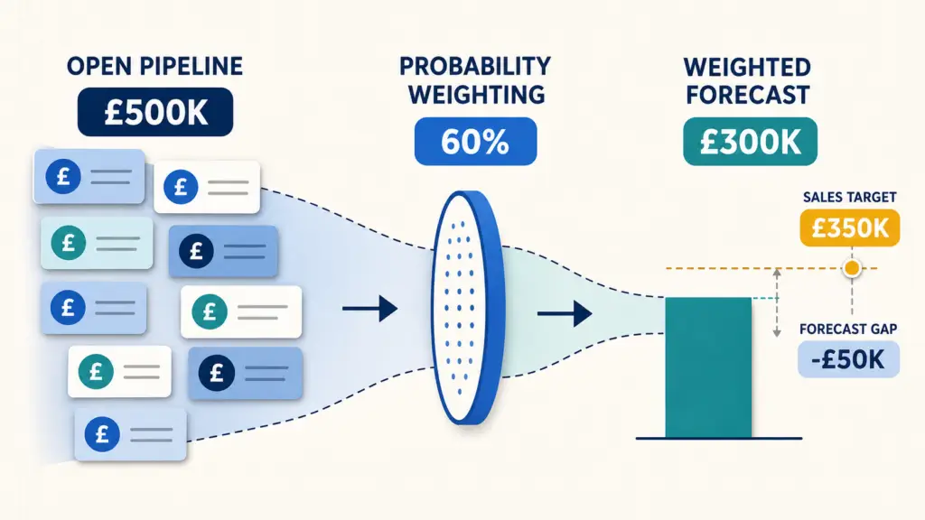
A sales forecast can use several different values, so define the method before creating calculations. Otherwise, two dashboard pages may display different forecasts while both appear correct.
Unweighted pipeline
This method includes the full value of every open deal expected to close during the selected period. It shows the maximum potential revenue but does not account for uncertainty.
Example: A £20,000 open deal contributes £20,000 to the forecast.
Probability-weighted pipeline
This method multiplies each open deal’s value by its probability of closing.
Example: A £20,000 deal with a 60% probability contributes £12,000.
You can use the deal’s Forecast Probability or the Probability associated with its pipeline stage. Choose one approach and apply it consistently.
HubSpot forecast value
If your team actively maintains Forecast Amount, Projected Amount, Predicted Amount or Manual Forecast Category, you can build the dashboard around those HubSpot values. This may better reflect the sales team’s judgement than a calculation based only on pipeline stage.
For this tutorial, we’ll create both an unweighted pipeline measure and a probability-weighted forecast. This allows users to compare total opportunity value with a more conservative estimate of likely revenue.
Prepare the Power BI Data Model
Before creating the forecast measures, confirm that the hubspot deals table is connected correctly to the pipeline and date tables in the Connectorly model.
The relationship to hubspot deal_pipelines allows each deal to inherit information such as its stage label, stage probability and display order.
Forecast reporting also requires a relationship between:
hubspot dates[Date]
hubspot deals[Forecast Close Date]
Power BI may already use another deal date—such as Created Date or Closed Won Date—for the active relationship to the date table. Because only one relationship between the same two tables can normally be active at once, the Forecast Close Date relationship may need to remain inactive.
An inactive relationship is not a problem. You can activate it within a DAX measure by using USERELATIONSHIP. This ensures that a month, quarter or year selected from the date table filters deals according to their forecast close dates.
Check that Forecast Close Date uses the Date data type. If it contains a time component, create a date-only version before building the relationship. A consistent date field prevents deals from being excluded because their date and time values do not match the daily rows in the calendar.
For more detail on calendar fields, relationships and financial periods, see our guide to creating a date table in Power BI.
Create the Open Pipeline Measure
The first measure calculates the full value of open deals expected to close during the selected forecast period.
Create a new measure in Power BI:
Open Pipeline (RC) =
CALCULATE(
    SUM('hubspot deals'[Amount (RC)]),
    'hubspot deals'[Is Closed] = FALSE(),
    USERELATIONSHIP(
        'hubspot dates'[Date],
        'hubspot deals'[Forecast Close Date]
    )
)
This measure performs three tasks:
It adds the reporting-currency value of the deals.
It excludes opportunities that are already closed.
It filters the results using Forecast Close Date rather than another date associated with the deal.
If the Forecast Close Date relationship is already active, remove the USERELATIONSHIP section from the measure.
Use Amount instead of Amount (RC) if every deal uses the same currency and you do not need reporting-currency conversion.
Add the measure to a Card visual and apply a date filter for the current month or quarter. The result represents the full unweighted value of open opportunities expected to close within that period.
Create the Probability-Weighted Forecast Measure
The weighted forecast reduces each open deal’s contribution according to its probability of closing.
Create this measure:
Weighted Forecast (RC) =
CALCULATE(
    SUMX(
        FILTER(
            'hubspot deals',
            'hubspot deals'[Is Closed] = FALSE()
        ),
        VAR RawProbability =
            COALESCE(
                'hubspot deals'[Forecast Probability],
                RELATED('hubspot deal_pipelines'[Probability]),
                0
            )
        VAR ProbabilityValue =
            IF(
                RawProbability > 1,
                DIVIDE(RawProbability, 100),
                RawProbability
            )
        RETURN
            'hubspot deals'[Amount (RC)] * ProbabilityValue
    ),
    USERELATIONSHIP(
        'hubspot dates'[Date],
        'hubspot deals'[Forecast Close Date]
    )
)
The measure uses Forecast Probability when it is available. If that value is blank, it falls back to the probability associated with the deal’s pipeline stage.
Some models store probability as a decimal, such as 0.6, while others store it as a percentage, such as 60. The ProbabilityValue variable supports both formats.
Add this measure to a second Card visual beside Open Pipeline (RC). Comparing the two values shows the difference between the maximum potential pipeline and the probability-adjusted forecast.
If the Forecast Close Date relationship is active, remove the USERELATIONSHIP section as you did with the previous measure.
Build the Core Forecast KPI Cards
A useful forecast summary should show more than revenue alone. Add four Card visuals across the top of the report:
Open Pipeline (RC)
Weighted Forecast (RC)
Open Forecast Deals
Average Open Deal Value (RC)
Create the deal-count measure:
Open Forecast Deals =
CALCULATE(
    DISTINCTCOUNT('hubspot deals'[Deal ID]),
    'hubspot deals'[Is Closed] = FALSE(),
    USERELATIONSHIP(
        'hubspot dates'[Date],
        'hubspot deals'[Forecast Close Date]
    )
)
Then create the average-value measure:
Average Open Deal Value (RC) =
DIVIDE(
    [Open Pipeline (RC)],
    [Open Forecast Deals]
)
You can also show how much of the open pipeline remains after probability weighting:
Weighted Pipeline Percentage =
DIVIDE(
    [Weighted Forecast (RC)],
    [Open Pipeline (RC)]
)
Format the revenue measures using the appropriate reporting currency. Format Weighted Pipeline Percentage as a percentage with one decimal place.
Add a slicer using a month, quarter or year field from hubspot dates. When users change the period, all KPI cards should recalculate according to the deals’ Forecast Close Dates.
Create a Monthly Sales Forecast Chart
A monthly forecast chart shows when the current pipeline is expected to convert into revenue.
Insert a Line and clustered column chart, then configure it as follows:
X-axis: Year Month from hubspot dates
Column Y-axis: Open Pipeline (RC)
Line Y-axis: Weighted Forecast (RC)
Sort the Year Month label using its corresponding chronological sort field from the date table. This prevents Power BI from arranging month names alphabetically.
The columns show the full value of open opportunities forecast to close each month. The line provides the probability-adjusted view, making it easier to see how much of that pipeline is realistically expected to convert.
Use a continuous timeline when you want to show the overall direction of the forecast. Use a categorical axis when users need to compare clearly separated monthly or quarterly values.
Give the visual a descriptive title such as:
Open Pipeline and Weighted Forecast by Expected Close Month
Add tooltips for Open Forecast Deals, Average Open Deal Value (RC) and Weighted Pipeline Percentage. Users can then hover over each period to understand the volume and quality of the underlying pipeline.
Analyse the Forecast by Deal Owner and Pipeline Stage
The total forecast explains what may close, but sales leaders also need to understand who owns the opportunities and how far those deals have progressed.
Forecast by deal owner
Insert a clustered bar chart with:
Y-axis: Owner Name
X-axis: Weighted Forecast (RC)
Tooltips: Open Pipeline (RC), Open Forecast Deals and Average Open Deal Value (RC)
Sort the chart by Weighted Forecast (RC) in descending order. This helps managers compare expected contributions across the sales team and identify forecasts that depend heavily on one representative.
Forecast by pipeline stage
Add a second bar or column chart with:
Axis: Pipeline Stage Label or Stage Label
Value: Open Pipeline (RC)
Tooltips: Weighted Forecast (RC) and Open Forecast Deals
Sort the stages using Pipeline Stage Sort Order rather than alphabetically. The chart should follow the actual journey from early qualification through to the final open stage.
Review the two visuals together. A representative may have a large pipeline but a relatively low weighted forecast if most opportunities remain in early stages. Conversely, a smaller pipeline can produce a stronger near-term forecast when deals have higher probabilities and later-stage positions.
Add slicers for Pipeline Label, Owner Name and Manual Forecast Category so users can focus on a particular team, representative or forecast classification.
Add a Detailed Forecast Deal Table
Summary visuals reveal patterns, but sales managers still need to see the opportunities behind the forecast. Add a Table visual containing:
Deal Name
Company Name
Owner Name
Pipeline Stage Label
Forecast Close Date
Amount (RC)
Forecast Probability
Manual Forecast Category
Internal URL
Filter the table so it includes open deals only. Sort it by Forecast Close Date or Amount (RC), depending on whether the priority is timing or financial value.
Format Internal URL as a web link. This allows authorised users to move directly from the Power BI report to the corresponding record in HubSpot when they need to review or update a deal.
Use conditional formatting to highlight:
Forecast Close Dates that have already passed
Deals with large values but low probabilities
Blank forecast categories
Missing owners
Deals approaching their expected close date
This table turns the dashboard from a passive forecast into a practical sales-management tool. When a number appears unrealistic, users can identify the responsible opportunities and investigate them immediately.
Compare the Sales Forecast with Targets
A forecast becomes more useful when users can compare it with an agreed sales target.
If targets are maintained outside HubSpot, create a simple Excel table containing:
Period
Owner or Team
Target Amount
Import the table into Power BI and relate its Period field to the date table. If targets are assigned to individual representatives, also map the owner values consistently.
Create a target measure:
Sales Target =
SUM('Sales Targets'[Target Amount])
Then calculate the expected gap:
Forecast to Target Gap =
[Weighted Forecast (RC)] - [Sales Target]
Finally, calculate target attainment:
Forecast Target Attainment =
DIVIDE(
    [Weighted Forecast (RC)],
    [Sales Target]
)
Display Sales Target, Forecast to Target Gap and Forecast Target Attainment as KPI cards. You can also add the target as a second line to the monthly forecast chart.
A positive gap indicates that the weighted forecast exceeds the target. A negative gap highlights a potential shortfall that may require additional pipeline, faster deal progression or a review of the current forecast assumptions.
Keep forecast values and targets in the same reporting currency before comparing them.
Improve the Accuracy of Your HubSpot Sales Forecast
A technically correct Power BI dashboard can still produce an unreliable forecast when the underlying HubSpot records are incomplete or outdated.
Review these areas regularly:
Missing deal amounts: Opportunities without a value cannot contribute meaningfully to the forecast.
Outdated close dates: Open deals with dates in the past can distort current-period analysis.
Unrealistic probabilities: Stage probabilities should reflect genuine historical likelihood rather than optimism.
Incorrect pipeline stages: Deals that have stopped progressing should not remain indefinitely in active late stages.
Missing owners: Every active opportunity should have clear responsibility.
Inconsistent forecast categories: Define when the team should use categories such as pipeline, best case or commit.
Duplicate deals: Repeated opportunities can overstate both pipeline value and deal count.
Mixed currencies: Use the RC fields when values must be compared in one reporting currency.
Create a dedicated data-quality page in the report showing deals with blank amounts, missing close dates, past-due forecast dates or no assigned owner.
This page does not need complex visuals. A few KPI cards and a detailed exception table can help sales managers correct CRM records before the next forecasting meeting.
The dashboard should support the forecasting process, but it cannot replace consistent sales discipline and regular review of the underlying opportunities.
Recommended Sales Forecast Dashboard Layout
Keep the dashboard focused on the questions discussed during sales-forecast meetings.
A practical one-page layout is:
Top row: headline KPIs
Open Pipeline
Weighted Forecast
Sales Target
Forecast to Target Gap
Open Forecast Deals
Middle row: forecast analysis
Open Pipeline and Weighted Forecast by Expected Close Month
Weighted Forecast by Deal Owner
Open Pipeline by Pipeline Stage
Bottom row: deal detail
Forecast deal table
Slicers for period, pipeline, owner and forecast category
Use consistent colours throughout the page. For example, display the open pipeline in blue, the weighted forecast in teal and the sales target in amber. Reserve red for genuine risks or negative forecast gaps.
Keep the date and pipeline filters visible near the top of the page. Users should be able to understand the active forecast period without opening the filter pane.
Avoid filling the dashboard with too many visuals. The summary page should explain the forecast quickly, while detailed opportunity analysis and data-quality checks can sit on separate report pages.
Once complete, test each slicer and select several deal owners, stages and forecast periods. Confirm that the KPI cards, charts and detail table all respond consistently.
How Connectorly Supports HubSpot Forecasting in Power BI
Building a forecast dashboard requires more than connecting to a list of deals. The reporting model must also preserve relationships between deals, pipelines, stages, owners, companies and dates.
Connectorly prepares HubSpot information in structured tables that Power BI can use for reporting. The deals table includes fields such as forecast amounts, probabilities, expected close dates, owners, pipeline stages and reporting-currency values. Related pipeline and date tables provide the context required for filtering and time-based analysis.
This approach reduces the amount of API, authentication and data-preparation work required before report development can begin. Users can still customise the Power BI model, create their own DAX measures and combine HubSpot information with targets or data from other business systems.
Connectorly does not decide which forecasting methodology an organisation should use. That remains a business decision. Instead, it provides the underlying HubSpot data in a form that supports unweighted, probability-weighted and HubSpot-managed forecasting approaches.
Learn more about the Connectorly HubSpot and Power BI integration.
Final Thoughts
A HubSpot sales forecast dashboard in Power BI provides a flexible view of expected revenue, pipeline risk and performance against targets.
The most important step is defining the forecasting methodology before building the report. An unweighted pipeline, a probability-weighted calculation and a forecast maintained by the sales team can all produce different results. Each can be useful, but users must understand what the selected number represents.
Start with a small set of reliable measures and visuals. Show the open pipeline, weighted forecast, expected close periods, owners, stages and underlying deal details. Add targets only when they use compatible periods and currencies.
Finally, review the quality of the HubSpot data regularly. Accurate amounts, probabilities, owners, stages and close dates are what turn a technically correct dashboard into a forecast that decision-makers can trust.
Frequently Asked Questions
1. What is a weighted sales forecast?
A weighted sales forecast multiplies each open deal’s value by its probability of closing. For example, a £10,000 opportunity with a 60% probability contributes £6,000 to the weighted forecast.
2. Can Power BI use HubSpot forecast data?
Yes. Connectorly makes HubSpot deal, pipeline, probability, forecast, owner and close-date information available in a structured Power BI data model.
3. Should I use deal probability or pipeline-stage probability?
Use deal-level forecast probability when your sales team maintains it consistently. Otherwise, pipeline-stage probability can provide a repeatable alternative. Define one method and use it consistently across the report.
4. Can I compare the HubSpot forecast with sales targets?
Yes. Import monthly, quarterly or annual targets into Power BI, connect them to the date and owner dimensions where appropriate, and compare them with the weighted forecast using DAX measures.
5. Why does my Power BI forecast differ from HubSpot?
Differences can result from date filters, currencies, forecast categories, probability methods, closed-deal filters or data-refresh timing. Confirm that both reports use the same records, periods and forecasting rules.