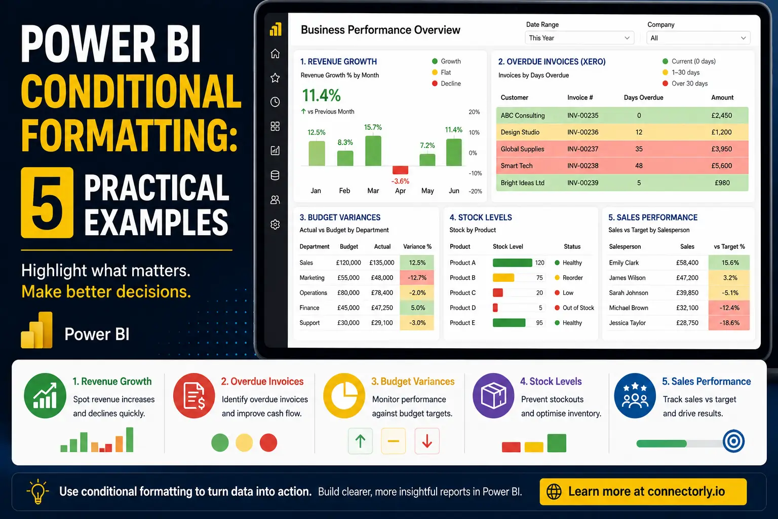
When people first start using Power BI, they often focus on charts, tables, and dashboards. However, one of the most effective ways to improve a report is often much simpler: conditional formatting.
Conditional formatting allows Power BI to automatically change colours, icons, data bars, or visual indicators based on the underlying data. This helps users identify trends, spot problems, and make decisions faster without having to manually review every number.
At Connectorly, we regularly see businesses use conditional formatting to improve reporting on financial performance, sales activity, customer payments, and operational metrics. When applied correctly, it can make reports easier to understand and significantly more useful.
In this guide, we’ll explore five practical examples of Power BI conditional formatting that businesses can implement today, including several examples using Xero data.
What Is Conditional Formatting in Power BI?
Conditional formatting allows Power BI to automatically apply visual styling based on data values.
Instead of displaying every value in the same format, Power BI can highlight important information using:
- Background colours
- Font colours
- Data bars
- Icons
- KPI indicators
- Web URLs
For example, a report might display profitable months in green and loss-making months in red.
This visual approach helps users identify patterns and exceptions more quickly than reviewing rows of numbers.
Why Is Conditional Formatting Important for Business Reports?
Business users rarely have time to analyse every value in a report.
Conditional formatting helps focus attention on information that requires action.
For example, finance teams can instantly identify overdue invoices, sales managers can spot underperforming regions, and operations teams can monitor stock levels before shortages occur.
The result is a report that communicates information more clearly and supports faster decision-making.
Example 1: Highlight Revenue Growth and Decline
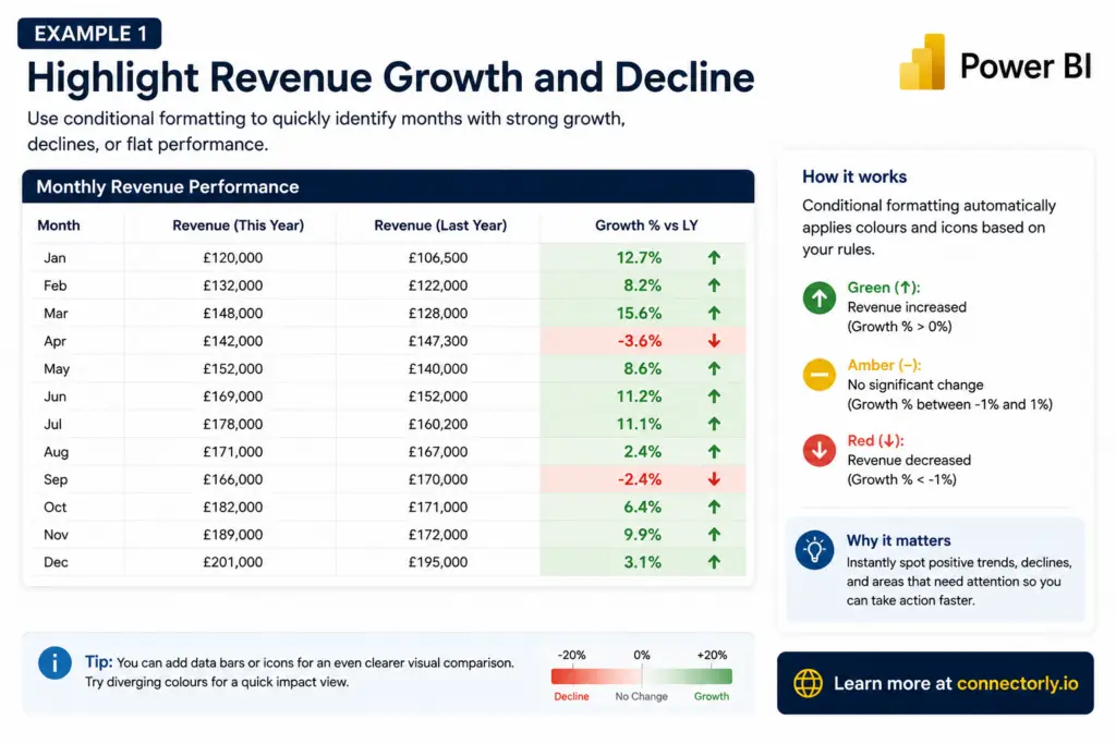
One of the most common uses of conditional formatting is revenue reporting.
Many organisations compare current revenue against previous periods to understand business performance.
In Power BI, conditional formatting can automatically display:
- Green when revenue has increased
- Red when revenue has decreased
- Amber when growth is close to zero
For example, a monthly revenue table might display:
Month | Revenue Growth |
January | +12% |
February | +8% |
March | -4% |
With conditional formatting applied, positive values immediately stand out while declining periods become easy to identify.
This approach works particularly well in executive dashboards where users need to understand performance at a glance.
How to Create Revenue Growth Conditional Formatting in Power BI
You can recreate this type of revenue growth table in Power BI using a standard Table visual and built-in conditional formatting.
Step 1: Create a Revenue Growth Measure
Assuming you already have current and previous year revenue measures, create a growth percentage measure:
Revenue Growth % =
DIVIDE(
    [Revenue This Year] - [Revenue Last Year],
    [Revenue Last Year]
)
Format the measure as a percentage.
Step 2: Add a Table Visual
Insert a Table visual and add:
- Month
- Revenue This Year
- Revenue Last Year
- Revenue Growth %
Your table should now display revenue performance by month.
Step 3: Apply Conditional Formatting
Select the table visual.
In the Values section:
- Click the dropdown beside Revenue Growth %
- Select Conditional formatting
- Choose Background colour
Step 4: Configure Formatting Rules
Select Rules as the format style.
Create rules similar to:
Value Range | Colour |
|---|---|
Less than 0% | Red |
0% to 2% | Amber |
Greater than 2% | Green |
This instantly highlights declining and growing periods.
Step 5: Add Icons (Optional)
For even clearer reporting:
- Select Conditional formatting
- Choose Icons
- Create rules such as:
- Green Up Arrow for values above 0%
- Yellow Circle for values between -1% and 1%
- Red Down Arrow for values below -1%
This gives users an immediate visual indication of performance without needing to analyse every number.
Instead of reading every figure, users can focus immediately on the exceptions that matter.
Example 2: Identify Overdue Invoices from Xero
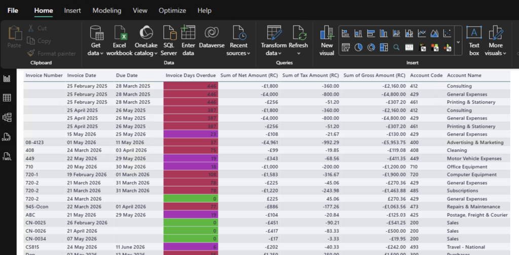
Businesses using Xero often track outstanding invoices and customer payment behaviour.
When Xero data is connected to Power BI, conditional formatting can highlight invoices based on their age.
For example:
- Green = Current invoices
- Amber = 1–30 days overdue
- Red = More than 30 days overdue
Instead of reviewing individual invoice dates, finance teams can instantly identify accounts requiring attention.
This becomes particularly useful when managing larger sales ledgers where hundreds or thousands of invoices may be outstanding.
If you’re looking to bring Xero invoice data into Power BI, our guide explains how to connect the two platforms:
How To Connect Xero to Power BI Desktop and Start Reporting in Minutes
How to Create Overdue Invoice Conditional Formatting in Power BI
One of the most practical uses of conditional formatting is highlighting overdue invoices.
When Xero invoice data is connected to Power BI through Connectorly, you can quickly identify customers who require follow-up by applying colour coding based on invoice age.
Step 1: Create an Invoice Days Overdue Column
In Power BI Desktop:
- Open Data View
- Select the xero invoices table
- Click New Column
Create the following calculated column:
Invoice Days Overdue =
VAR DaysOverdue =
    DATEDIFF(
        'xero invoices'[Due Date],
        TODAY(),
        DAY
    )
RETURN
    IF(DaysOverdue > 0, DaysOverdue, 0)
This calculates the number of days an invoice is overdue.
Invoices that have not yet reached their due date will display 0 rather than a negative value.
Step 2: Create a Table Visual
Switch to Report View and insert a Table visual.
Add the following fields:
- Contact Name
- Invoice Number
- Due Date
- Amount Due
- Invoice Days Overdue
You should now have a simple invoice ageing report.
Step 3: Apply Conditional Formatting
Select the Invoice Days Overdue column within the table.
Then:
- Click the dropdown beside Invoice Days Overdue
- Select Conditional Formatting
- Choose Background Colour
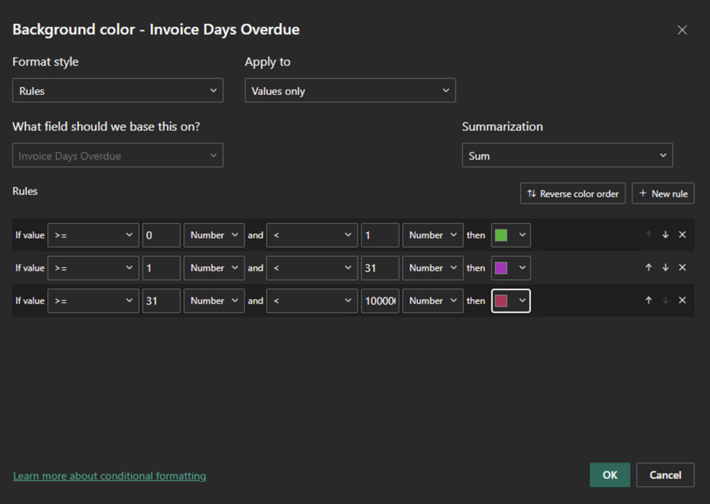
Step 4: Configure the Rules
Set Format Style to Rules.
Make sure all rule values use Number rather than Percent.
Create the following rules:
If Value | And | Colour |
|---|---|---|
>= 0 | < 1 | Green |
>= 1 | < 31 | Amber |
>= 31 | Highest Value | Red |
This creates a simple traffic-light system:
- Green = Current invoice
- Amber = Overdue but manageable
- Red = High-priority overdue invoice
Step 5: Highlight the Amount Due Column
To make overdue balances even easier to identify:
- Click the dropdown beside Amount Due
- Select Conditional Formatting
- Choose Background Colour
- Base the formatting on Invoice Days Overdue
This means high-value overdue invoices immediately stand out in the report.
Step 6: Add Icons (Optional)
For management dashboards, icon formatting can make the report even easier to read.
Apply icon rules such as:
Days Overdue | Icon |
|---|---|
0 | Green Tick |
1–30 | Yellow Warning |
31+ | Red Warning |
This provides an instant visual summary of invoice status.
Example Using Xero Data
Your finished report might look like this:
Customer | Amount Due | Days Overdue | Status |
|---|---|---|---|
ABC Consulting | £2,450 | 0 | Green |
Design Studio | £1,200 | 12 | Amber |
Global Supplies | £3,950 | 35 | Red |
Smart Tech | £5,600 | 48 | Red |
Bright Ideas Ltd | £980 | 5 | Amber |
Why This Works
Cash flow management often depends on quickly identifying overdue invoices.
Conditional formatting turns a standard accounts receivable report into an action-focused dashboard by highlighting:
- Customers requiring follow-up
- High-risk overdue balances
- Ageing trends across the sales ledger
- Potential cash flow issues
When combined with Xero data in Power BI, this approach provides a much clearer view of outstanding receivables and helps finance teams prioritise collection activities.
Example 3: Highlight Budget Variances
Budget versus actual reporting is one of the most common Power BI use cases.
Conditional formatting can make variance analysis significantly easier.
For example:
- Green when actual results exceed budget
- Red when actual results fall below budget
- Amber when variance is within an acceptable threshold
Rather than analysing every figure manually, users can immediately identify areas that require investigation.
How to Create Budget Variance Conditional Formatting in Power BI
This example assumes you have a table containing:
- Department
- Budget Amount
- Actual Amount
Step 1: Create a Budget Variance Measure
Create a new measure:
Budget Variance % =
DIVIDE(
    [Actual Amount] - [Budget Amount],
    [Budget Amount]
)
Format the measure as a Percentage.
This measure shows how far actual performance differs from budget.
Examples:
Budget | Actual | Variance |
|---|---|---|
£100,000 | £110,000 | 10% |
£50,000 | £45,000 | -10% |
£75,000 | £76,000 | 1.3% |
Step 2: Create a Table Visual
Insert a Table visual.
Add:
- Department
- Budget Amount
- Actual Amount
- Budget Variance %
You should now see the variance for each department.
Step 3: Apply Conditional Formatting
Select the Budget Variance % field.
Then:
- Click the dropdown beside Budget Variance %
- Select Conditional Formatting
- Choose Background Colour
Step 4: Configure the Variance Rules
Set:
- Format Style = Rules
- Base Field = Budget Variance %
- Summarisation = First (or Don’t Summarise where available)
Create the following rules:
If Value | And | Colour |
|---|---|---|
>= 5% | Highest Value | Green |
>= -5% | < 5% | Amber |
Less than -5% | Lowest Value | Red |
This creates a simple performance indicator:
- Green = Exceeding budget
- Amber = Close to budget
- Red = Missing budget
Step 5: Apply Formatting to Actual Amount (Optional)
You can also apply the same colour rules to the Actual Amount column.
To do this:
- Select Actual Amount
- Choose Conditional Formatting
- Select Background Colour
- Base the formatting on Budget Variance %
This makes underperforming departments stand out immediately.
Step 6: Add Icons (Optional)
Many management reports use icon sets to make variance reporting easier to interpret.
Configure icon rules such as:
Variance % | Icon |
|---|---|
Greater than 5% | Green Up Arrow |
Between -5% and 5% | Yellow Circle |
Less than -5% | Red Down Arrow |
This provides a quick visual summary for managers and executives.
Example Budget Variance Report
Your finished report might look like this:
Department | Budget | Actual | Variance |
|---|---|---|---|
Sales | £100,000 | £110,000 | 10% |
Marketing | £50,000 | £45,000 | -10% |
Operations | £75,000 | £76,000 | 1.3% |
Finance | £40,000 | £44,000 | 10% |
Support | £30,000 | £28,000 | -6.7% |
Using conditional formatting:
- Sales would appear green
- Marketing would appear red
- Operations would appear amber
- Finance would appear green
- Support would appear red
Why This Works
Budget variance reports are designed to highlight exceptions.
Without conditional formatting, users must manually review every figure.
With conditional formatting, Power BI automatically highlights:
- Departments exceeding expectations
- Areas under budget pressure
- Teams requiring further investigation
- Opportunities for better resource allocation
This allows managers to focus on the most important issues rather than spending time searching through rows of data.
Example Using Xero Data
Many businesses import their Profit and Loss data from Xero into Power BI using Connectorly.
By combining Xero actuals with a budgeting spreadsheet or planning system, organisations can create automated budget variance dashboards that highlight performance issues in real time.
This is one of the most common financial reporting dashboards we see built using Connectorly for Xero & Power BI.
Example 4: Monitor Stock Levels
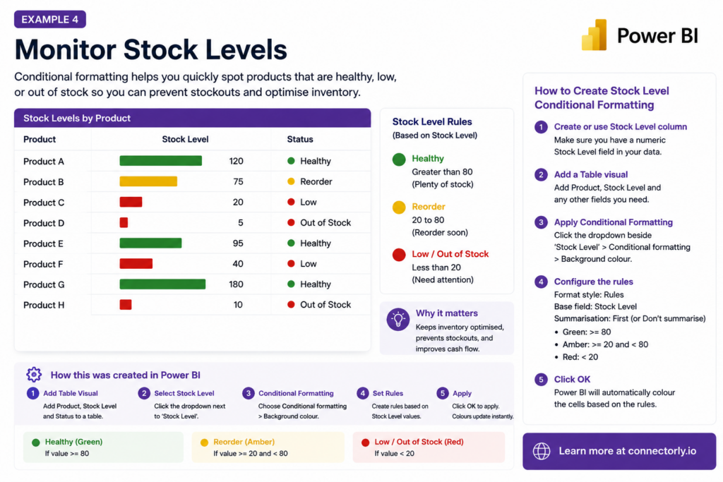
Inventory management is another practical use case for Power BI conditional formatting.
Businesses often need to monitor stock availability across products, warehouses, or locations. Instead of checking every product manually, conditional formatting can highlight items that are healthy, close to reorder level, or running low.
For example:
- Green = Healthy stock level
- Amber = Reorder soon
- Red = Low stock or out of stock
This helps operations, finance, and purchasing teams identify potential stock issues before they affect customers.
How to Create Stock Level Conditional Formatting in Power BI
This example uses a simple table with product names and stock quantities.
Step 1: Make Sure You Have a Numeric Stock Level Field
Your data should include a numeric column such as:
- Product
- Stock Level
- Warehouse
- Reorder Level
For a simple example, you can use Stock Level as the field for conditional formatting.
Step 2: Create a Table Visual
In Power BI Desktop:
- Go to Report View
- Insert a Table visual
- Add Product
- Add Stock Level
You should now have a simple product stock report.
Step 3: Add Data Bars to Stock Level
Data bars are useful for stock reporting because they show the size of each stock balance visually.
To add them:
- In the table visual, click the dropdown beside Stock Level
- Select Conditional Formatting
- Choose Data Bars
- Keep the minimum and maximum values based on your data
- Choose colours that fit your report design
- Click OK
Power BI will now display a bar inside the Stock Level column, making it easier to compare product quantities.
Step 4: Add Background Colour Rules
Next, add traffic-light formatting.
Click the dropdown beside Stock Level again, then select:
Conditional Formatting > Background Colour
Set:
- Format Style = Rules
- What field should we base this on? = Stock Level
- Summarisation = First, or Don’t summarise if available
Create rules like this:
If Value | And | Colour |
|---|---|---|
>= 80 | Highest value | Green |
>= 20 | < 80 | Amber |
>= 0 | < 20 | Red |
Make sure the rule values are set to Number, not Percent.
Step 5: Add a Stock Status Column
For clearer reporting, you can also create a calculated column that gives each product a readable status.
In Data View, select your stock table and click New Column.
Use this example DAX:
Stock Status =
SWITCH(
    TRUE(),
    'Stock'[Stock Level] >= 80, "Healthy",
    'Stock'[Stock Level] >= 20, "Reorder",
    "Low / Out of Stock"
)
You can then add Stock Status to the table visual.
Step 6: Add Icons to the Stock Status
To make the report easier to scan:
- Click the dropdown beside Stock Level
- Select Conditional Formatting
- Choose Icons
- Base the rules on Stock Level
Use rules such as:
If Value | Icon |
|---|---|
>= 80 | Green circle or tick |
>= 20 and < 80 | Yellow warning icon |
< 20 | Red warning icon |
This gives users a quick visual signal for each product.
Example Stock Level Report
Your finished report might look like this:
Product | Stock Level | Status |
|---|---|---|
Product A | 120 | Healthy |
Product B | 75 | Reorder |
Product C | 20 | Reorder |
Product D | 5 | Low / Out of Stock |
Product E | 95 | Healthy |
Using conditional formatting:
- Product A and Product E would appear green
- Product B and Product C would appear amber
- Product D would appear red
Why This Works
Stock reports are most useful when they highlight exceptions quickly.
Conditional formatting helps users identify:
- Products that may need reordering
- Products with critically low stock
- Healthy stock levels
- Items that need operational attention
This makes the report more useful for purchasing, stock control, and operations teams.
The exact thresholds should depend on the business. A product with 20 units in stock might be healthy for one company but critically low for another. The important point is to define clear thresholds and apply them consistently in Power BI.
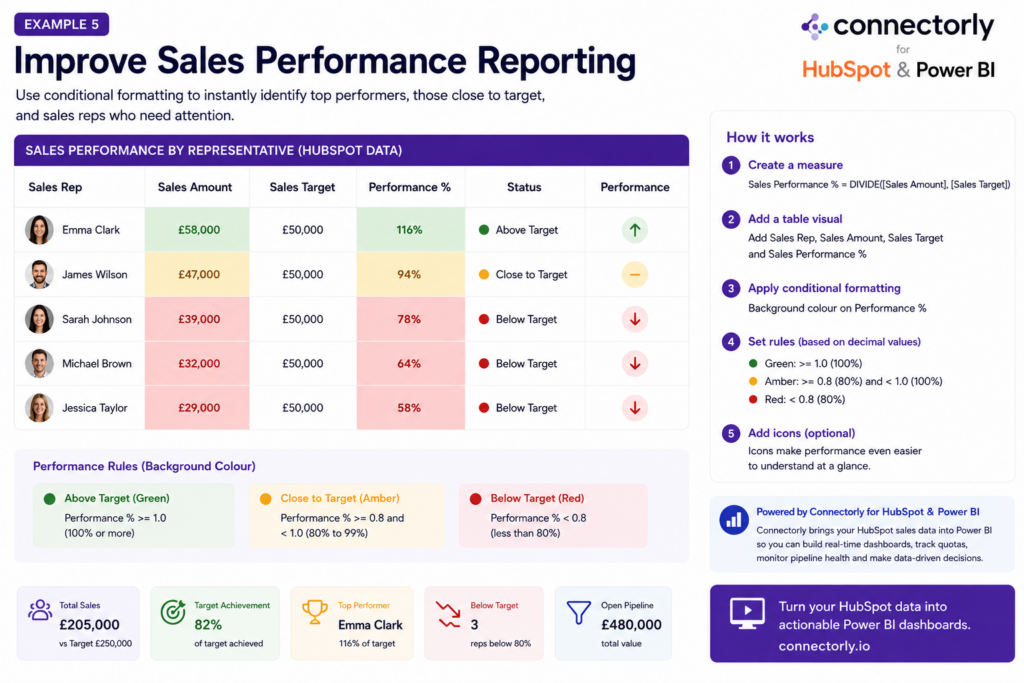
Example 5: Improve Sales Performance Reporting
Sales reports often contain large volumes of information.
Conditional formatting can help sales managers quickly identify top performers, underperforming sales representatives, and opportunities for improvement.
Examples include:
- Highlighting sales representatives above target
- Flagging underperforming regions
- Monitoring conversion rates
- Comparing actual sales against targets
Instead of reviewing dozens of numbers, managers can immediately see where attention is required.
You can easily push your HubSpot data into Power BI:
https://connectorly.io/blog/connect-hubspot-to-power-bi/
How to Create Sales Performance Conditional Formatting in Power BI
This example compares actual sales against sales targets.
Step 1: Make Sure You Have Sales and Target Data
Your data should contain:
- Salesperson
- Sales Amount
- Sales Target
For example:
Salesperson | Sales | Target |
|---|---|---|
Emma | £58,000 | £50,000 |
James | £47,000 | £50,000 |
Sarah | £39,000 | £50,000 |
Step 2: Create a Sales Performance Measure
Create a new measure:
Sales Performance % =
DIVIDE(
    [Sales Amount],
    [Sales Target]
)
Format the measure as a Percentage.
This measure shows how much of the target each salesperson has achieved.
Examples:
Sales | Target | Performance |
|---|---|---|
£58,000 | £50,000 | 116% |
£47,000 | £50,000 | 94% |
£39,000 | £50,000 | 78% |
Step 3: Create a Table Visual
In Report View:
- Insert a Table visual
- Add:
- Salesperson
- Sales Amount
- Sales Target
- Sales Performance %
You should now have a simple sales performance report.
Step 4: Apply Conditional Formatting
Select the Sales Performance % column.
Then:
- Click the dropdown beside Sales Performance %
- Select Conditional Formatting
- Choose Background Colour
Configure:
- Format Style = Rules
- Base Field = Sales Performance %
- Summarisation = First (or Don’t Summarise where available)
Step 5: Configure Performance Rules
Create the following rules:
If Value | And | Colour |
|---|---|---|
>= 1.0 | Highest Value | Green |
>= 0.8 | < 1.0 | Amber |
>= 0 | < 0.8 | Red |
Remember that Power BI stores percentages as decimal values:
- 100% = 1.0
- 80% = 0.8
- 50% = 0.5
This creates a simple traffic-light system:
- Green = Target achieved
- Amber = Close to target
- Red = Below target
Step 6: Add Icons
Many sales dashboards use icons because they are easy to understand.
Apply icon formatting using:
Conditional Formatting > Icons
Configure:
Performance | Icon |
|---|---|
>= 100% | Green Up Arrow |
80%-99% | Yellow Circle |
< 80% | Red Down Arrow |
This allows managers to identify performance levels instantly.
Step 7: Highlight Sales Amount (Optional)
You can also apply the same formatting to the Sales Amount column.
To do this:
- Select Sales Amount
- Choose Conditional Formatting
- Select Background Colour
- Base the formatting on Sales Performance %
This makes top-performing and underperforming sales representatives stand out immediately.
Example Sales Performance Dashboard
Your finished report might look like this:
Salesperson | Sales | Target | Performance |
|---|---|---|---|
Emma Clark | £58,000 | £50,000 | 116% |
James Wilson | £47,000 | £50,000 | 94% |
Sarah Johnson | £39,000 | £50,000 | 78% |
Michael Brown | £32,000 | £50,000 | 64% |
Jessica Taylor | £29,000 | £50,000 | 58% |
Using conditional formatting:
- Emma would appear green
- James would appear amber
- Sarah, Michael and Jessica would appear red
Why This Works
Sales managers need to identify performance trends quickly.
Conditional formatting automatically highlights:
- Representatives exceeding targets
- Individuals close to target
- Underperforming team members
- Areas requiring coaching or support
This turns a basic sales report into a practical management dashboard.
Example Using HubSpot Data
One of the most common uses of conditional formatting is sales reporting with HubSpot data.
Using Connectorly for HubSpot & Power BI, businesses can bring deal values, closed revenue, pipeline information, and sales targets into Power BI.
Managers can then use conditional formatting to:
- Track quota attainment
- Compare sales representatives
- Monitor pipeline health
- Identify underperforming territories
- Highlight top performers
This creates a much more actionable sales dashboard than simply displaying raw numbers.
Which Conditional Formatting Option Should You Use?
The best formatting option depends on the report.
Background colours work well for financial reporting and KPI tables.
Icons are often effective for executive dashboards where users need simple indicators.
Data bars are particularly useful when comparing large numbers of products, customers, or transactions.
In many cases, combining multiple formatting techniques creates the most effective user experience.
The goal should always be to improve clarity rather than add visual complexity.
How Connectorly Helps You Build Better Power BI Reports
Conditional formatting becomes even more powerful when it is applied to reliable business data.
Connectorly helps organisations connect Xero, HubSpot, and Microsoft 365 directly to Power BI, making it easier to build meaningful dashboards and reports.
Our solutions include:
Connectorly for Xero & Power BI
https://connectorly.io/xero-power-bi/
Build financial dashboards, invoice reporting, cash flow reports, and management accounts using Xero data.
Connectorly for HubSpot & Power BI
https://connectorly.io/hubspot-power-bi/
Create advanced sales, marketing, and customer reporting using HubSpot data.
We also provide free Power BI templates for Xero users:
Easy Power BI Templates for Xero
These templates help businesses get started quickly with practical dashboard examples and reporting layouts.
You can find more tips like
- How To Build A Cash Flow Dashboard In Power BI: https://connectorly.io/blog/cash-flow-dashboard-power-bi/
Final Thoughts
Conditional formatting is one of the simplest ways to make Power BI reports more effective.
Whether you’re tracking revenue growth, overdue invoices, budget variances, stock levels, or sales performance, conditional formatting helps users identify important information faster.
The most successful reports are not necessarily the most complex. They are the reports that communicate information clearly and help users take action.
By combining conditional formatting with reliable data from Xero, HubSpot, or Microsoft 365, businesses can build reports that are both easier to understand and more useful for decision-making.
Recommended Reading
Connect Xero to Power BI in Minutes
How To Connect Xero to Power BI Desktop and Start Reporting in Minutes
Split and Merge Fields in Power BI
How to Split and Merge Fields in Power BI
Top 10 Power BI Keyboard Shortcuts That Save Hours
Top 10 Power BI Keyboard Shortcuts That Save Hours
Xero Dashboards in Power BI
How to Build Dashboards from Xero in Power BI
Frequently Asked Questions
What is conditional formatting in Power BI?
Conditional formatting allows Power BI to automatically apply colours, icons, data bars, and visual indicators based on underlying data values.
Why should I use conditional formatting in Power BI?
Conditional formatting helps users identify trends, exceptions, risks, and opportunities more quickly without manually reviewing large datasets.
Can Power BI highlight overdue invoices from Xero?
Yes. When Xero data is connected to Power BI, conditional formatting can highlight invoices based on age and payment status.
What are the best uses of conditional formatting in Power BI?
Common uses include revenue growth reporting, budget variance analysis, sales performance monitoring, stock level tracking, and accounts receivable reporting.
Does Connectorly work with Power BI and Xero?
Yes. Connectorly helps businesses connect Xero, Xero Projects, HubSpot, Datto RMM and Microsoft 365 data directly into Power BI for advanced reporting and dashboard creation.