Why businesses build Xero dashboards in Power BI
We regularly hear from finance teams, operations managers, and Power BI developers who want better visibility into their Xero data. The question is usually straightforward: “How do we build proper dashboards from Xero without relying on spreadsheets?”
Xero includes standard financial reports, but many businesses eventually need more flexibility. They want to compare revenue trends across periods, track cash flow visually, monitor outstanding invoices, or combine financial data with operational systems.
This is where Power BI becomes valuable.
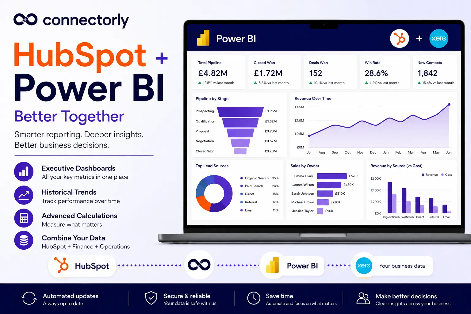
Power BI allows businesses to create interactive dashboards from Xero data using charts, tables, filters, and custom calculations. Combined with Connectorly for Xero & Power BI teams can build structured reporting environments without manually exporting data every week.
This guide explains how to set up Xero dashboards in Power BI, what data structures matter, and how Connectorly templates help speed up the process.
If you want to explore the wider reporting landscape before building your dashboard, our complete guide to Xero reporting in Power BI covers native Xero reports, connection options, data modelling, financial dashboards and multi-organisation reporting.
Why use Power BI instead of Xero’s built-in reports?
Xero’s built-in reporting works well for standard accounting reports such as:
- Profit and loss
- Balance sheet
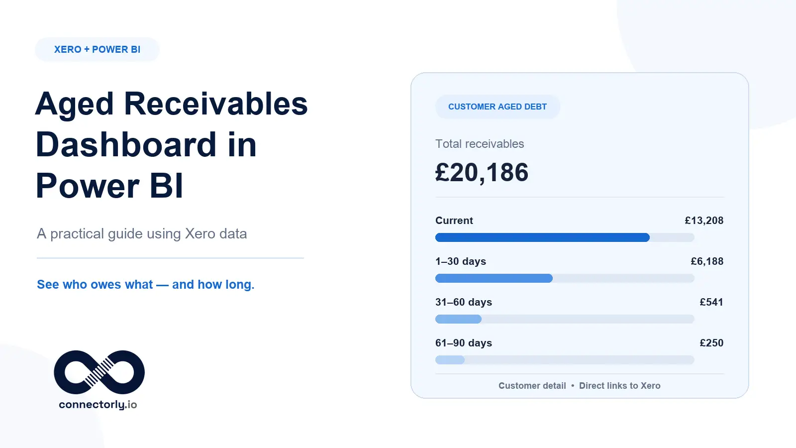
- Aged receivables
- Cash summary
However, these reports are limited when businesses need:
- Interactive dashboards
- Consolidated reporting
- Cross-system analysis
- Custom calculations
- Advanced filtering and drill-down
Power BI provides far more flexibility for visualising and modelling data.
For example, Power BI dashboards can include:
- Revenue trends by month
- Outstanding invoices by customer
- Cash flow movement over time
- Expense analysis by category
- Multi-entity comparisons
Users can also filter reports dynamically by:
- Date range
- Organisation
- Tracking category
- Customer or supplier
This creates a far more interactive reporting experience than static exports or spreadsheets.
Learn more about Xero Analytics (Powered by Syft) and Connectorly
How do you connect Xero to Power BI?
The first step is getting Xero data into Power BI in a structured and reliable way.
Connectorly for Xero & Power BI handles this process by extracting Xero data and preparing it for reporting.
Useful setup resources include:
- Connect Xero to Power BI in minutes
- What is Connectorly for Xero and Power BI
- Setup Connectorly for Xero and Microsoft Power BI
Instead of building direct API connections manually, Connectorly structures the data before it reaches Power BI. This reduces the need to manage:
- API pagination
- Authentication handling
- Complex Power Query transformations
It also improves refresh reliability because Power BI connects to prepared datasets instead of raw API endpoints.
What Xero data can be used in Power BI dashboards?
Once connected, Power BI can use a wide range of Xero data, including:
- Invoices
- Bills
- Payments
- Bank transactions
- Contacts
- Accounts
- Tracking categories
- Journals
These tables can be linked together in the Power BI model view to support dashboard reporting.
For example:
- Invoice tables can connect to contacts
- Payments can connect to invoices
- Accounts can connect to journal lines
This allows businesses to create visuals that reflect real financial activity across the organisation.
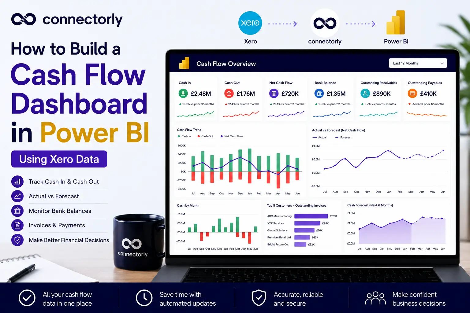
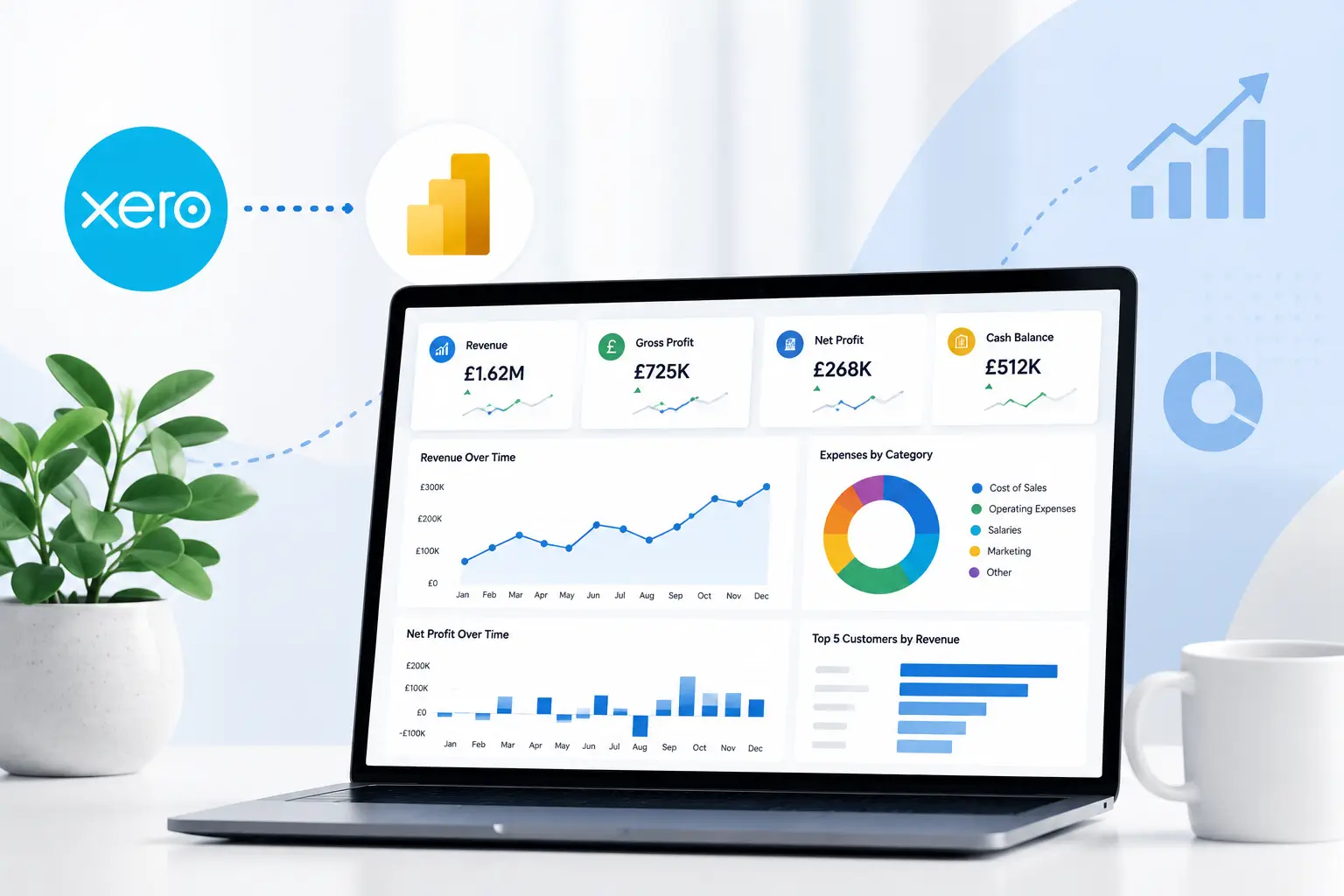
What are the most useful Xero dashboards to build?
The most common Xero dashboards focus on financial visibility and operational performance.
Examples include:
- Revenue dashboards showing monthly trends
- Cash flow dashboards tracking inflows and outflows
- Accounts receivable dashboards showing overdue invoices
- Expense dashboards grouped by category or department
- Profitability dashboards by tracking category
Power BI visuals such as line charts, matrix tables, KPIs, and decomposition trees are commonly used for these reports.
Because the dashboards are interactive, users can drill into details directly from summary visuals.
For example, clicking a revenue bar chart can filter the entire dashboard to show only invoices from a specific month or organisation.
How do Connectorly templates help?
One of the fastest ways to build Xero dashboards is by starting with pre-built templates.
Connectorly provides free Xero Power BI templates.
These templates already include:
- Pre-built report pages
- Relationships between tables
- Common DAX measures
- Standard financial visuals
- Structured data models
This means businesses do not need to start from a blank Power BI file.
For example, the templates may already include measures for:
- Total revenue
- Gross profit
- Outstanding invoices
- Cash balance
- Year-on-year comparisons
The templates also include structured tables such as Connectorly Views, which support grouped reporting structures for accounts and tracking categories.
This significantly reduces report development time.
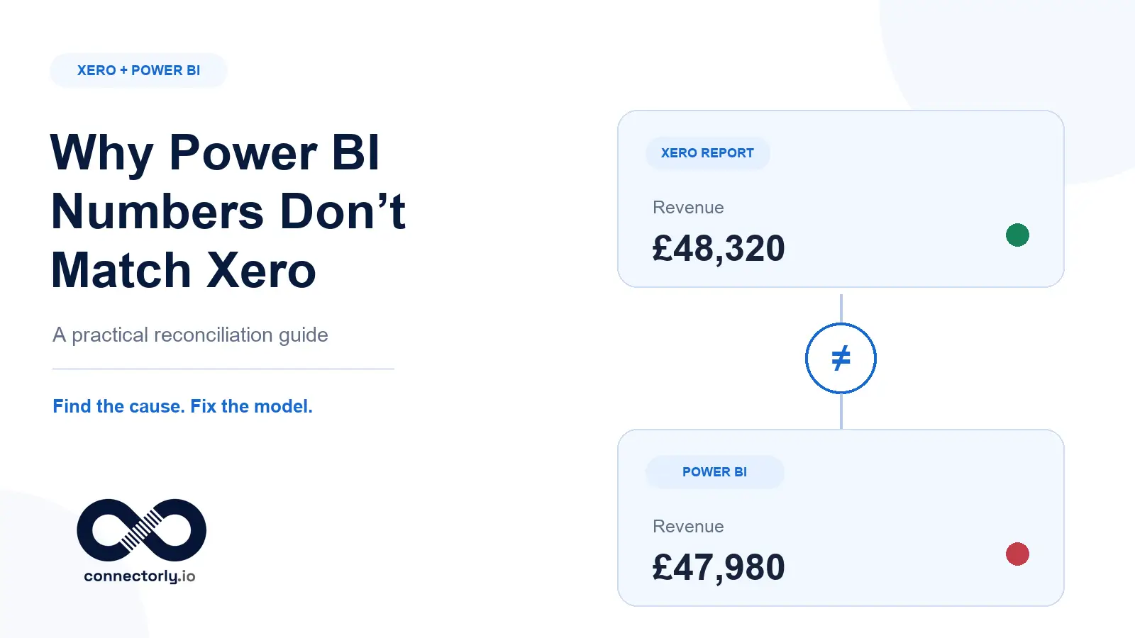
Why data modelling matters for Xero dashboards
Good dashboards depend on good data models.
A common mistake is importing Xero tables into Power BI without defining clear relationships between them. This often leads to duplicated values or incorrect totals.
Connectorly templates help avoid this problem because relationships are already configured.
Typical relationships include:
- Contacts linked to invoices
- Accounts linked to journal lines
- Tracking categories linked to transactional data
This structure allows Power BI to filter and aggregate data correctly across visuals.
It also makes measures easier to maintain over time.
Can Xero dashboards also include CRM or operational data?
Yes.
Many businesses eventually want to combine financial data with CRM or operational systems.
Connectorly supports additional integrations such as:
This allows businesses to create dashboards comparing:
- Pipeline vs invoiced revenue
- Sales activity vs financial performance
- Revenue by customer or business unit
within one Power BI environment.
Why businesses move away from spreadsheet reporting
Before Power BI, many businesses relied on exported spreadsheets for financial reporting.
This usually involved:
- Exporting CSV files from Xero
- Rebuilding pivot tables manually
- Updating formulas after each refresh
As reporting requirements grow, this approach becomes difficult to maintain consistently.
Power BI dashboards reduce this manual work by:
- Automating refreshes
- Centralising calculations
- Providing one reporting environment
This improves reporting consistency across finance and leadership teams.
Recommended further reading
To explore related topics further, consider reading:
- Connect Xero to Power BI in Minutes
- Grouped Xero Organisations in Power BI
- Creating Views in Power BI Desktop for Xero & Power BI
- Why Excel Is Killing Your Reporting
Final thoughts
Building dashboards from Xero in Power BI is not just about visualisation. It is about creating a reliable reporting structure that supports accurate analysis over time.
The key steps are:
- Connecting Xero data properly
- Using a structured data model
- Defining relationships correctly
- Reusing templates where possible
Connectorly simplifies much of this process by preparing the data before it reaches Power BI and providing free templates that already include useful measures and relationships.
For businesses looking to move beyond static accounting reports and spreadsheets, this creates a much more scalable reporting setup.