Cash flow is one of the most closely monitored financial metrics in any business.
While profit and loss reports show whether a business is profitable, cash flow tells you whether there is enough money available to pay suppliers, employees, taxes, and other day-to-day expenses.
One of the questions we regularly receive from customers is:
“Can I build a proper cash flow dashboard in Power BI using my Xero data?”
The answer is yes.
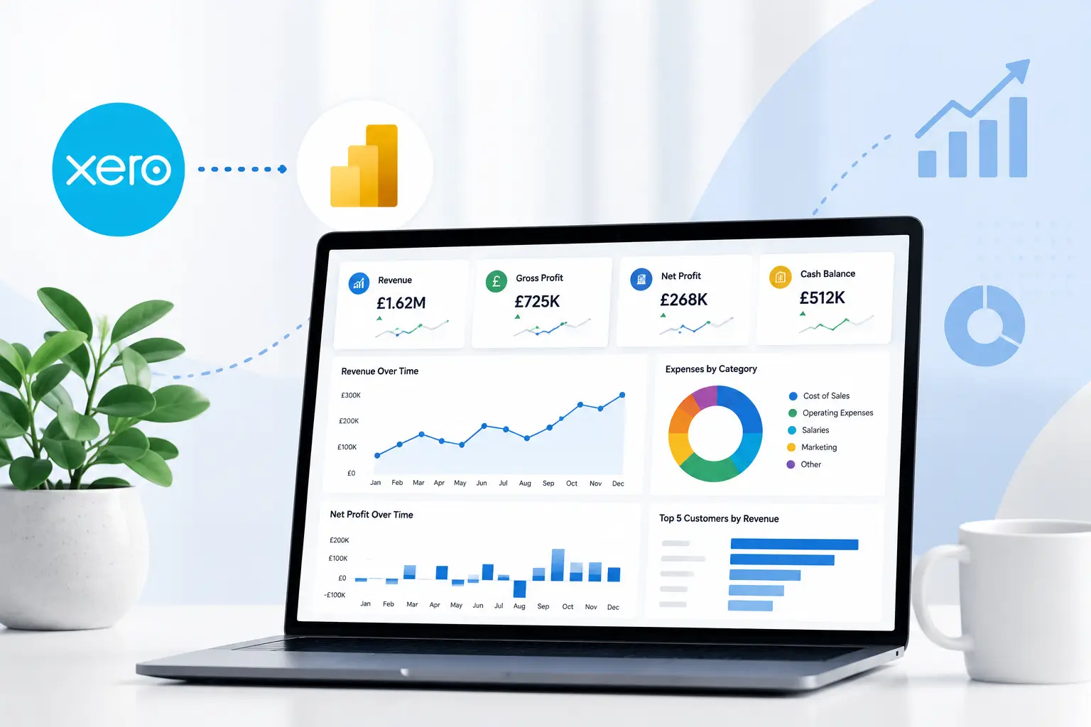
Power BI allows you to combine data from Xero into interactive dashboards that make it much easier to monitor cash coming in, cash going out, outstanding invoices, and overall cash position.
In this guide, we’ll show you what data you need, the key visuals to include, and how to build a practical cash flow dashboard that provides a clear picture of your business finances.
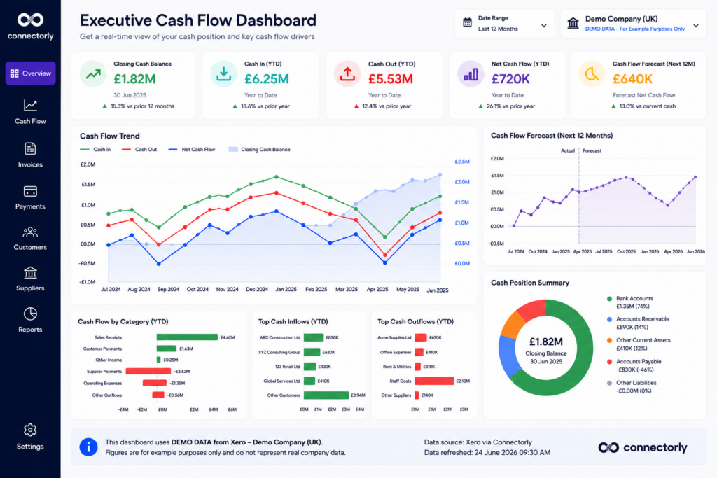
What Is a Cash Flow Dashboard?
A cash flow dashboard is a visual report that summarises how money moves through a business.
Rather than reviewing multiple accounting reports, it presents the most important cash flow information in a single dashboard.
A typical cash flow dashboard includes:
- Cash received
- Cash paid
- Net cash flow
- Current bank balance
- Outstanding customer invoices
- Outstanding supplier bills
- Cash flow trends
- Forecast cash position
Unlike static reports, Power BI dashboards are interactive. Users can filter by date, company, department, tracking category, or any other available dimension.
For finance teams and business owners, this makes it much easier to identify trends before they become problems.
Why Isn’t the Standard Xero Cash Flow Report Always Enough?
Xero includes several useful cash flow and financial reports.
For many businesses, these provide an excellent starting point.
However, as reporting requirements grow, organisations often need additional flexibility.
Common requests include:
- Comparing actual cash flow with forecasts
- Combining multiple Xero organisations
- Viewing historical trends over several years
- Combining accounting data with operational information
- Building executive dashboards
- Monitoring KPIs on one screen
Power BI complements Xero by allowing businesses to create reports tailored to their own requirements rather than relying solely on standard accounting reports.
What Data Do You Need?
A useful cash flow dashboard starts with accurate data.
If you’re using Xero, most of the information already exists within your accounting records.
Typical data includes:
- Bank transactions
- Accounts receivable
- Accounts payable
- Invoices
- Credit notes
- Payments
- Contacts
- Tracking categories
- Reporting periods
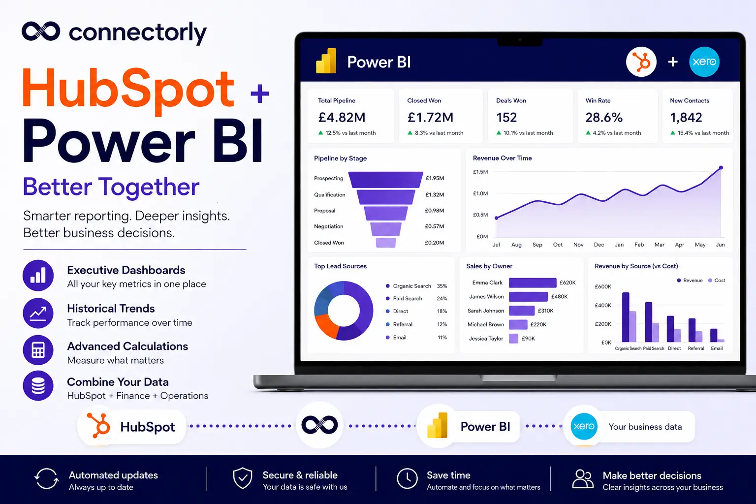
Using Connectorly for Xero & Power BI, this information can be brought directly into Microsoft Power BI without relying on manual CSV exports.
You can learn more here:
Xero and Power BI Connector
If you’re new to Connectorly, our setup guide explains the process step by step:
https://help.connectorly.io/en/articles/8092459-setup-connectorly-for-xero-and-microsoft-power-bi
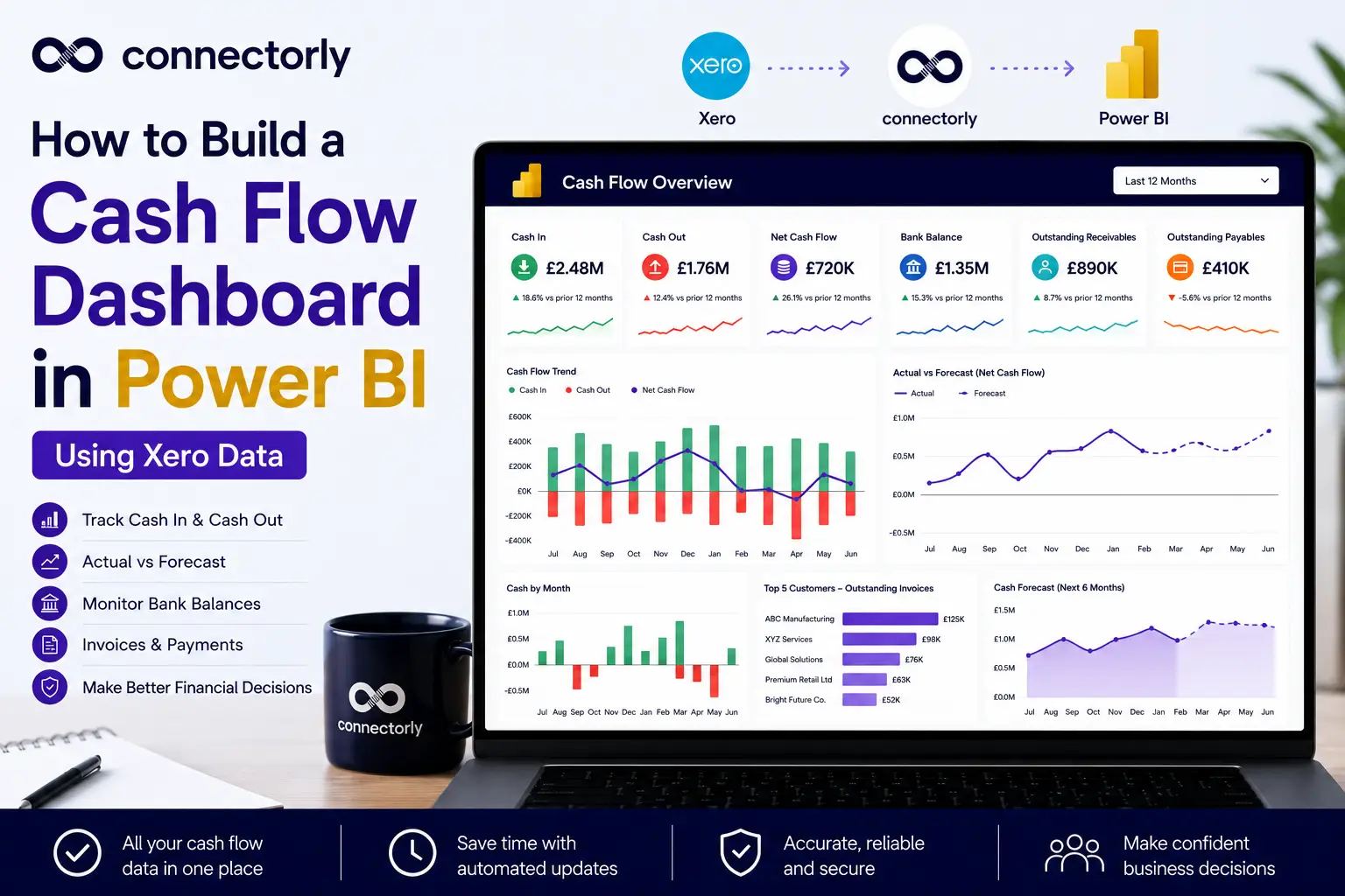
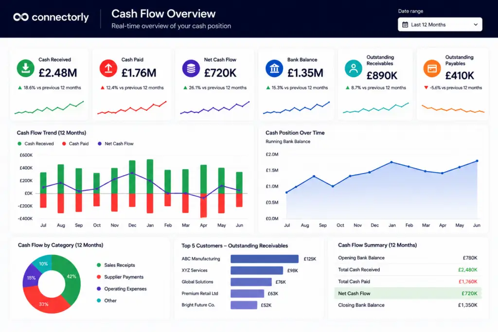
Build the Core Cash Flow KPIs
A good dashboard starts with a small number of key metrics.
We recommend placing KPI cards across the top of the report.
Typical KPIs include:
- Cash Received
- Cash Paid
- Net Cash Flow
- Bank Balance
- Outstanding Receivables
- Outstanding Payables
These six numbers immediately tell management whether the business is generating positive cash flow.
How to Create KPI Cards in Power BI
Once you’ve created your key measures, the easiest way to display them is using KPI cards.
Power BI’s Card visual is ideal for highlighting important financial metrics such as cash received, cash paid, current bank balance, and net cash flow.
Step 1: Create Your Measures
For this example, we’ll assume you’ve already created measures for:
- Total Cash In
- Total Cash Out
- Net Cash Flow
You can also create measures for:
- Current Bank Balance
- Outstanding Receivables
- Outstanding Payables
Step 2: Insert a Card Visual
In Power BI Desktop:
- Open Report View.
- Select the Card visual from the Visualisations pane.
- Drag one of your measures, such as Total Cash In, onto the card.
Power BI will automatically display the total value for the selected reporting period.
Step 3: Format the Card
To improve readability:
- Add a descriptive title, such as Cash Received
- Format the value as Currency
- Increase the callout value size
- Use a consistent colour palette across all KPI cards
- Add rounded corners and subtle shadows if your report theme supports them
Step 4: Duplicate the Card
Rather than creating each card from scratch:
- Select the existing card
- Press Ctrl + C
- Press Ctrl + V
Replace the measure with:
- Total Cash Out
- Net Cash Flow
- Bank Balance
- Outstanding Receivables
- Outstanding Payables
This keeps formatting consistent across the dashboard.
Step 5: Arrange KPI Cards
Place the KPI cards in a single row across the top of the report.
This allows users to understand the overall financial position before exploring more detailed visuals.
How to Calculate Cash Received and Cash Paid in Power BI
The first step in building a cash flow dashboard is calculating how much money has entered and left the business.
If you’re using Connectorly for Xero & Power BI, this information is available in the xero bank_transactions table.
Step 1: Create the Cash Received Measure
Select Modeling > New Measure and create the following measure:
					Total Cash In =
CALCULATE(
    SUM('xero bank_transactions'[Amount (RC)]),
    'xero bank_transactions'[Source Type] IN {
        "CASHREC",
        "ACCRECPAYMENT",
        "ACCRECCREDITPAYMENT"
    }
)
This returns the total amount of cash received based on common Xero bank transaction types.
Step 2: Create the Cash Paid Measure
Create another measure:
					Total Cash Out =
CALCULATE(
    SUM('xero bank_transactions'[Amount (RC)]),
    'xero bank_transactions'[Source Type] IN {
        "CASHPAID",
        "ACCPAYPAYMENT",
        "APCREDITPAYMENT"
    }
)
Depending on your reporting requirements, you may choose to include or exclude certain transaction types. It’s always worth reviewing the available Source Type values in your own Xero data before finalising the measures.
Step 3: Display the Measures
Insert two Card visuals and add:
- Total Cash In
- Total Cash Out
These become the first two KPIs in your cash flow dashboard.
Step 4: Format the Values
Format both measures as Currency and apply consistent colours throughout the dashboard. For example:
- Green for Cash Received
- Red for Cash Paid
This makes the dashboard easier to scan at a glance.
Calculate Net Cash Flow
Once cash in and cash out have been calculated, the next step is to calculate net cash flow.
Example – Net Cash Flow
					Net Cash Flow =
[Total Cash In] - [Total Cash Out]
Displaying this value as a KPI immediately shows whether cash is increasing or decreasing during the selected reporting period.
Add a Running Cash Balance
Many finance teams also like to display a running cash balance.
Instead of showing individual transactions, this visual demonstrates how the business cash position changes over time.
A line chart works particularly well for this purpose.
Power BI allows users to drill into specific months, quarters, or years while maintaining a clear overview of long-term performance.
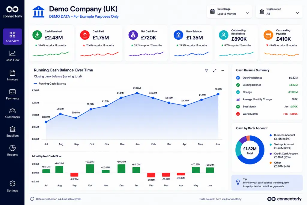
How to Create a Running Cash Balance Chart in Power BI
A running cash balance shows how your available cash changes over time.
This is one of the most useful visuals in a cash flow dashboard because it highlights long-term trends rather than individual transactions.
Step 1: Create a Running Balance Measure
Assuming you’ve already created your Net Cash Flow measure, create a new measure:
					Running Cash Balance =
CALCULATE(
    [Net Cash Flow],
    FILTER(
        ALL('Calendar'[Date]),
        'Calendar'[Date] <= MAX('Calendar'[Date])
    )
)
This creates a cumulative running balance over time.
Step 2: Insert a Line Chart
Add a Line Chart visual.
Configure:
- X-Axis: Date
- Y-Axis: Running Cash Balance
Power BI will automatically plot the cumulative cash balance.
Step 3: Improve the Visual
To make the chart easier to interpret:
- Enable data labels
- Use a blue line
- Turn on markers
- Add a light area fill beneath the line
You can also highlight the highest and lowest cash balances using annotations or callouts.
This makes it much easier to identify seasonal cash flow patterns.
Compare Actual Cash Flow Against Forecasts
Forecasting is one of the biggest advantages of moving cash flow reporting into Power BI.
Many organisations maintain forecasts in Excel while recording actual transactions in Xero.
Power BI makes it possible to compare both datasets within a single report.
For example:
- Actual Cash Received
- Forecast Cash Received
- Actual Payments
- Forecast Payments
Displaying both as line charts allows management to identify where actual performance differs from expectations.
This makes forecasting meetings much more productive.
How to Build an Actual vs Forecast Cash Flow Report
One of the biggest advantages of Power BI is the ability to compare actual financial results with forecast data.
Many businesses maintain forecasts in Excel while actual transactions come from Xero.
Step 1: Import Your Forecast
Import your forecast spreadsheet into Power BI.
A simple table might contain:
- Date
- Forecast Cash In
- Forecast Cash Out
Relate this table to your Calendar table using the Date field.
Step 2: Create Forecast Measures
Create measures for:
- Forecast Cash In
- Forecast Cash Out
- Forecast Net Cash Flow
These can be simple SUM measures if your forecast table already contains monthly values.
Step 3: Create a Line Chart
Insert a Line Chart.
Configure:
- X-Axis = Month
- Line 1 = Actual Net Cash Flow
- Line 2 = Forecast Net Cash Flow
Using two lines makes it easy to compare expected performance with actual results.
Step 4: Add Variance
Create another measure:
					Cash Flow Variance =
[Net Cash Flow] - [Forecast Net Cash Flow]
Display this as a KPI card or column chart.
Positive variances indicate actual performance exceeded expectations, while negative variances highlight periods where cash flow was below forecast.
Step 5: Add Slicers
Add slicers for:
- Organisation
- Date
- Tracking Category
This allows users to compare forecasts across different business units or reporting periods.
A well-designed Actual vs Forecast report helps finance teams identify trends early and adjust budgets or spending plans before small issues become larger cash flow problems.
Highlight Cash Flow Risks
Not every dashboard should focus only on summary figures.
It is equally important to highlight potential risks.
Useful visuals include:
- Overdue customer invoices
- Outstanding supplier bills
- Customers with the highest outstanding balances
- Monthly payment trends
- Cash flow exceptions
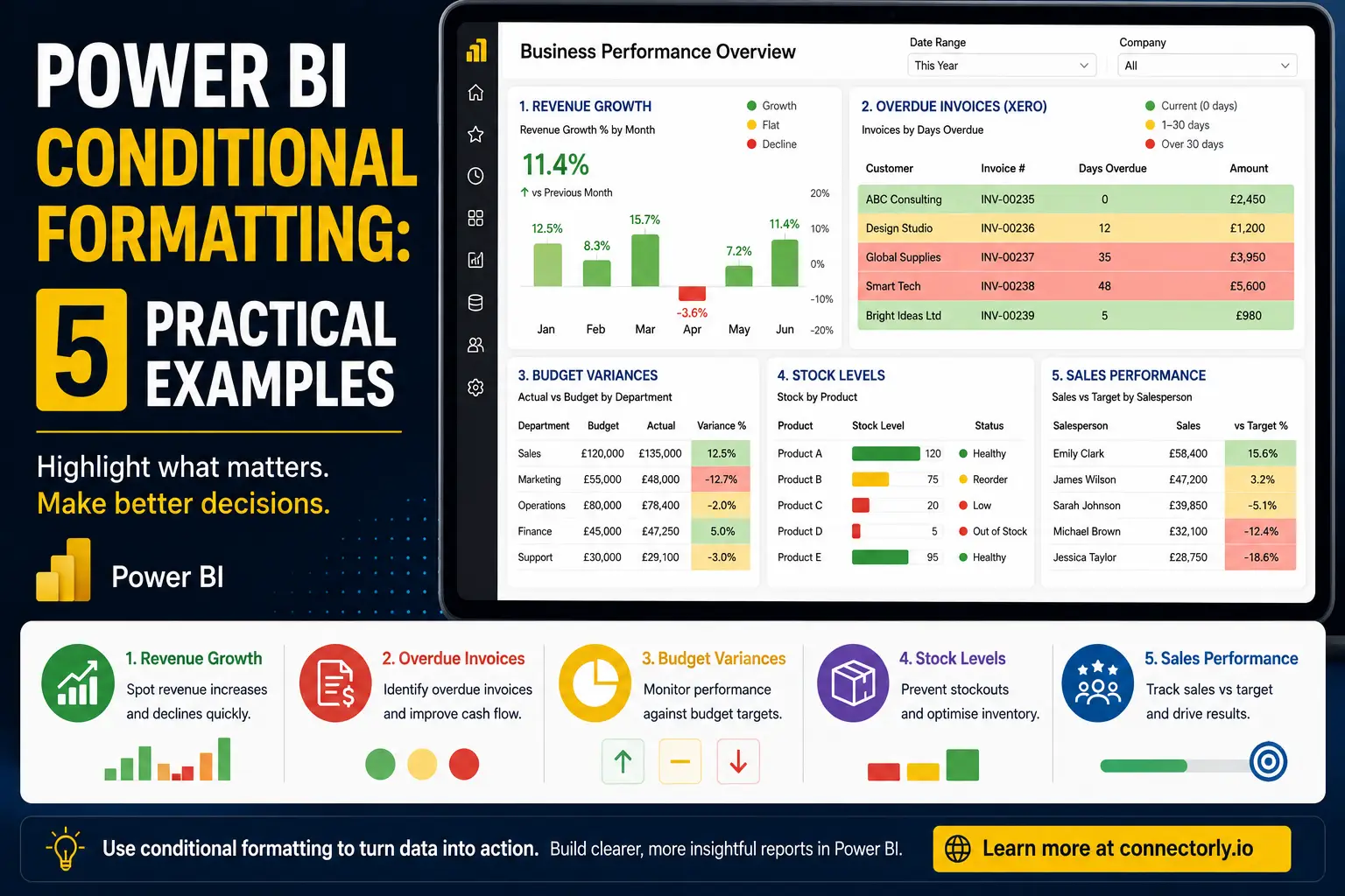
Conditional formatting can help draw attention to overdue balances or unusual cash movements.
For example, invoices overdue by more than 30 days could automatically appear in red.
Build an Executive Dashboard
Senior managers usually want answers rather than detailed transaction lists.
An executive dashboard should provide a concise overview of business performance.
Typical visuals include:
- Current bank balance
- Net cash flow
- Cash received this month
- Cash paid this month
- Outstanding receivables
- Outstanding payables
- Monthly cash flow trend
- Cash forecast
- Largest outstanding customers
Keeping everything on a single page allows executives to understand business performance in seconds.
Use Tracking Categories for Better Cash Flow Analysis
If your business uses Xero Tracking Categories, these can also be included in your dashboard.
For example, you might analyse cash flow by:
- Department
- Business unit
- Office location
- Project
- Cost centre
This allows managers to identify which parts of the business generate positive cash flow and which require attention.
If you’re new to Tracking Categories, you may also find our guide useful:
How to Create Custom Tracking Categories in Xero (And Actually Use Them)
Getting Started Is Easier Than You Might Think
One of the biggest concerns businesses have is the time required to build reports.
Fortunately, you don’t have to start from a blank page.
Connectorly provides free Power BI templates that include professionally designed financial reports which can be customised to suit your business.
You can download them here:
Easy Power BI Templates for Xero
Many organisations begin with one of these templates and gradually adapt it as reporting requirements grow.
If you’re new to Power BI, Connectorly also provides onboarding and setup guidance to help you get started more quickly.
Why Use Connectorly for Xero & Power BI?
Connectorly makes it simple to connect Xero with Microsoft Power BI.
Instead of manually exporting CSV files every month, your reporting data is available for dashboard creation and analysis.
Connectorly supports reporting across multiple organisations and provides access to a structured data model that is designed specifically for reporting.
To learn more, visit:
Xero and Power BI Connector
Or read:
Connect Xero to Power BI in Minutes
How To Connect Xero to Power BI Desktop and Start Reporting in Minutes
Final Thoughts
A well-designed cash flow dashboard gives finance teams, business owners, and executives a much clearer understanding of business performance.
Rather than relying on multiple reports, Power BI can bring together bank transactions, invoices, payments, forecasts, and cash flow KPIs into a single interactive dashboard.
Combined with Xero data, this provides a practical way to monitor liquidity, identify potential risks, and support better financial decision-making.
Whether you’re building your first Power BI report or expanding an existing reporting solution, starting with a cash flow dashboard is one of the most valuable investments you can make.
Recommended Reading
- Connectorly for Xero & Power BI
https://connectorly.io/integrations/xero-power-bi/ - Connect Xero to Power BI in Minutes
https://connectorly.io/blog/connect-xero-to-power-bi-in-minutes/ - What is Connectorly for Xero & Power BI?
https://help.connectorly.io/en/articles/8517292-what-is-connectorly-for-xero-and-power-bi - Setup Connectorly for Xero & Microsoft Power BI
https://help.connectorly.io/en/articles/8092459-setup-connectorly-for-xero-and-microsoft-power-bi - Free Xero Power BI Templates
https://connectorly.io/data-templates/xero-templates-power-bi/ - How to Create Custom Tracking Categories in Xero
https://connectorly.io/blog/how-to-create-custom-tracking-categories-in-xero/ - Power BI Conditional Formatting: 5 Practical Examples
https://connectorly.io/blog/power-bi-conditional-formatting-examples/
Frequently Asked Questions
What should a cash flow dashboard include?
A cash flow dashboard should include key metrics such as cash received, cash paid, net cash flow, current bank balance, outstanding receivables, outstanding payables, and historical cash flow trends. Many businesses also include cash flow forecasts and executive KPIs.
Can I build a cash flow dashboard in Power BI using Xero?
Yes. Xero data can be brought into Microsoft Power BI using Connectorly for Xero & Power BI, allowing you to build interactive dashboards, create custom measures, and combine financial data with information from other business systems.
What is the difference between profit and cash flow?
Profit measures whether your business earns more than it spends over a period, while cash flow measures the movement of money into and out of the business. A profitable business can still experience cash flow challenges if customer payments are delayed.
Can Power BI forecast cash flow?
Yes. Power BI can compare actual cash flow with forecast values stored in Excel, SQL Server, or other data sources. This allows businesses to monitor forecast accuracy and identify potential cash shortages before they occur.
Which Power BI visuals work best for cash flow reporting?
Common visuals include KPI cards, line charts, column charts, waterfall charts, tables with conditional formatting, and executive summary dashboards. Combining these visuals helps users understand both current performance and long-term trends.
Do I need advanced Power BI skills to build a cash flow dashboard?
No. You can begin with a template and gradually customise it. Connectorly also provides free Power BI templates, setup guides, and onboarding support to help new users get started quickly.
How often should a cash flow dashboard be refreshed?
This depends on your reporting requirements. Many businesses refresh their dashboards daily, while others update them several times a day to provide finance teams with near real-time visibility of cash movements.
Can I report across multiple Xero organisations?
Yes. Connectorly for Xero & Power BI supports reporting across multiple Xero organisations, allowing businesses to consolidate financial information into a single Power BI dashboard.