Estimated reading time: 35–40 minutes
Whether you’re completely new to Power BI or looking to build a stronger foundation, this guide will take you from installing Power BI Desktop to creating professional dashboards, writing DAX measures, and publishing reports. By the end, you’ll understand the core concepts used in real-world business reporting.
Microsoft Power BI has become one of the most popular business intelligence tools in the world.
Organisations of every size use it to turn raw data into interactive reports and dashboards that help people make better business decisions. Whether you’re analysing sales, monitoring financial performance, tracking marketing campaigns, or reporting on operational KPIs, Power BI provides a flexible way to bring data together and present it in a meaningful way.
One of the questions we hear most often at Connectorly is:
“Where do I actually start with Power BI?”
There are thousands of tutorials available online, but many assume you already understand concepts such as data modelling, DAX, relationships, or Power Query. For someone opening Power BI for the first time, that can quickly become overwhelming.
This guide is different.
We’ll start with the basics and gradually build your understanding of Power BI step by step. By the end, you’ll understand how Power BI works, how to build reports, and how to connect business systems such as Xero and HubSpot to create professional dashboards.
Whether you’re an accountant, finance manager, Power BI developer, business owner, or someone simply curious about business intelligence, this guide is designed to help you build a solid foundation.
In This Guide
📥 Download the Tutorial Files
Follow along using the exact files from this guide.
- Excel Sample Data
- Completed PBIX
- Free
- Beginner Friendly
What Is Microsoft Power BI?
Power BI is Microsoft’s business intelligence and data visualisation platform.
Its purpose is simple: help people understand data.
Instead of reading hundreds or thousands of rows in spreadsheets, Power BI transforms that information into charts, dashboards, maps, KPIs, and interactive reports that are much easier to explore and understand.
Unlike traditional reports, Power BI allows users to interact with the data.
For example, instead of creating separate reports for every department or sales region, users can apply filters, click on charts, drill into details, and explore information from different perspectives without creating additional reports.
Power BI can connect to hundreds of different data sources, including:
- Microsoft Excel
- CSV files
- SQL Server
- SharePoint
- Azure
- Xero
- HubSpot
- Microsoft Dynamics 365
- PostgreSQL
- MySQL
- Salesforce
- Google Analytics
- Many other cloud and on-premises systems
This flexibility is one of the main reasons businesses choose Power BI for reporting.

Why Businesses Choose Power BI
Most organisations already have data.
The challenge is turning that data into useful information.
Many businesses still rely on spreadsheets that are manually updated every week or month. Others export reports from accounting systems, CRMs, payroll software, or ERP systems before combining everything in Excel.
This approach often creates several problems:
- Reports take a long time to produce.
- Different departments work with different versions of the same data.
- Historical reporting becomes difficult.
- Manual processes increase the risk of errors.
- Decision-makers don’t always have access to up-to-date information.
Power BI addresses these challenges by connecting directly to business data and presenting it in interactive dashboards.
Instead of spending time preparing reports, teams can spend more time analysing the information.
This is particularly useful for organisations that rely on multiple systems.
For example, a finance team may use Xero for accounting, HubSpot for customer relationship management, Microsoft Dynamics 365 for operations, and Excel for budgeting.
Power BI makes it possible to bring all of this information together into one reporting environment.
This gives managers a more complete view of business performance.
Who Should Learn Power BI?
One of the biggest misconceptions about Power BI is that it’s only for developers or data analysts.
In reality, Power BI is used by people across almost every department.
Finance teams use it to build Profit and Loss reports, cash flow dashboards, and budget analysis.
Sales managers use it to monitor pipelines, opportunities, and team performance.
Marketing teams analyse campaign performance and lead generation.
Business owners use executive dashboards to understand how the organisation is performing.
Even operational teams use Power BI to monitor projects, stock levels, customer service, and productivity.
If your job involves making decisions based on data, learning Power BI is likely to be valuable.
What Can You Build with Power BI?
Power BI can be used to create almost any type of business report.
Some of the most common examples include:
- Executive dashboards
- Sales dashboards
- Financial reports
- Profit and Loss statements
- Cash flow dashboards
- Accounts Receivable reports
- Accounts Payable reports
- Marketing dashboards
- Customer service dashboards
- Project reporting
- Operational KPIs
- Inventory reports
- Forecasting dashboards
Throughout this guide, we’ll build many of these concepts step by step.
You’ll also find links to more detailed tutorials where you can explore each topic in greater depth.
How Businesses Use Connectorly with Power BI
Many businesses already store valuable information in systems such as Xero, HubSpot, and Microsoft Dynamics 365.
One challenge is bringing that data into Power BI in a reliable and repeatable way.
Connectorly provides integrations that help businesses access reporting data from these systems and use it within Microsoft Power BI.
For example:
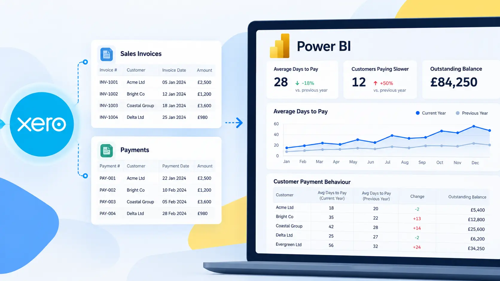
- Connectorly for Xero & Power BI helps businesses build financial dashboards, cash flow reports, management accounts, and consolidated reporting.
- Connectorly for HubSpot & Power BI allows sales and marketing teams to analyse CRM performance, pipelines, deal activity, and customer trends.
Throughout this guide, we’ll refer to practical examples using these integrations where they help explain a concept. However, the principles you’ll learn apply regardless of where your data comes from.
What You’ll Learn in This Guide
By the end of this guide, you’ll understand:
- How to install Power BI Desktop
- How to import your first dataset
- How Power Query works
- How tables and relationships work
- When to use measures instead of calculated columns
- Basic DAX calculations
- How to build professional reports
- How dashboards differ from reports
- How to publish reports to the Power BI Service
- Best practices for creating reports that are easy to maintain and perform well
We’ll also link to more detailed tutorials covering topics such as conditional formatting, dashboard design, cash flow reporting, keyboard shortcuts, and connecting Xero and HubSpot to Power BI.
So, let’s begin by installing Power BI Desktop and taking a look around the interface.
Installing Microsoft Power BI Desktop
Now that you understand what Power BI is and why businesses use it, it’s time to install the software and become familiar with the interface.
The good news is that getting started with Power BI Desktop is free.
Microsoft provides a free version that includes everything you need to build reports, create dashboards, learn Power Query, and write DAX calculations. Many professionals use the free Desktop application every day to develop reports before publishing them to the Power BI Service.
For this guide, we’ll use Power BI Desktop, which is where almost every report starts.
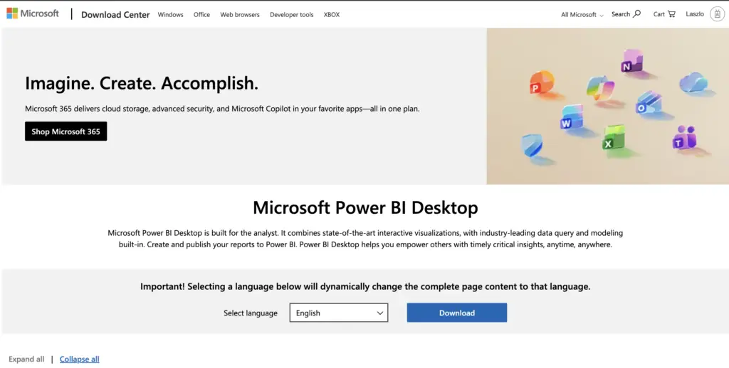
Where Can You Download Power BI Desktop?
The safest place to download Power BI Desktop is directly from Microsoft.
There are two common installation methods:
Microsoft Store (Recommended)
Installing through the Microsoft Store is the easiest option for most users. The application updates automatically whenever Microsoft releases a new version, meaning you’ll always have access to the latest features and bug fixes.
Direct Download (.exe)
Microsoft also provides a standalone installer. This option is often used within organisations where software is managed by an IT department.
If you’re installing Power BI on your own computer, the Microsoft Store version is generally the better choice.
Which Version Should You Install?
If you’re just starting with Power BI, install the latest version of Power BI Desktop.
You don’t need Power BI Pro, Premium, or Microsoft Fabric to complete this guide.
Those services become important later when you want to publish reports and share them with colleagues, but everything we’ll build initially can be created using the free Desktop application.
Installing Power BI Desktop
Once you’ve downloaded Power BI Desktop:
- Run the installer.
- Accept the Microsoft licence agreement.
- Choose the default installation location.
- Wait for the installation to complete.
- Launch Power BI Desktop.
The installation usually takes only a few minutes.
When Power BI starts for the first time, you may be asked to sign in using a Microsoft account.
You can skip this step for now if you simply want to explore the application locally.
Your First Look at Power BI Desktop
When Power BI Desktop opens for the first time, the number of buttons and menus can seem overwhelming.
Don’t worry.
You won’t need to understand everything immediately.
In fact, most people use only a small part of the interface during their first few weeks with Power BI.
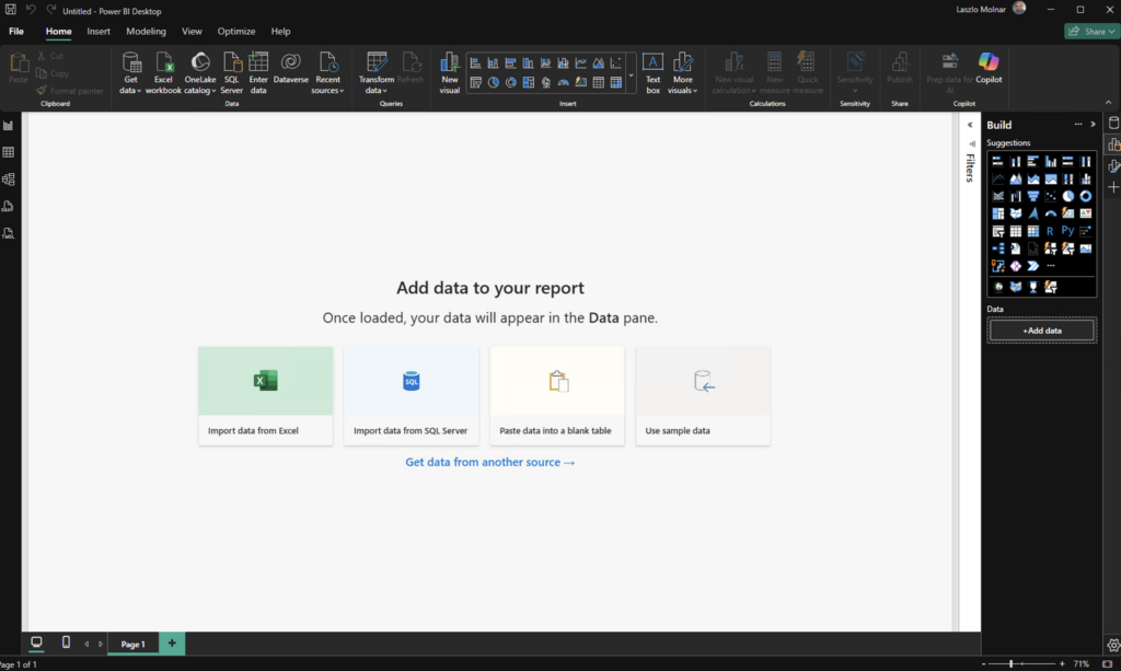
Let’s look at the areas you’ll use most often.
The Ribbon
Across the top of Power BI Desktop you’ll find the Ribbon.
If you’ve used Microsoft Excel, Word or Outlook, this will already feel familiar.
The Ribbon groups together the tools you’ll use most often.
Some of the most useful tabs include:
Home
Import data, refresh data, transform data, create visuals and publish reports.
Insert
Add text boxes, images, buttons and shapes to your reports.
Modeling
Create measures, calculated columns, tables and relationships.
View
Manage themes, page layouts, grids and display options.
Although there are many commands available, don’t worry about learning them all immediately.
As you progress through this guide, you’ll naturally become familiar with the ones you use most often.
Report View
Report View is where you’ll spend most of your time.
This is where dashboards and reports are designed.
You can drag charts onto the canvas, resize visuals, add filters, and create interactive reports.
Think of Report View as your design workspace.
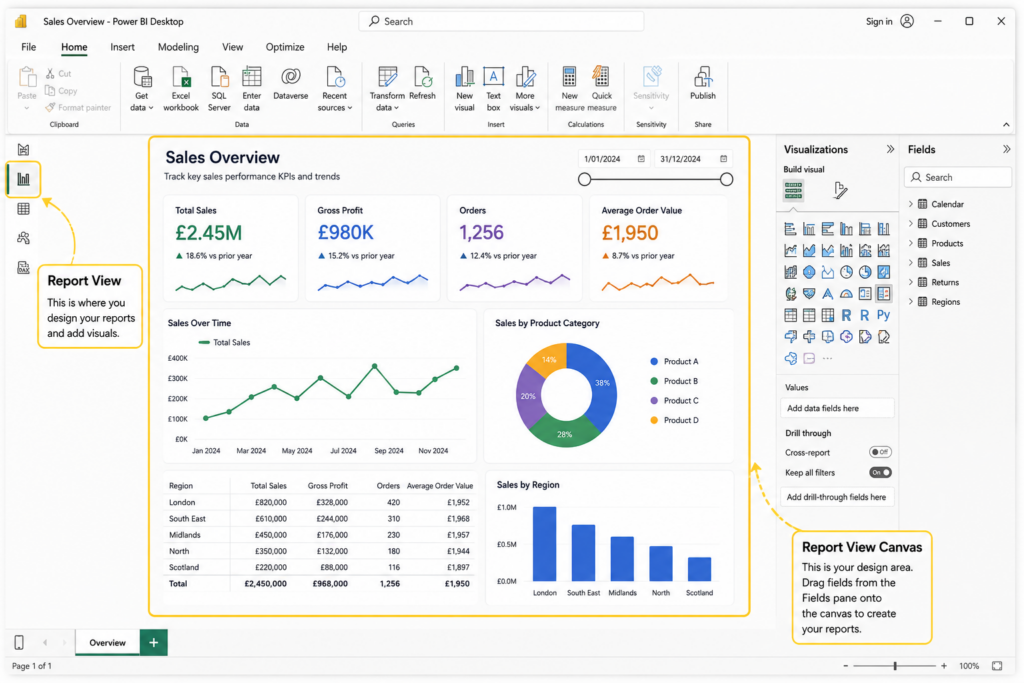
Table View
Table View allows you to see the underlying tables that Power BI has imported.
Here you can:
- Browse your data
- Check values
- Create calculated columns
- Verify imported information
This view is particularly useful when you’re trying to understand unfamiliar datasets.
For example, if you’ve connected Xero using Connectorly, Table View lets you explore tables such as invoices, contacts, bank transactions and tracking categories before you start building reports.
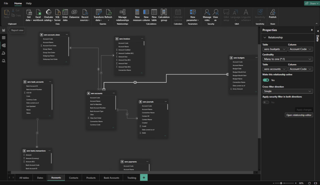
Model View
Model View is where Power BI displays relationships between tables.
Understanding relationships is one of the most important skills you’ll learn in Power BI.
Fortunately, we’ll cover this in detail later in the guide.
For now, it’s enough to know that Model View shows how different tables connect together.
The Data Pane
On the right-hand side of the screen you’ll find the Fields pane.
This lists every table and column available in your report.
For example, after importing accounting data you might see tables such as:
- Customers
- Invoices
- Contacts
- Accounts
- Bank Transactions
Expanding a table displays all of its available fields.
Building reports is often as simple as dragging these fields onto a visual.
The Visualisations Pane
The Visualisations pane contains all of the chart types available in Power BI.
Some of the most commonly used visuals include:
- Table
- Matrix
- Card
- Clustered Column Chart
- Line Chart
- Bar Chart
- Pie Chart
- Donut Chart
- Map
- KPI
- Slicer
Don’t feel that you need to use every visual.
In fact, many professional reports rely on only a handful of chart types used consistently.
Keeping reports simple often makes them easier to understand.
Common Mistake
Beginners often add too many chart types to a report. Using a consistent set of visuals usually produces cleaner, more professional dashboards.
The Filters Pane
The Filters pane controls which data appears in your report.
Filters can be applied at several levels:
- Individual visual
- Entire page
- Entire report
For example, you might create a sales dashboard that only shows the current financial year, or a report filtered to a specific company.
Later in this guide we’ll also look at slicers, which allow report users to interactively filter information themselves.
Your First Hands-On Exercise
Before importing any data, let’s spend a few minutes becoming familiar with Power BI Desktop. Don’t worry about creating reports yet—the goal is simply to get comfortable with the interface and build your first report page.
Step 1: Open Power BI Desktop
Launch Power BI Desktop from your Start Menu or desktop shortcut.
If this is your first time opening the application, you’ll see a blank report canvas.
Step 2: Create a New Blank Report
If Power BI doesn’t automatically open a new report:
- Select File > New.
- A blank report page will appear.
This is where you’ll build your reports throughout this guide.
Step 3: Rename the Report Page
At the bottom of the screen, you’ll see a tab called Page 1.
Double-click Page 1 and rename it to:
Sales Overview
Although this seems like a small step, giving your report pages meaningful names is a good habit to develop from the beginning.
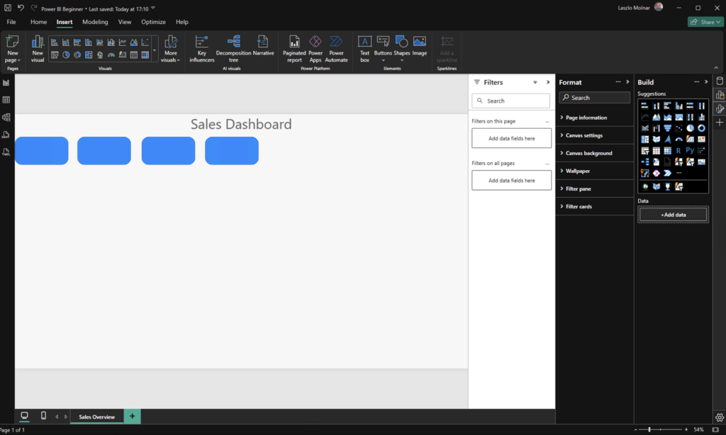
Step 4: Add a Report Title
From the Insert ribbon, select Text box.
Type the following title:
Sales Dashboard
Resize the text and position it at the top of the page.
This simple step starts to give your report a professional structure.
Step 5: Create a Simple Dashboard Layout
Next, we’ll create placeholders for future KPI cards.
- Select Insert > Shapes > Rounded Rectangle.
- Draw a rectangle near the top of the report.
- Resize it to approximately the size of a KPI card.
- Copy and paste it three or four times (Ctrl + C and Ctrl + V).
Don’t worry about the colours or formatting yet. These will eventually display important business metrics such as revenue, profit, or customer numbers.
Step 6: Save Your Report
Finally, save your report so you can continue using it throughout this guide.
Select File > Save As and save the file as:
Power BI Beginner.pbix
You’ll continue building on this report in the next chapters as you import data, create visuals, and learn more advanced Power BI features.
What You’ve Learned
By completing this exercise, you’ve already taken the first practical steps towards building reports in Power BI.
You have:
- Opened Power BI Desktop.
- Created your first report.
- Renamed a report page.
- Added a report title.
- Designed a simple dashboard layout.
- Saved your Power BI project.
In the next chapter, we’ll import your first dataset and start creating real reports using Excel, before moving on to Power Query and other data sources such as Xero and HubSpot.
Loading Your First Data into Power BI
Now that Power BI Desktop is installed and you’re familiar with the interface, it’s time to build your first report.
Every Power BI report starts with data. Fortunately, Power BI can connect to hundreds of different data sources, including Excel workbooks, CSV files, SQL Server, SharePoint, cloud applications, and business systems such as Xero and HubSpot.
For your first report, we’ll start with the simplest and most common option: an Excel spreadsheet.
Once you’ve learned how to import Excel data, the same principles apply to almost every other data source.
Importing Your First Excel File
Excel remains one of the most popular data sources for Power BI.
Many organisations already store sales reports, budgets, customer lists, or operational data in spreadsheets, making Excel the ideal place to begin learning.
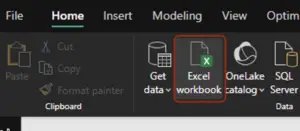
To import an Excel workbook:
- Open Power BI Desktop.
- On the Home ribbon, select Excel Workbook.
- Browse to your Excel file.
- Click Open.
Power BI will read the workbook and display a list of available worksheets and Excel tables.
If your workbook contains multiple worksheets, don’t worry. You’ll be able to choose exactly which data you want to import.
Understanding the Navigator Window
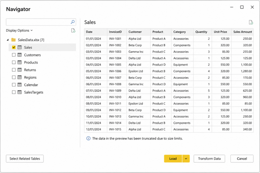
After selecting your workbook, Power BI displays the Navigator window.
This window lists every worksheet and table available within the Excel file.
Selecting a worksheet shows a preview of the data before importing it.
This allows you to confirm that you’ve selected the correct information.
You’ll also notice two buttons at the bottom of the Navigator:
- Load
- Transform Data
Understanding the difference between these two options is one of the first important Power BI concepts.
Load vs Transform Data
Many beginners immediately click Load.
Sometimes that’s exactly the right choice.
However, if your data needs cleaning or restructuring, it’s usually better to choose Transform Data.
Here’s the difference:
Load
Use Load when your data is already clean and ready for reporting.
Power BI imports the selected tables directly into your report.
Transform Data
Use Transform Data when you need to:
- Remove unnecessary columns
- Rename fields
- Change data types
- Filter rows
- Split columns
- Merge datasets
- Clean inconsistent values
Selecting Transform Data opens Power Query Editor, which is where data preparation takes place.
We’ll explore Power Query in more detail shortly.
Creating Your First Table Visual
Let’s build your first report.
Once you’ve loaded your Excel data:
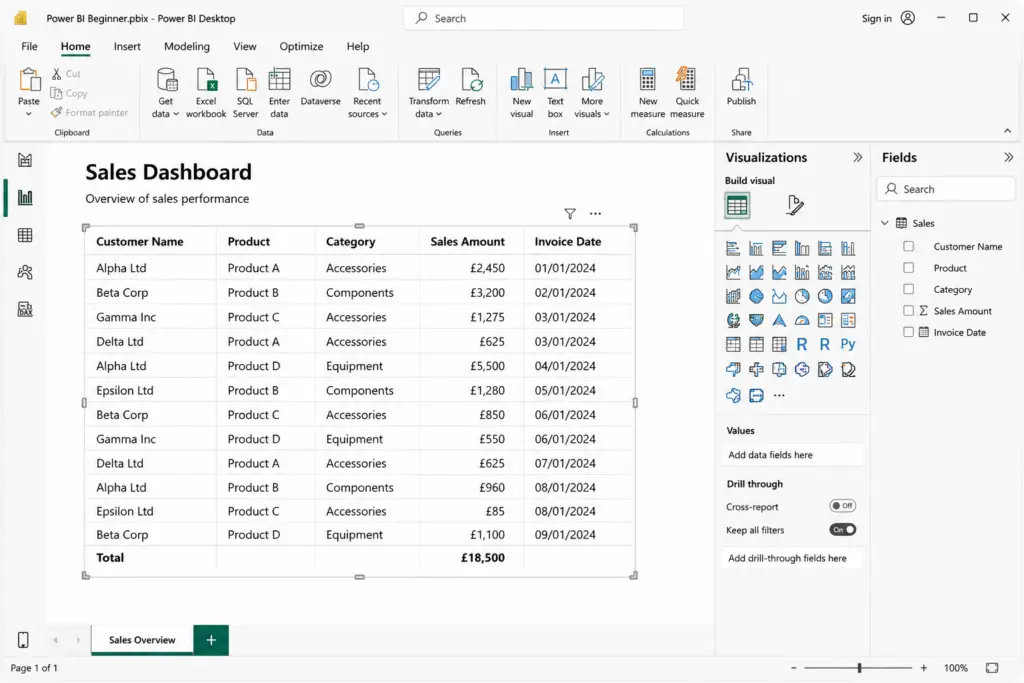
- Stay in Report View.
- Select the Table visual from the Visualisations pane.
- A blank table appears on the report canvas.
- Expand your imported table in the Fields pane.
- Drag a few fields into the table.
For example:
- Customer Name
- Product
- Sales Amount
- Invoice Date
Power BI automatically creates a simple table showing your data.
Congratulations—your first Power BI visual is complete.
Creating Your First Chart
Tables are useful, but charts make trends much easier to understand.
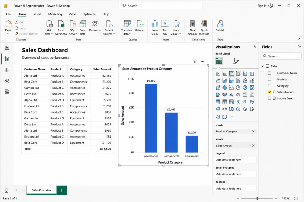
Let’s create a simple column chart.
- Click on an empty area of the report.
- Select the Clustered Column Chart visual.
- Drag a category field, such as Product Category, to the X-axis.
- Drag a numeric field, such as Sales Amount, to Values.
Power BI automatically groups the data and creates a chart.
Try clicking on one of the columns.
You’ll notice that Power BI automatically highlights related information in other visuals on the page.
This interactive behaviour is one of Power BI’s biggest strengths.
Introducing Power Query
Before building larger reports, it’s important to understand Power Query.
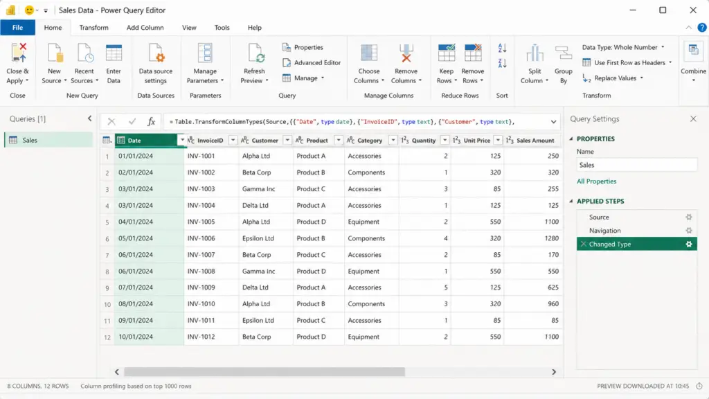
Power Query is Power BI’s data preparation tool.
Rather than modifying your original Excel workbook, Power Query creates a series of repeatable transformation steps.
Each time your data refreshes, Power BI automatically applies those same steps.
This saves time and helps keep reports consistent.
Some of the most common Power Query tasks include:
- Removing unnecessary columns
- Renaming columns
- Filtering rows
- Changing data types
- Replacing values
- Splitting columns
- Merging queries
- Appending tables
One of the biggest advantages of Power Query is that your original data remains unchanged.
Cleaning Your Data
Real-world data is rarely perfect.
Before building reports, it’s often worth spending a few minutes cleaning your data.
Common tasks include:
- Removing blank rows
- Correcting data types
- Renaming confusing column headings
- Removing unnecessary fields
- Replacing missing values
- Standardising dates
Performing these tasks inside Power Query helps create more reliable reports.
Common Mistake
Many beginners try to clean their data directly in Excel before every report refresh.
Instead, perform these transformations once in Power Query so they happen automatically each time your data updates.
Splitting and Merging Columns
Power Query makes it easy to split one column into several columns or combine multiple columns into one.
For example:
You might split a customer’s full name into:
- First Name
- Last Name
Or combine:
- City
- County
into a single address field.
We cover these techniques in much more detail in our dedicated guide:
Connecting to Other Data Sources
Once you’re comfortable importing Excel files, you’ll find that connecting other data sources follows a very similar process.
Power BI supports hundreds of connectors, including:
- CSV files
- SQL Server
- PostgreSQL
- MySQL
- SharePoint
- Azure SQL Database
- Web APIs
- Folder imports
Many businesses also connect cloud applications such as Xero and HubSpot to Power BI.
Connectorly provides integrations that make it easy to access reporting data from these systems without relying on manual exports.
For example:
- Connectorly for Xero & Power BI helps you build financial reports, management accounts, cash flow dashboards, and consolidated reporting.
- Connectorly for HubSpot & Power BI allows you to analyse sales pipelines, marketing performance, customer activity, and CRM data.
As you progress through this guide, we’ll use examples from both Excel and Connectorly to demonstrate different reporting techniques.
Your Hands-On Exercise
Let’s put everything together.
Using a simple Excel workbook:
- Import the workbook into Power BI.
- Open the Navigator window.
- Select Load.
- Create a Table visual.
- Create a Clustered Column Chart.
- Resize both visuals.
- Save your report.
Congratulations!
You’ve now imported data, created multiple visuals, and built your first interactive Power BI report.
What You’ve Learned
By completing this chapter, you’ve learned how to:
- Import an Excel workbook.
- Understand the Navigator window.
- Choose between Load and Transform Data.
- Create your first table visual.
- Build your first chart.
- Understand the purpose of Power Query.
- Prepare data for reporting.
- Connect Power BI to additional data sources.
In the next chapter, we’ll look at one of the most important concepts in Power BI: data modelling and relationships. Understanding how tables connect together is the foundation for creating accurate reports and writing effective DAX calculations.
Understanding Data Models and Relationships
Now that you’ve imported your first dataset and created a few basic visuals, it’s time to learn one of the most important concepts in Power BI: the data model.
Understanding how tables relate to one another is essential if you want to build accurate reports, write DAX calculations, and analyse data from multiple sources.
Fortunately, once you understand the basics, the same principles apply to almost every Power BI project.
What Is a Data Model?
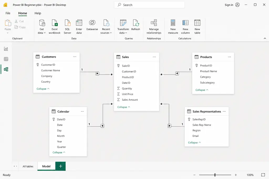
A data model is simply the collection of tables that make up your Power BI report, along with the relationships between them.
Instead of storing all your information in one large table, Power BI works best when related information is organised into separate tables.
For example, a sales report might contain:
- Customers
- Products
- Sales
- Calendar
- Sales Representatives
Each table stores different information, but together they create a complete reporting model.
Why Use Multiple Tables?
Many beginners ask:
“Why can’t I just import one Excel spreadsheet with everything in it?”
Sometimes you can.
However, as reports become larger, separating information into related tables makes reports easier to maintain, faster to refresh, and more flexible.
For example:
The Customers table stores customer information only once.
The Sales table stores every transaction.
Rather than repeating customer details thousands of times, Power BI links the two tables together using a relationship.
This reduces duplication and improves performance.
What Is a Relationship?
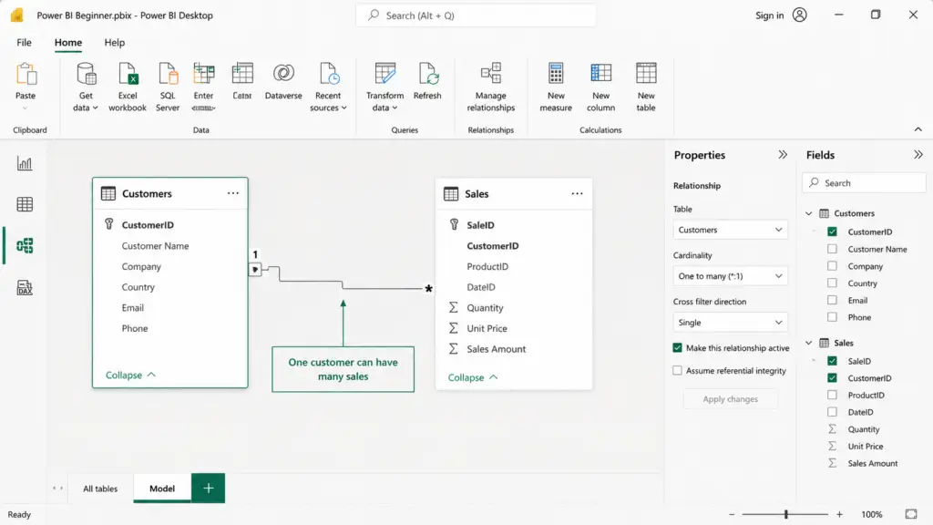
A relationship tells Power BI how two tables are connected.
For example:
The Sales table might contain a Customer ID.
The Customers table also contains the same Customer ID.
Power BI uses this shared field to understand which customer belongs to each sale.
Without relationships, Power BI has no way of knowing how your tables should work together.
Understanding Fact and Dimension Tables
As your reports become more advanced, you’ll often hear the terms Fact Table and Dimension Table.
Don’t let the names intimidate you.
They’re actually quite simple.
A Fact Table contains measurable information.
Examples include:
- Sales
- Invoices
- Payments
- Orders
- Bank Transactions
A Dimension Table provides descriptive information.
Examples include:
- Customers
- Products
- Calendar
- Employees
- Locations
Fact tables answer questions such as:
“How much?”
Dimension tables answer questions such as:
“Who?”
“What?”
“Where?”
“When?”
Understanding this distinction makes it much easier to design reports that are both accurate and easy to maintain.
A calendar is another important dimension in most reporting models. It gives Power BI a consistent way to group transactions by year, quarter, month, week and financial period. For a practical walkthrough, see our step-by-step guide to creating a date table in Power BI.
One-to-Many Relationships
The most common relationship in Power BI is a One-to-Many relationship.
For example:
One customer can have many invoices.
One product can appear in many sales transactions.
One date can contain many transactions.
This is the relationship type you’ll use most often.
Active and Inactive Relationships
Sometimes two tables can be related in more than one way.
For example, an invoice might contain both an Invoice Date and a Payment Date.
Only one relationship can be active at a time.
The active relationship is used automatically when creating reports.
Inactive relationships can still be used in DAX calculations when required.
Don’t worry if this seems unfamiliar—we’ll revisit this topic later when we introduce DAX.
What Is a Star Schema?
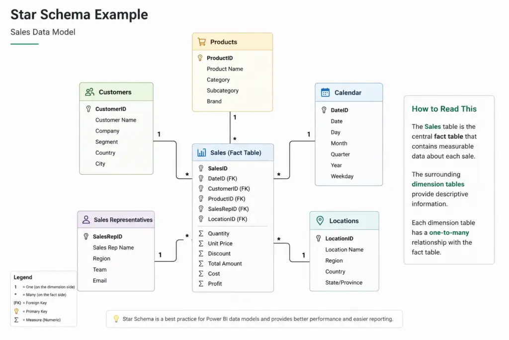
If you’ve searched for Power BI best practices, you’ve probably come across the term Star Schema.
A Star Schema is simply a way of organising your tables.
A central fact table sits in the middle, surrounded by related dimension tables.
For example:
Sales
↓
Customers
Products
Calendar
Sales Representatives
The layout resembles a star, which is where the name comes from.
This design makes reports easier to build and generally improves performance.
How Connectorly Helps
If you’re using Connectorly for Xero & Power BI or Connectorly for HubSpot & Power BI, much of this work has already been done for you.
The connectors provide a structured reporting model that includes related tables for common business entities such as contacts, invoices, bank transactions, deals, companies and activities.
This allows you to spend less time preparing data and more time building reports.
You can also download our free Power BI templates to see examples of these relationships in practice.
Easy Power BI Templates for Xero
Easy Power BI Templates for HubSpot
Your First Relationship Exercise
Let’s create your first relationship.
If you have two tables containing customer information:
- Open Model View.
- Locate the Customers table.
- Locate the Sales table.
- Drag the Customer ID field from one table to the matching field in the other.
- Power BI creates a relationship between the tables.
Congratulations!
You’ve created your first Power BI relationship.
Common Beginner Mistakes
Most relationship problems come from just a few common mistakes.
These include:
- Joining the wrong columns.
- Using duplicate values where unique values are expected.
- Creating unnecessary many-to-many relationships.
- Ignoring date tables.
- Importing everything into one large spreadsheet.
Fortunately, all of these become easier to recognise with experience.
What You’ve Learned
By completing this chapter, you’ve learned:
- What a Power BI data model is.
- Why reports use multiple tables.
- How relationships work.
- The difference between fact and dimension tables.
- What a one-to-many relationship looks like.
- Why star schemas are considered best practice.
- How to create your first relationship.
In the next chapter, we’ll introduce Power Query in much greater detail and learn how to clean, transform and prepare data before building more advanced reports.
Mastering Power Query
Once you’ve imported data into Power BI, the next step is making sure it’s ready for reporting.
In reality, business data is rarely perfect.
Columns may have inconsistent names, dates might be stored as text, unnecessary fields may be included, or information could be spread across multiple files.
Rather than fixing these problems manually every time new data arrives, Power BI provides a powerful tool called Power Query.
Power Query allows you to clean, transform and prepare your data before it is loaded into your report.
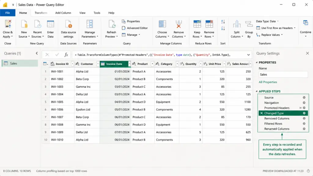
The best part is that every transformation is recorded as a series of reusable steps. The next time your data refreshes, Power BI automatically repeats those same steps, saving you time and ensuring your reports remain consistent.
For many Power BI developers, Power Query is where most of the work takes place.
What Is Power Query?
Power Query is Power BI’s built-in data preparation tool.
Think of it as a workspace where you can reshape your data without changing the original source.
For example, you can:
- Remove unnecessary columns
- Rename fields
- Filter unwanted rows
- Split a column into multiple columns
- Merge several columns into one
- Change data types
- Replace incorrect values
- Combine data from multiple files
Every action you perform is stored as an Applied Step.
This means you only need to perform the transformation once.
Whenever the data is refreshed, Power BI automatically repeats those same steps.
Why Not Just Edit the Excel File?
A common question from beginners is:
“Why not just clean the Excel file before importing it?”
While this may work for a one-off report, it quickly becomes difficult to maintain.
Imagine receiving a new sales export every Monday morning.
If you manually delete columns, rename headings and correct data types every week, you’ll spend valuable time repeating the same work.
Instead, perform those tasks once in Power Query.
The next time you refresh your report, Power BI automatically repeats every transformation.
This is one of the biggest reasons businesses adopt Power BI for reporting.
Understanding Applied Steps
One of the most useful features in Power Query is the Applied Steps pane.
Every transformation you perform is recorded automatically.
For example:
- Source
- Navigation
- Promoted Headers
- Changed Type
- Removed Columns
- Filtered Rows
- Renamed Columns
Each step builds upon the previous one.
You can return to any earlier step, edit it, or remove it without affecting your original data source.
Changing Data Types
Correct data types are essential for accurate reporting.
Power BI needs to know whether a field contains:
- Text
- Whole numbers
- Decimal numbers
- Dates
- Date & Time
- Currency
- True/False values
If a sales amount is imported as text instead of a number, calculations and charts may not work correctly.
Fortunately, changing a data type is simple.
- Select the column.
- Choose Transform.
- Select the appropriate data type.
Power Query automatically records this as another applied step.
Removing Unnecessary Columns
Many source systems include dozens or even hundreds of fields.
In most reports, you’ll only use a small percentage of them.
Removing unnecessary columns has several benefits:
- Smaller data models
- Faster refresh times
- Improved report performance
- Easier navigation
To remove a column:
- Select the column.
- Right-click.
- Choose Remove.
Alternatively, if you know exactly which columns you need, use Choose Columns to keep only those fields.
Renaming Columns
Clear field names make reports much easier to understand.
Instead of working with names such as:
Cust_Name
or
Inv_Date
rename them to:
- Customer Name
- Invoice Date
These names will appear throughout your report, making it easier for both report developers and end users to understand the data.
Filtering Rows
Power Query also allows you to remove unnecessary records before the data reaches your report.
For example, you might:
- Exclude cancelled orders
- Remove blank rows
- Keep only the current financial year
- Remove test records
Filtering data before loading it into Power BI reduces the size of your data model and improves performance.
Splitting and Merging Columns
Many datasets contain information that would be easier to analyse if it were separated into individual fields.
For example:
John Smith
can become:
- John
- Smith
Similarly, separate address fields can be combined into a single display field.
Power Query includes built-in tools for both operations.
We’ve covered these techniques in much greater detail in our dedicated guide:
How to Split and Merge Fields in Power BI
Combining Data from Multiple Files
Power Query isn’t limited to a single Excel workbook.
It can combine information from:
- Multiple Excel files
- CSV files
- Databases
- SharePoint folders
- Web APIs
- Business applications
For example, many businesses receive monthly sales reports as separate Excel files.
Instead of importing each file individually, Power Query can automatically combine them into one reporting table.
This saves a considerable amount of manual work.
Using Connectorly with Power Query
If you’re using Connectorly for Xero & Power BI or Connectorly for HubSpot & Power BI much of your data preparation is already taken care of.
Connectorly provides structured reporting tables that are designed for Power BI, helping reduce the amount of manual data preparation required.
You can still use Power Query to apply additional business-specific transformations, but many users find they can begin building reports immediately.
You can also explore our free Power BI templates to see practical examples of how Power Query and the Connectorly data model work together.
Easy Power BI Templates for Xero
Easy Power BI Templates for HubSpot
Your First Power Query Exercise
Let’s put what you’ve learned into practice.
Using your Excel workbook:
- Open Transform Data.
- Remove one unnecessary column.
- Rename two column headings.
- Change a date column to the Date data type.
- Filter out blank rows.
- Click Close & Apply.
Return to Report View.
Your report now uses the cleaned version of the data without modifying the original Excel workbook.
What You’ve Learned
By completing this chapter, you’ve learned how to:
- Understand the purpose of Power Query.
- Prepare data before reporting.
- Use Applied Steps.
- Change data types.
- Remove unnecessary columns.
- Rename fields.
- Filter unwanted records.
- Split and merge columns.
- Combine data from multiple sources.
In the next chapter, we’ll introduce DAX (Data Analysis Expressions) and learn how to create measures that calculate totals, averages, percentages and other business metrics.
Understanding DAX: Creating Your First Calculations
Up to this point, you’ve imported data, cleaned it using Power Query, and created relationships between your tables.
Now it’s time to make your reports more powerful.
One of Power BI’s biggest strengths is its ability to perform calculations that update automatically as users interact with a report.
These calculations are created using DAX, which stands for Data Analysis Expressions.
Don’t let the name put you off.
Although DAX is a formula language, you don’t need to be a programmer to use it.
If you’ve ever written a formula in Microsoft Excel, you’ll already recognise many of the concepts.
In this chapter, we’ll introduce the most useful DAX concepts for beginners and build a few practical calculations using our Demo Company (UK) sales data.
What Is DAX?
DAX is the formula language used throughout Power BI.
It allows you to create calculations that answer business questions such as:
- How much revenue have we generated?
- How many customers do we have?
- What is the average invoice value?
- Which products generate the highest sales?
- How has revenue changed over time?
Unlike Excel formulas, DAX works across your entire data model, meaning it can use information from multiple related tables.
As your reports become more advanced, DAX becomes one of the most valuable Power BI skills you can learn.
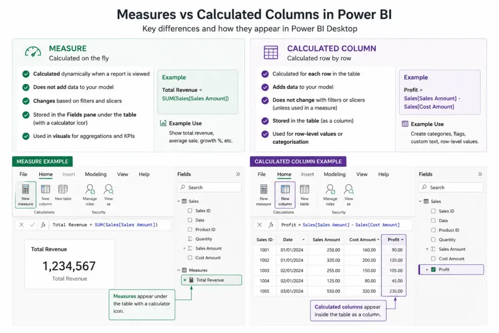
Measures vs Calculated Columns
One of the first concepts every Power BI user should understand is the difference between Measures and Calculated Columns.
Although both use DAX, they serve different purposes.
Calculated Columns
A calculated column creates a new value for every row in a table.
For example, you might create a column that combines a customer’s first and last name or categorises sales into price bands.
The result is stored in the data model and increases its size.
Measures
A measure performs a calculation only when it is needed.
For example:
- Total Revenue
- Average Sale
- Number of Customers
- Gross Profit
Measures don’t store values for every row. Instead, Power BI calculates the result dynamically based on the filters applied to your report.
For most reporting scenarios, measures are the recommended approach.
Creating Your First Measure
Let’s create a simple measure that calculates total revenue.
- In the Fields pane, right-click the Sales table.
- Select New measure.
- Enter the following DAX formula:
Total Revenue = SUM(Sales[Sales Amount])
- Press Enter.
Congratulations!
You’ve just created your first DAX measure.
Power BI automatically adds the measure to your Fields pane.
Displaying the Measure
Now let’s use the measure in a report.
- Insert a Card visual.
- Drag Total Revenue onto the card.
Power BI instantly displays the total revenue for your current report filters.
Try adding a slicer for Year or Product Category.
Notice how the card updates automatically.
This is one of the biggest advantages of using measures.
Creating an Average
Next, let’s calculate the average sales value.
Create another measure:
Average Sale = AVERAGE(Sales[Sales Amount])
Add it to another Card visual.
This immediately provides another useful KPI for your report.
Counting Customers
Instead of counting every sales transaction, let’s count unique customers.
Total Customers = DISTINCTCOUNT(Customers[Customer ID])
Using DISTINCTCOUNT ensures each customer is counted only once, even if they’ve made multiple purchases.
How to Create a Running Total and Top N Customers in Power BI with DAX
Performing Simple Calculations
Measures can also reference other measures.
For example:
Profit = [Total Revenue] – [Total Costs]
Building calculations from existing measures keeps your reports easier to understand and maintain.
Quick Measures
If you’re not ready to write DAX yourself, Power BI includes Quick Measures.
These create common calculations automatically, including:
- Running totals
- Percent of grand total
- Year-to-date totals
- Rolling averages
Quick Measures are a useful way to learn how DAX works because Power BI generates the formulas for you.
The free Connectorly templates also include measures that you can use when you build your dashboard.
Understanding Prebuilt Power BI Measures for Xero Reporting with Connectorly
Common Beginner Mistakes
Some of the most common DAX mistakes include:
- Creating calculated columns instead of measures.
- Hard-coding values into formulas.
- Using the wrong data type.
- Giving measures unclear names.
- Writing one large formula instead of several reusable measures.
Building small, reusable measures is generally considered best practice.
Your First DAX Exercise
Using your Demo Company (UK) sales data:
- Create a Total Revenue measure.
- Create an Average Sale measure.
- Create a Total Customers measure.
- Display each measure using a Card visual.
- Add a slicer for Product Category.
- Verify that all three cards update when you change the filter.
Congratulations!
You’ve now created your first dynamic Power BI dashboard using DAX.
What You’ve Learned
By completing this chapter, you’ve learned how to:
- Understand what DAX is.
- Create measures.
- Understand the difference between measures and calculated columns.
- Calculate totals, averages and counts.
- Use measures in visuals.
- Build reusable calculations.
In the next chapter, we’ll use these measures to build a professional business dashboard with KPI cards, charts, slicers and interactive navigation.
Building Your First Professional Dashboard
You’ve now imported data, cleaned it using Power Query, created relationships between your tables, and written your first DAX measures.
Now it’s time to bring everything together.
A well-designed dashboard should answer business questions quickly.
Instead of presenting dozens of tables and charts, your dashboard should guide users towards the information that matters most.
Whether you’re reporting on sales, finance, marketing, or operations, the same dashboard design principles apply.
In this chapter, we’ll build a simple but professional dashboard using our Demo Company (UK) data.
What Makes a Good Dashboard?
One of the biggest mistakes beginners make is trying to display too much information on a single page.
A dashboard isn’t designed to show every piece of available data.
Instead, it should highlight the most important information at a glance.
Ask yourself:
- What question is this dashboard answering?
- Who will use it?
- What decisions should it help people make?
If every visual supports those goals, you’re on the right track.
Choosing the Right Visual
Power BI includes dozens of visual types, but most business dashboards rely on a small number of them.
Here are some of the most useful:
Visual | Best Used For |
Card | KPIs such as Revenue, Profit or Customer Count |
Table | Detailed transactional information |
Matrix | Financial statements and grouped summaries |
Column Chart | Comparing values across categories |
Line Chart | Showing trends over time |
Bar Chart | Ranking products, customers or regions |
Donut Chart | Displaying simple proportions |
Slicer | Allowing users to filter the report |
Using the same visual types consistently makes reports easier to understand.
Adding KPI Cards
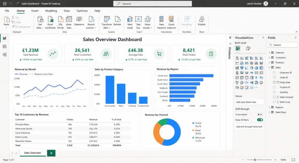
Let’s begin by creating a row of KPI cards.
Insert four Card visuals and display measures such as:
- Total Revenue
- Total Customers
- Average Sale
- Total Orders
Position the cards across the top of the report.
This gives users an immediate overview of business performance.
Adding Charts
Next, let’s visualise the data.
A good starting point is:
- Revenue by Month (Line Chart)
- Sales by Product (Column Chart)
- Revenue by Region (Bar Chart)
Arrange the charts beneath your KPI cards.
Try to align visuals neatly and leave consistent spacing between them.
White space is an important part of good dashboard design.
Adding Slicers
Slicers allow report users to interact with the dashboard without changing the report itself.
Useful slicers include:
- Year
- Month
- Product Category
- Sales Representative
- Region
Place slicers either across the top of the dashboard or in a panel on the left-hand side.
Avoid scattering them throughout the report.
Keeping filters together creates a cleaner user experience.
Using Consistent Colours
Colours should support the information rather than distract from it.
A few simple guidelines:
- Use one primary accent colour.
- Use green for positive performance where appropriate.
- Use red for negative values or alerts.
- Avoid using too many bright colours on the same page.
- Keep chart colours consistent across reports.
Professional dashboards often use fewer colours than beginners expect.
Power BI Conditional Formatting: 5 Practical Examples for Better Business Reporting
Designing for Readability
Good dashboards are easy to scan.
Try to:
- Align visuals neatly.
- Keep similar charts the same size.
- Use descriptive titles.
- Format numbers consistently.
- Avoid unnecessary borders.
- Leave enough white space.
If users need several minutes to understand the dashboard, it probably contains too much information.
Using Connectorly Templates
If you’re new to Power BI, building dashboards from scratch can take time.
Connectorly provides free Power BI templates for Xero that demonstrate many of the techniques covered in this guide.
These templates include:
- Financial dashboards
- Profit and Loss reports
- Balance Sheet reports
- Cash Flow dashboards
- Accounts Receivable
- Accounts Payable
- Sales reporting
They’re a great way to learn how professional Power BI reports are structured while adapting them to your own organisation.
Easy Power BI Templates for Xero
Easy Power BI Templates for HubSpot
Your Dashboard Exercise
Using the report you’ve built so far:
- Add four KPI cards.
- Create one line chart.
- Create one column chart.
- Add a slicer for Year.
- Align the visuals neatly.
- Add meaningful chart titles.
- Save your report.
Congratulations!
You’ve now created your first professional Power BI dashboard.
What You’ve Learned
By completing this chapter, you’ve learned how to:
- Design a dashboard layout.
- Select appropriate visuals.
- Add KPI cards.
- Build charts.
- Use slicers.
- Apply consistent formatting.
- Improve dashboard readability.
In the next chapter, we’ll publish your report to the Power BI Service, learn how to share reports with colleagues, and understand the difference between reports, dashboards, workspaces and apps.
Publishing and Sharing Your Reports
Building a report in Power BI Desktop is only the first step.
In most organisations, reports are created in Power BI Desktop and then published to the Power BI Service, where they can be shared with colleagues, refreshed automatically and accessed through a web browser.
Understanding how these two parts of Power BI work together is an important step in becoming a confident Power BI user.
Fortunately, the publishing process is straightforward once you understand the basic concepts.
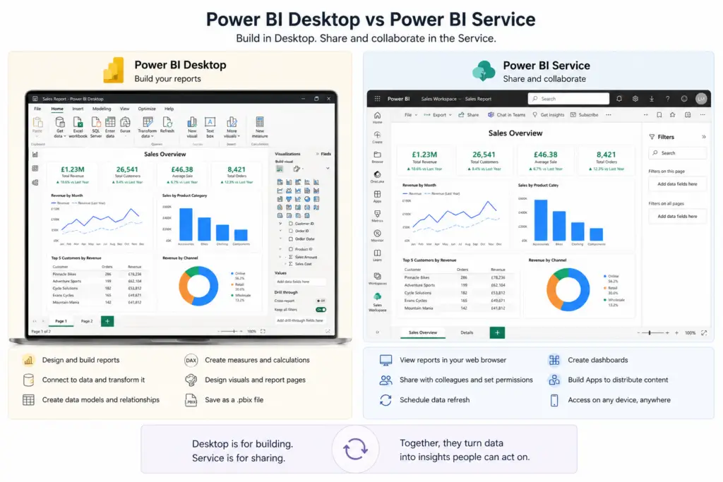
Power BI Desktop vs Power BI Service
One of the most common questions beginners ask is:
“What’s the difference between Power BI Desktop and Power BI Service?”
The answer is simple.
Power BI Desktop is where you create reports.
This is the application you’ve been using throughout this guide.
Power BI Desktop allows you to:
- Import data.
- Build relationships.
- Create DAX measures.
- Design report pages.
- Save reports as .pbix files.
Once your report is finished, you can publish it to the Power BI Service.
The Power BI Service is Microsoft’s cloud platform.
It allows you to:
- View reports in a web browser.
- Share reports with colleagues.
- Schedule data refreshes.
- Create dashboards.
- Manage workspaces.
- Build Power BI Apps.
A simple way to think about it is:
- Desktop = Build
- Service = Share
Publishing Your First Report
Publishing a report is very straightforward.
- Save your Power BI report.
- Select Home > Publish.
- Sign in with your Microsoft account if prompted.
- Choose a Workspace.
- Click Select.
Power BI uploads your report to the Power BI Service.
Once the upload is complete, you’ll receive a confirmation message containing a link to open the report in your browser.
What Is a Workspace?
Think of a Workspace as a project folder.
It stores:
- Reports
- Semantic models (Datasets)
- Dashboards
- Dataflows
- Scorecards
Many organisations create separate workspaces for different departments.
For example:
- Finance
- Sales
- Marketing
- Operations
This keeps reports organised and makes permissions easier to manage.
Reports vs Dashboards
- Can contain multiple pages.
- Includes interactive visuals.
- Supports drill-through and filters.
- Is created in Power BI Desktop.
- Exists only in the Power BI Service.
- Is a single page.
- Can combine visuals from multiple reports.
- Is designed to provide a high-level overview.
When you are ready to let readers move from a summary visual into supporting detail, follow our step-by-step guide to creating a Power BI drill-through page. It explains how to configure the destination filter, preserve context, add navigation and troubleshoot common problems.
What Is a Power BI App?
As organisations build more reports, sharing them individually can become difficult.
This is where Power BI Apps become useful.
An App packages together:
- Reports
- Dashboards
- Semantic models
Users receive one link that provides access to everything they need.
Apps also allow administrators to publish updates without requiring users to reopen reports manually.
If you’re building reports for multiple departments or customers, Apps are often the recommended way to distribute content.
How and Why to Create Apps in Power BI?
Refreshing Your Data
Publishing a report doesn’t mean the data automatically stays up to date.
Power BI supports scheduled refreshes.
For example:
- Daily
- Every few hours
- Multiple times per day
When using cloud-based systems such as Xero or HubSpot, automatic refreshes ensure users always see the latest information.
Connectorly is designed to work with these refreshes, allowing Power BI to access updated reporting data without relying on manual exports.
This helps finance teams, sales managers and executives make decisions using current information.
How To Manage Credentials and Automatic Refresh in Power BI Online
Sharing Reports Securely
Once a report has been published, you can share it with colleagues.
Before sharing, consider:
- Who needs access?
- Should everyone see the same information?
- Does the report contain sensitive financial data?
Power BI includes several security features, including permissions at the workspace level and Row-Level Security (RLS) for more advanced scenarios.
If you’re just starting out, it’s usually best to begin with simple workspace permissions and explore more advanced security features as your reporting environment grows.
Using Connectorly Templates
If you’ve followed this guide using sample data, the next step is to try building reports using real business information.
Connectorly provides free Power BI templates for Xero, allowing you to explore professionally designed dashboards without starting from scratch.
You can customise these templates, connect them to your own data and adapt them to suit your organisation’s reporting requirements.
If you’re new to Power BI, they’re an excellent way to learn how experienced report developers structure dashboards.
Easy Power BI Templates for Xero
Easy Power BI Templates for HubSpot
Your Publishing Exercise
Using the report you’ve built throughout this guide:
- Save your Power BI report.
- Sign in to Power BI Desktop.
- Publish the report to a Workspace.
- Open the report in the Power BI Service.
- Explore the report in your browser.
- Try interacting with your visuals and slicers.
If you don’t yet have access to the Power BI Service, don’t worry.
Everything you’ve learned in this guide can still be practised using Power BI Desktop.
What You’ve Learned
By completing this chapter, you’ve learned how to:
- Understand the difference between Power BI Desktop and the Power BI Service.
- Publish reports.
- Work with Workspaces.
- Understand the difference between Reports and Dashboards.
- Use Power BI Apps.
- Refresh data.
- Share reports securely.
In the final chapter, we’ll bring everything together with best practices, common mistakes to avoid, recommended learning resources, and answers to the most frequently asked questions from new Power BI users.
Final Thoughts and Where to Go Next
Congratulations!
If you’ve followed this guide from start to finish, you’ve already learned many of the core skills required to build professional Power BI reports.
You now understand how to:
- Install Power BI Desktop.
- Import data from different sources.
- Clean and prepare data using Power Query.
- Create relationships between tables.
- Build DAX measures.
- Design interactive dashboards.
- Publish reports to the Power BI Service.
These are the same building blocks used in thousands of business reporting projects every day.
The more reports you build, the more natural these skills will become.
Remember that every experienced Power BI developer started exactly where you are now—with their very first report.
Continue Learning with Connectorly
Learning Power BI is much easier when you can apply it to real business scenarios.
That’s why we’ve created a growing collection of tutorials, templates and practical guides covering finance, sales, CRM reporting and business intelligence.
If you’d like to continue learning, these articles are a great place to start.
Power BI Fundamentals
Top 10 Power BI Keyboard Shortcuts That Save Hours
Learn the shortcuts that experienced Power BI developers use every day to build reports more efficiently.
https://connectorly.io/blog/top-10-power-bi-keyboard-shortcuts/
Power BI Conditional Formatting: 5 Practical Examples
Discover how conditional formatting can highlight trends, overdue invoices, budget variances and sales performance.
https://connectorly.io/blog/power-bi-conditional-formatting-examples/
How to Split and Merge Fields in Power BI
Learn how to reshape your data using Power Query before building reports.
https://connectorly.io/blog/split-merge-fields-in-power-bi/
How to Create Running Totals in Power BI Using DAX
A practical introduction to one of the most commonly used DAX calculations.
https://connectorly.io/blog/power-bi-running-total-top-customers-dax/
Build Reports Using Real Business Data
Once you’re comfortable using sample data, the next step is connecting Power BI to your business systems.
Connectorly provides integrations that make it easier to build reports using live data from platforms such as Xero and HubSpot.
Connectorly for Xero & Power BI
Build financial dashboards, management reports, cash flow dashboards, accounts receivable reporting, consolidated reporting and much more.
Product page:
👉 https://connectorly.io/xero-power-bi/
Getting started guide:
👉 https://help.connectorly.io/en/articles/8517292-what-is-connectorly-for-xero-and-power-bi
Setup guide:
👉 https://help.connectorly.io/en/articles/8092459-setup-connectorly-for-xero-and-microsoft-power-bi
Connectorly for HubSpot & Power BI
Analyse your sales pipeline, marketing performance, customer lifecycle and CRM data using Power BI.
👉 https://connectorly.io/hubspot-power-bi/
Download Free Power BI Templates
If you’d prefer to start with professionally designed reports rather than building everything from scratch, we’ve created a collection of free Power BI templates for Xero.
These templates demonstrate many of the techniques covered throughout this guide, including:
- KPI dashboards
- Profit and Loss reports
- Balance Sheets
- Cash Flow dashboards
- Accounts Receivable
- Accounts Payable
- Sales reporting
- Tracking Category analysis
Download them here:
Easy Power BI Templates for Xero
Easy Power BI Templates for HubSpot
Frequently Asked Questions
Is Power BI free to use?
Yes. Power BI Desktop is free to download and includes everything you need to create reports, build dashboards and learn DAX. Some sharing and collaboration features require a Power BI Pro or Premium licence.
Should I learn Excel before Power BI?
No. Although Excel knowledge is helpful, it isn’t a requirement. Many Power BI concepts can be learned without advanced Excel skills.
How long does it take to learn Power BI?
Most beginners can build basic reports within a few days. Becoming confident with Power Query, DAX and data modelling usually takes a few weeks of regular practice.
Is DAX difficult to learn?
DAX can appear intimidating at first, but most users only need a relatively small number of functions to build useful business reports.
What is the difference between Power BI Desktop and the Power BI Service?
Power BI Desktop is used to create reports. Power BI Service is used to publish, share and manage those reports online.
Can Power BI connect directly to Xero?
Yes. Connectorly for Xero & Power BI allows businesses to access Xero reporting data and build financial dashboards in Power BI.
Can Power BI connect to HubSpot?
Yes. Connectorly for HubSpot & Power BI makes it possible to analyse CRM data, pipelines, marketing activity and sales performance in Power BI.
What is Power Query used for?
Power Query prepares data before it is loaded into Power BI. It can clean, filter, combine and transform data from many different sources.
Should I use Measures or Calculated Columns?
For totals, KPIs, averages and percentages, Measures are usually the preferred option because they calculate results dynamically based on report filters.
Can I combine multiple data sources in Power BI?
Yes. One of Power BI’s strengths is its ability to combine information from accounting systems, CRMs, databases, spreadsheets and many other data sources into a single reporting model.
You can also easily combine your Connectorly data to make the reporting easier in Power BI.
What should I learn after this guide?
A good next step is learning more about:
- Power Query
- DAX
- Dashboard design
- Financial reporting
- Performance optimisation
- Row-Level Security
- Microsoft Fabric
You’ll also find practical examples throughout the Connectorly blog.
Start Building Your Own Reports
The best way to improve your Power BI skills is by building reports.
Start with a simple dashboard, experiment with different visuals and gradually introduce more advanced features as your confidence grows.
If you’re working with Xero, HubSpot or Dynamics 365, Connectorly can help you connect your business data to Power BI more quickly, allowing you to spend less time preparing data and more time analysing it.
We hope this guide has given you the confidence to begin your Power BI journey.
Good luck—and happy reporting!