
How to Combine Xero and HubSpot Data in Power BI Using Connectorly
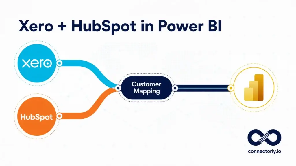
Learn how to combine Xero and HubSpot data in Power BI using Connectorly, including customer matching, bridge relationships, conflict handling and practical cross-system reporting.
How to Build a HubSpot Contacts and Companies Dashboard in Power BI

Build a HubSpot contacts and companies dashboard in Power BI using Connectorly data, practical DAX, ownership analysis, segmentation and CRM data-quality measures.
How to Build a HubSpot Deal Conversion and Win Rate Dashboard in Power BI

Build a HubSpot deal conversion and win rate dashboard in Power BI using Connectorly data, practical DAX measures, close-date trends and owner comparisons.
How to Build a HubSpot Customer Service Dashboard in Power BI
Build a HubSpot customer service dashboard in Power BI using Connectorly ticket data, with practical measures for open tickets, response times, workload, SLA status and ticket detail.
Use Connectorly Without Power BI: Connect Xero or HubSpot Data to Other BI Tools

Connectorly provides Xero and HubSpot data through PostgreSQL, allowing compatible tools such as Tableau, Data Studio, Qlik, Metabase and Excel to use it.
How to Create a Power BI Drill-Through Page: Step-by-Step Guide

Learn how to create a Power BI drill-through page step by step, configure its filters, add navigation and troubleshoot common drill-through problems.
HubSpot Sales Activity Dashboard in Power BI: Calls, Meetings and Tasks
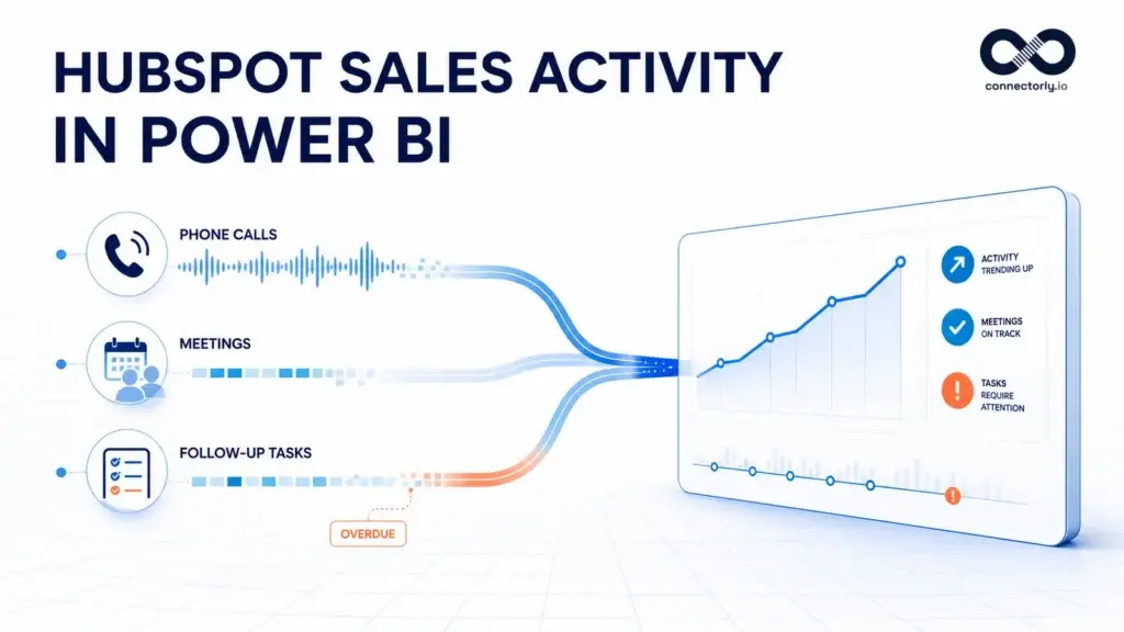
Learn how to build a HubSpot sales activity dashboard in Power BI using calls, meetings and tasks, with practical DAX measures for activity trends, task completion and overdue follow-ups.
HubSpot Sales KPIs in Power BI: Essential Metrics and DAX Examples

Learn how to create essential HubSpot sales KPIs in Power BI using the Connectorly data model, with practical DAX examples for pipeline, revenue, win rate, deal value and sales-cycle analysis.
How to Build a HubSpot Sales Forecast Dashboard in Power BI
Learn how to build a HubSpot sales forecast dashboard in Power BI using the Connectorly data model, DAX measures, weighted pipeline values and sales targets.
How to Create a Date Table in Power BI: Step-by-Step Guide

Learn how to create and use a Power BI date table with DAX, correct relationships, chronological month sorting and organisation-specific fiscal periods.
How to Build a HubSpot Sales Pipeline Dashboard in Power BI

Learn how to build a HubSpot sales pipeline dashboard in Power BI using Connectorly data, practical DAX measures and actionable deal-quality checks.
Xero Data Validation in Power BI: How Connectorly Checks Accuracy

Learn how Connectorly validates Xero financial and budget data for Power BI through automated reconciliation, customer-accessible audit views and pre-release testing.
The Complete Guide to HubSpot Reporting in Power BI

Learn how to connect HubSpot to Power BI, create a dependable CRM data model, choose useful KPIs and build dashboards that support better sales decisions.
How to Build an Aged Receivables Dashboard in Power BI Using Xero Data
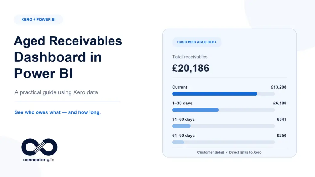
Learn how to build an aged receivables dashboard in Power BI using Xero data, Connectorly’s reporting model and a free template for customer and invoice analysis.
The Complete Guide to Xero Reporting in Power BI
A complete guide to Xero reporting in Power BI, covering native Xero reports, data connections, financial dashboards, multi-organisation reporting and reliable implementation practices.
Power BI for Beginners: The Complete Step-by-Step Guide (2026)
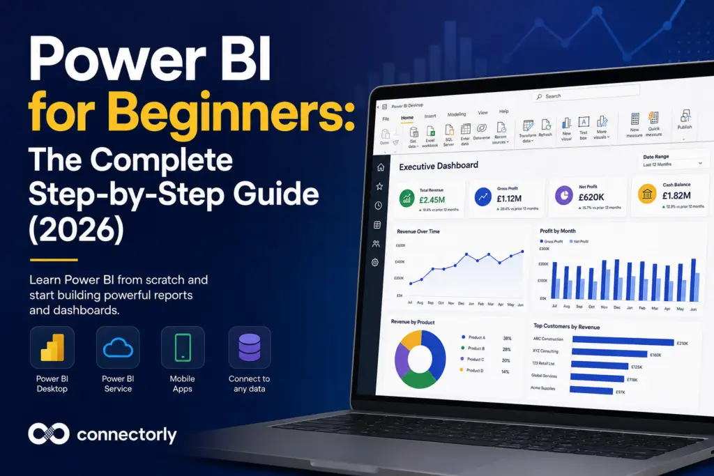
Learn Power BI from scratch with this complete beginner’s guide. Discover Power Query, DAX, dashboards, data modelling, publishing and practical business reporting examples.
Power BI Conditional Formatting: 5 Practical Examples for Better Business Reporting
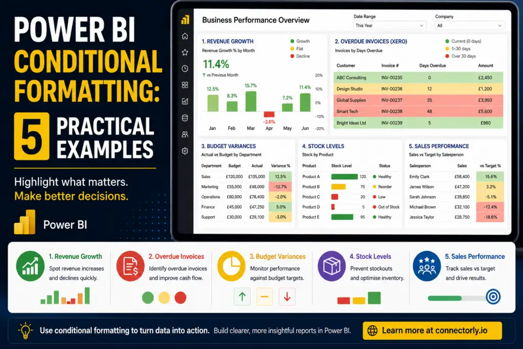
Discover five practical Power BI conditional formatting examples that improve reporting clarity and help users identify revenue trends, overdue invoices, budget variances, stock shortages, and sales performance faster.
How to Create Custom Tracking Categories in Xero (And Actually Use Them)
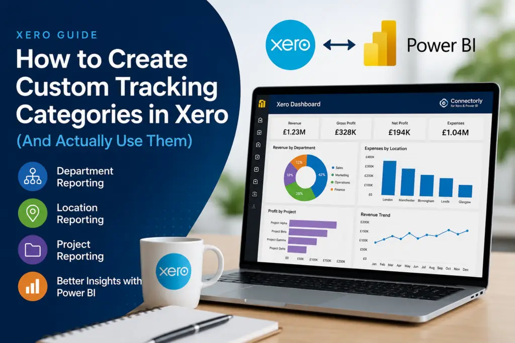
Tracking categories are one of the most useful reporting features in Xero, but many businesses never use them properly. Learn how to create tracking categories, improve department and location reporting, avoid common mistakes, and extend your Xero reporting with Power BI and Connectorly.
How to Build Dashboards from Xero in Power BI
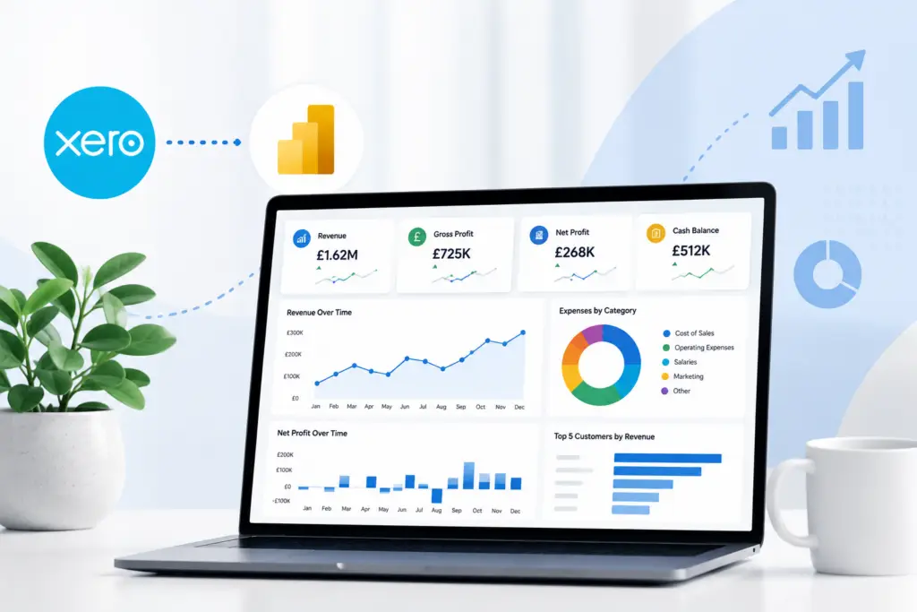
Want better Xero reporting? Learn how to build interactive dashboards in Power BI using Connectorly templates, structured data models, and automated refreshes.
Why Excel Is Killing Your Reporting
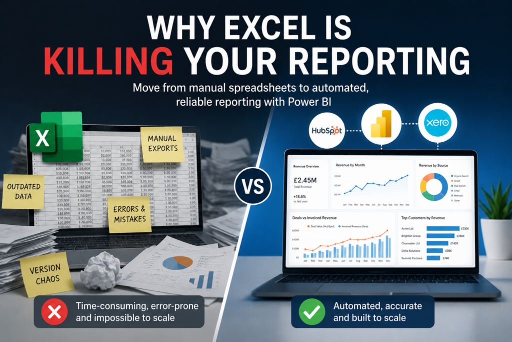
Excel is useful, but manual spreadsheet reporting creates hidden risks. Learn why automated Power BI reporting scales better for finance and operations teams.
Power BI Direct API Connection vs Using Connectorly for Xero Reporting

Should you connect Power BI directly to Xero or use Connectorly? This guide explains the differences, challenges, and best approach for reliable reporting.
HubSpot Native Reporting vs Power BI with Connectorly: Which One Scales Better?
Is HubSpot reporting enough, or do you need Power BI? This guide explains when to scale your reporting with Connectorly and how to combine HubSpot, Xero, and more.
Connectorly vs CData for Xero and Power BI: Which Integration Is Better for Consolidation?
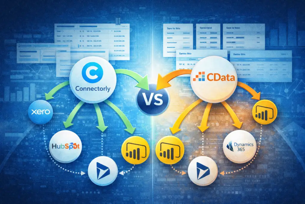
Struggling to consolidate multiple Xero organisations in Power BI? Compare Connectorly vs CData and find the best approach for structured financial reporting.
How to Use Xero Find & Recode (With Real Examples)
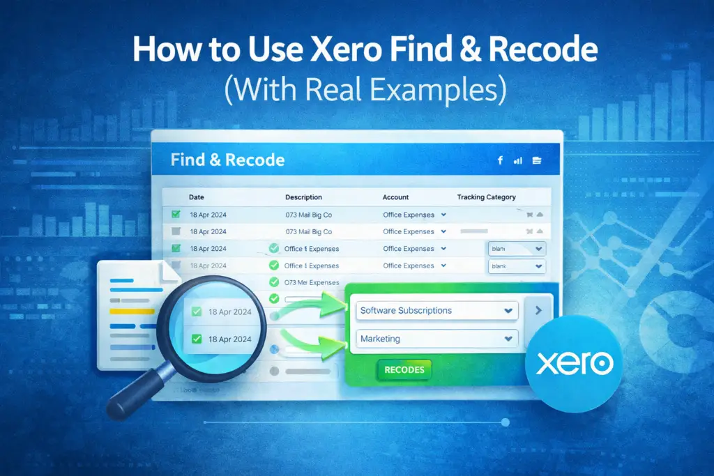
Struggling with incorrect transactions in Xero? Learn how to use Find & Recode with real examples to clean your data and improve reporting accuracy.